|
We decided our logo lacked sophistication, and the contrasting colours and text were orignally over-powering. Therefore, we decided to attempt making a second logo, with a more simplistic theme.
The text was added, along with a shadow of the text to create the impression the light had caused a silhoeuette to be presented on the wall behind. Our text included 'dh' which stands for 'Dollhouse'; our production name. We used the abbreviation as it seemed snappier, keeping the logo relatively simple and remaining the focus on the light. Our original choice of font was 'Amazone BT' as the letters were curly and slanted, however we then changed this to 'Monotype Corsiva', as it was more eligable while still containing a slight slanted flick. We then reduced the spacing between the letters,so they almost touched, so the title appeared smooth and almost as one. Lastly, we altered the text to be bold, so the letters stood out more against the background. We changed to colour scheme, to darker, more monotone. This seemed more mature and added sophistication through the lack of vibrant colours. We altered the shape, to a circle, as many logos hold a sypherical shape, for example the 'Apple' logo is almost circular, and the shape seemed to simbalise a logo.
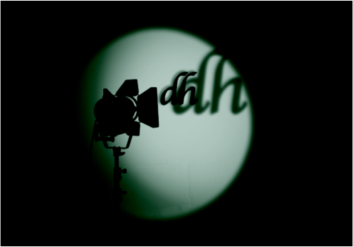 This is our final logo. We feel as if the logo succesfully demonstrates our genre and intentions through the colour scheme and features, as well as simbalising the film industry. We are proud with the outcome.
0 Comments
 This is the image we created using powerpoint. We began by using an image of a plain dolls' house, as displayed above, then varied the contrast and filters to make it appear darker and creepier. We did this by using the recolour tool. We then added the vines, changing the colour to a darker and gloomier green. Once we created this image, we then grouped them together and moved the image to photoshop. In photoshop we added the text. We used the font - 'Snell Roundhand' for the "DH". We made this bold and 50 pt to enhance it, intensifying our production name. The spacing between the letters was -25, as originally they seemed too far apart. For the "productions" we also used the 'Snell Roundhand' apart from the "P" where we used 'Lucida Handwriting' in italic to match the rest of the word, but to vary the word slightly, making it more unique. This was in 30 pt, and also bold, to make it stand out against the background, however not take away the emphasis from the "DH". 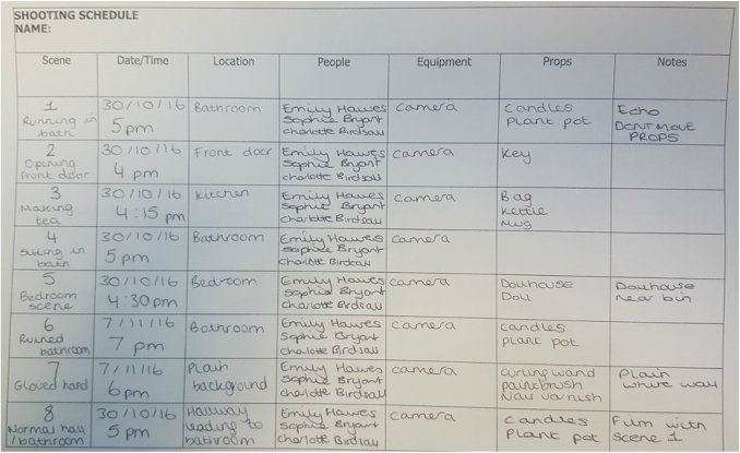 This is our shooting schedule, to ensure we get all our filming done at appropriate times of day suitable to the story line and in before our deadline. We are using this to keep to schedule and to make sure we have all our props and equipment ready so we can begin filming immediatley.
 We organised our actress using facebook messenger. We then ensured that we checked with our teacher to make sure this was allowed, and once we were certain it was we began preparing to film.
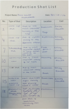
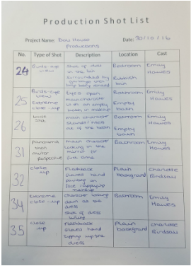
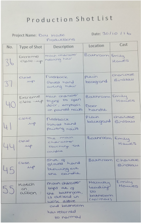 Our production shot list includes our most important and prominent scenes, in ordder to ensure we use varying shot types and are aware of our location and cast. We noted our important scenes within the list, as they require more preporation and a stong plan to follow.
Our opening sequence will not contain many hazardous elements as most of our scenes will be located within a safe environment, such as the bathroom. Handling candles may result in a burn, and is a potential fire risk. To reduce this risk, we will ensure that all of the actors and production team are aware of the locations of the candles. We will also use fake candles to provide lighting, and this is less dangerous then real ones. Since our actress has to submerge herself in water, there is a slight risk she could ingest the water. To resolve this problem, we will advise her to only stay under water as long as she is comfortable doing so. This will also result in a wet floor, which could become slippery so the chance of injury is increased. Our production team could dry the floor, and use a bath mat for when she hastily jumps out the bath to ensure she doesn't slip. As our opening sequence requires us to throw the objects around to suggest someone has been in the bathroom, this may result in broken objects such as glass. Our team will ensure the actress is aware of any risks, including tripping hazards and that any sharp objects are removed for safety purposes. 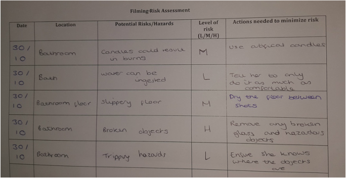
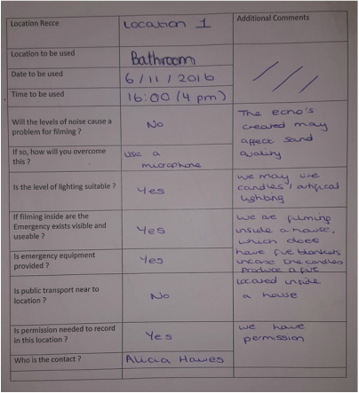
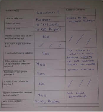
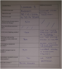 This is our location recce for our three locations: The bedroom, bathroom and kitchen. We have permission to film in all three and have assessed the risks and possible problems that may occur. The possible risks we have treated with care and we have ensured we are fully aware of them and what steps to take to reduce the risk.
Our group was split between the title names: 'Manipulation', and 'Upper Hand'. We showed four people of varying age groups and genders our opening sequence, then questioned them on which title they felt was more suited and why.
The first person we asked, was Barry Birdsall, 54, who suggested we used the title 'Manipulation'. He said this demonstrated the relationship between the gloved hand and the girl, as the hand 'manipulates' her into becoming this creature through makeup and clothing. Contrastingly, our second opinion was Ruth Hawes, 21 years old who thought 'Upper Hand' was more appropriate. She voiced that as 'Upper Hand' insinuates superiority and control. It relates to the idea of someone controlling her, like a child would with a doll and hence is suitable for a thriller movie, such as ours which revolves around someone taking advantage of a girl, to dress her and treat her like a doll. We questioned Conner Harling, 17, third, who expressed that he thought 'Manipulation' was a strong title, as it instantly informs the audience what the movie is about, with a quick snappy title. Furthermore, the title is memorable, like many other one-word titles such as 'Tangled', 'Inception' and 'Gladiator'. Our final person, Libby Burton, also 17, decided upon 'Upper Hand', as it reflected the black gloved hand which features in our opening sequence. However she then swayed her opinion, leaning more towards 'Manipulation'. This is because she felt the antagonist, the gloved hand, would be revealed somewhere in the middle/end of the movie and the title would no longer feel relevant. Overall, 'Manipulation' had 3 votes, while 'Upper Hand' only had the 1. We therefore decided to name our movie 'Manipulation'. This animatic includes a few scenes from our opening sequence plan. This also includes a rough plan for our music and sound. We used this animatic to progress our plan from the storyboard and establish a rough idea of how the whole piece would fit together.
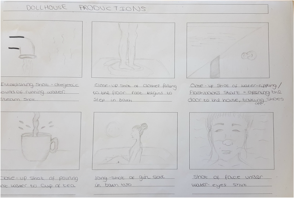 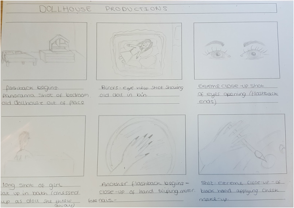 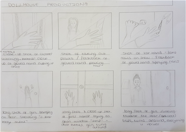 This is our storyboard. We planned our shot types and plot using this, so we had a rough guideline. We adapted it slightly, varying some shots and the arrangement of some scenes to improve our final production. For example, we removed the final scene, to reduce the risk of our opening sequence appearing as a trailer. We used this plan to develop our shot sequence and animatic.
|
Archives
May 2017
CategoriesEmily Hawes
Sophie Bryant Charlotte Birdsall |
- Welcome
- AS Level Blogs
- A2 Level Blogs
-
Useful Websites
-
AS EXAM INSTITUTIONS
- G322B1
- Digital Distribution
- Neurocinema and Focus Groups
- Intro to Audiences and Institutions
- Distribution
- Technological Convergence
- Marketing and Technological Convergence by Catilin
- Cross Media Convergence Revision
- Working TItle and Paul
- Pearl and Dean
- Understanding the Film Industry
- Media Ownership
- Documentary about Digital Grading in Lord of the Rings
- Marketing and Technological Convergence
- Benefits of Technological Convergence
- Film Distribution
- Digital Distribution of Film
- Working Title
- Warp Films
- Film Marketing
- Film Marketing
- Marketing and Technological Convergence by Alice and Rosanna
- AS EXAM TV DRAMA


 RSS Feed
