|
For question 3 of the evaluation question, I had recorded 2 people asking for their feedback. post by Fatma.
0 Comments
This is our final evaluation for our A2 media project.We all answered one question each.
Gina - Question 1 Elise - Question 2 Fatma - Question 3 Katja - Question 4 Post by Elise, Gina, Katja and Fatma Here is the final music video that we have created for Haunting by Halsey. We uploaded it to Youtube as it was a good multimedia source to have our video published on. We have all worked very hard to produce this and hope you enjoy. Music Video crediting:
Producers: Katja, Fatma, Elise, Gina Director: Gina Editing & Post Production: Katja Lighting Director: Elise Production Assistant: Fatma Actors: Katja and Chloe (not in our media group) Post by Gina, Elise, Katja and Fatma Below is our final magazine advert. I again kept to the same colour scheme and used the same picture and design as the album cover to make it more recognisable to the audience. The parental advisory sign is on the bottom left of the picture to advertise that the album is explicit. There is then what looks like a paper tear at the bottom of the picture and an avertisement of the singles released befefore the album to makee the artist more recognisable. There are then little details and information like the web adresses in a small font in the bottom left hand corner where the audience could find more information and the company logos in the bottom right hand corner. There is also a piece of text saying 'out now', teling the audience it is available for purchase. 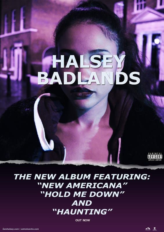 Post by Gina Below is our final digipak. We originally wanted the colour scheme to be pink and blue but given the dark lighting of the orignal photo the pink hues turned out more purple, which caused us to have more or a purple and blue colour scheme. 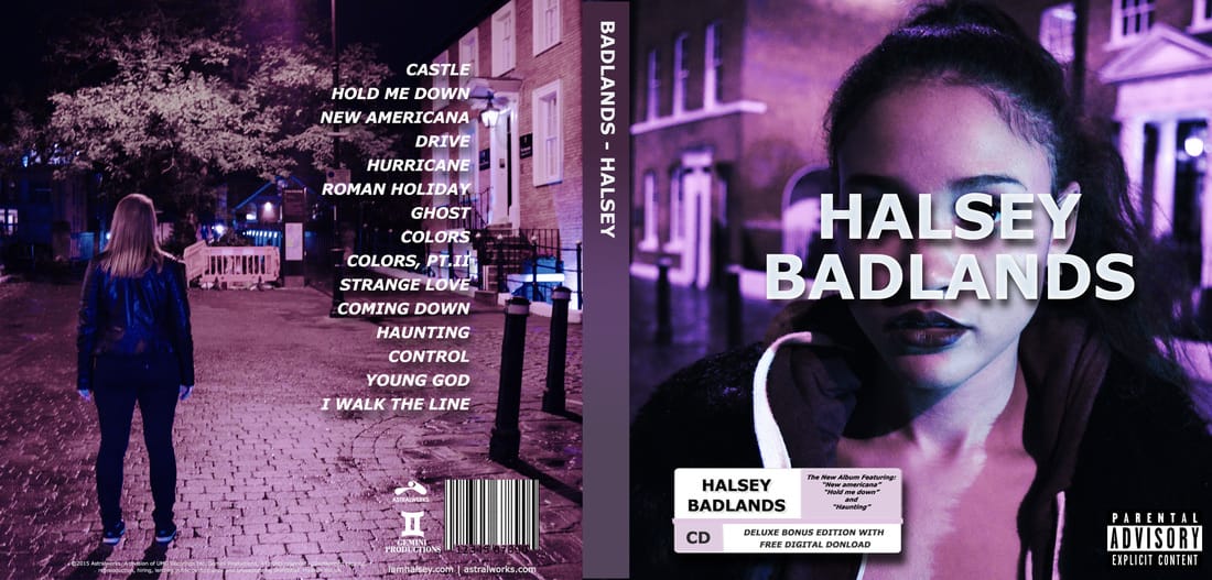 The right side of the digi pak is the album cover. It shows a close up of Katja who we cast as the singer in our music video. The artist name and album title are over the artists faec to ccreate an elment of mystery as this album is a concept album about a place called 'Badlands'. In the bottom left corner of the front cover, there is a bonus content sticker showing what version of the album it is (deluxe or standard) and advertising some featured tracks. In the bottom right corner of the front cover there is a parental advisory sign, showing that some songs on he album are explicit. The spine of the digipak was kept simple with a purple gradient and a bold, plain and readable text. The text is the same font used for the entire digipak as well as the magazine advert, this makes it recognisable to the audience. The back cover is a wide shot of our main actress who is in our video looking into the distance. This makes her look mysterius which helps set the tone for the album. On the right side of the back cover there is the tracklist o the album. It is in a bright white font and has a drop shadow to make it very eye catching and reble against all parts of the photo. I also paid attention to the details on the back cover. There is a barcode as well as small print at thhe bottom wth copyright information about the album. There are also company logos like Astralwerks and our logo for Gemini Porductions. There is also informatioon for Halsyes website as well as Astralwerks website.
Post by Gina To make a good and effective magazine advert for our chosen song's album to promote it we made a practice magazine advert so that we could decide on what we would like to really have for the real thing. This was more of a trial and error thing which enabled us to test our creativity and learn how not to over complicate things for the real thing. We also did research on other magazine adverts for albums and did some analysis' of Digipaks which gave us an idea of what is expected to be visually appealing for someone who would be purchasing an album in general. We needed to make sure that we had an idea that would make people look into at it and want to buy it. I used Photoshop to make this practice magazine advert which is what we will use to make our real one. It made it easier for me to add the pastel background and change the opacity of the picture in the middle by using this piece of software. We wanted to keep the information simple and just put the name of the singer and album at the top in a larger font then underneath the picture we picked there is the description of this being a debut album and some of the songs. I added an over lay of colour over the writing to make it pop and I lined it to the centre. In the bottom left corner I put a parental advisory as there are some songs on this album which are not suitable for all. In the bottom right corner there are some websites for the singer and record label. 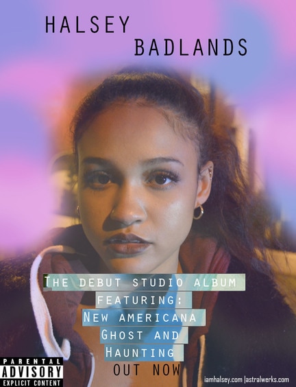 Post by Katja
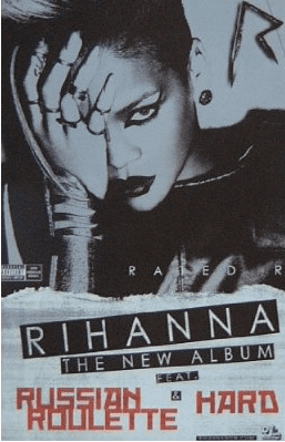
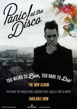
To get a better understanding of how to do our magazine advert, I have analyised 2 magazine advverts for current artists in the alternative and pop genre. The first magazne advert I have chosen to analyse is Rihanna's 'Rated R' and Panic! at the Disco's 'Too Weird to Live, Too Rare to Die'. I have chosen to analyse these two adverts as Rihannas reputation is slightly similar to Halsey's and Panic! at the Disco is in th alternative pop genre and most fans that like Halsey usually like this band too. Rihanna:
The words on this advert are very bold and stand out instantly. Rihanna's name is the biggest piece of text, which emphasises that she is a solo artist, along with the two singles on the album that were released beforehand. These would be 2 of the most familiar parts of the advert as it is a famous name and songs heard before, making the audience feel familiar with the album advertised already. Her name is the biggest text which is white in a black banner and the single names are in red, making these 2 pieces of text stand out the most in the advert. Panic! at the Disco:
The biggest piece of text on this advert is the band name in the top left corner. The part of the photo behind this part of the text is plain and light wich contrasts with the bold dark letters making the band name stand out the most. this would catch a fans attention as it is a familiar logo for the band. The album name is in white which contrast heavily with the dark part of the background which catches the eye. Other important information about the album is in yellow which stands out as it is against a black and white photo, adding a little bit of colour. The last piece of text which is not as noticeable as the others as it is grey which blends into the photo slightly. This pieece of text tells the audience about recent singles off of the album and as Panic! at the Disco is an alternative band and not top 40 charts sort of popular, this part of text is not as important.
_ These 2 magazine adverts advertise the artists new albums in different ways depending on the artists themselves. Rihanna's advert shows a close up of her face as she is well known whereas Panic! at the Discos' advert is a mishot. As Rihanna is an extrememly popular artist who has been in the chart multiple times, her singles are advertised bigger on her advert than Panic's are on theirs, although the names of the artists are the biggest and most noticeable pieces of text on both. Also both adverts have a web adress for the artist at the bottom as well as the record label the album is being released on. After analysing these 2 adverts, we now have a better idea on how to design our advert for Halsey. We will use the same picture from out digi pak and have her name stand out the most. We will make the picture slightly desaturated but not entirely and we will keep Halseys siignature colours which are pink and blue. Post by Gina Below is a test shot for our music video. We did a test shot in the studio setting so that we could find the appropriate lighting for our when we start filming our music video. We also edited a clip of the song we have chosen for our video to see how the lip syncing matched up. We feel the test shots went very well as we will be using this lighting and setting for our music video Post by Gina 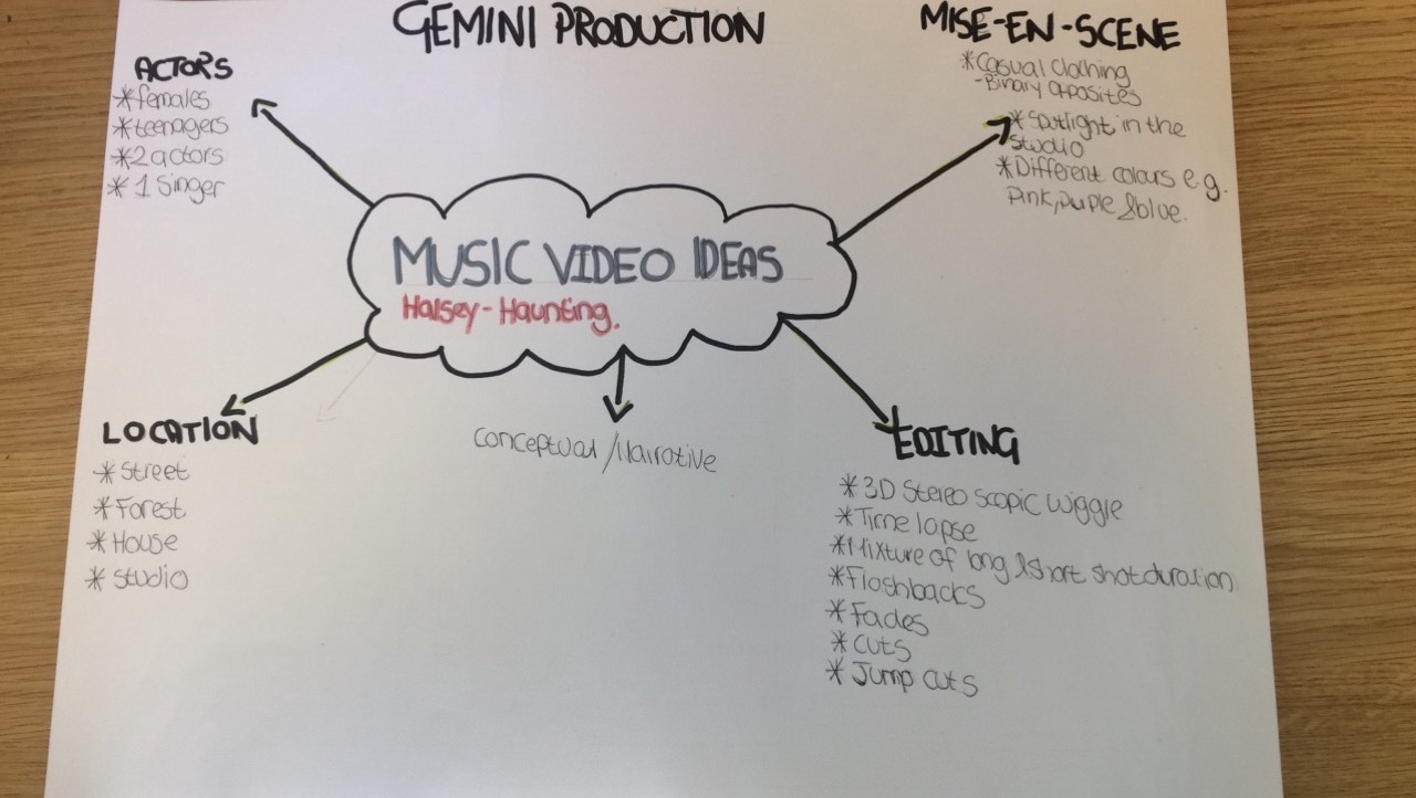 As a group had all sat together during a lesson so that we could discuss everything about our music video and how we are going to edit the music video
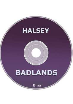
In order for our groups to get a better understanding of everything that we want in our music video which includes what type of music video we will have, mise-en-scene, how many actors we will need, the location and how we are planning to edit our music video. We have made this mind map so that our production can be easier and we can put our creative ideas into the music video. It was important for our group to make a mind map for our ideas so that we can remember everything we want for our video and also so that we can include all of our ideas into the music video. Post by: Elise, Fatma, Katja, Gina Before starting on the main design for our digi pak we decided to first create a practice version of what we wanted to do. We decided that the first thing we would do for this task was to create a couple of sketches of some of the ideas that we had, and different colours we could use. Then we would take the shots we needed when we were filming, and apply them to the practice copy of the digi pak. Sketches: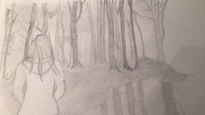 This was the sketch before we added colour to it. This would be the back of the CD cover, where it tells you what songs are featured on this album. This one of the ideas we had where we would have the main character of the music video, looking into the forest. 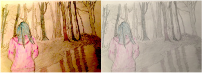 This is the same sketch but with different colouring added to them. The reason for the pink and the blue colouring is because the artist that we are using, uses these colours in her digi paks, and so we decided to use this in regards to our artist, Halsey. We didn't create anymore sketches as this was just to give us some idea of what we wanted to do and if the colours we wanted to use, worked well with our ideas, and the shots we needed in order to create the practice, and main digi pak. Pictures: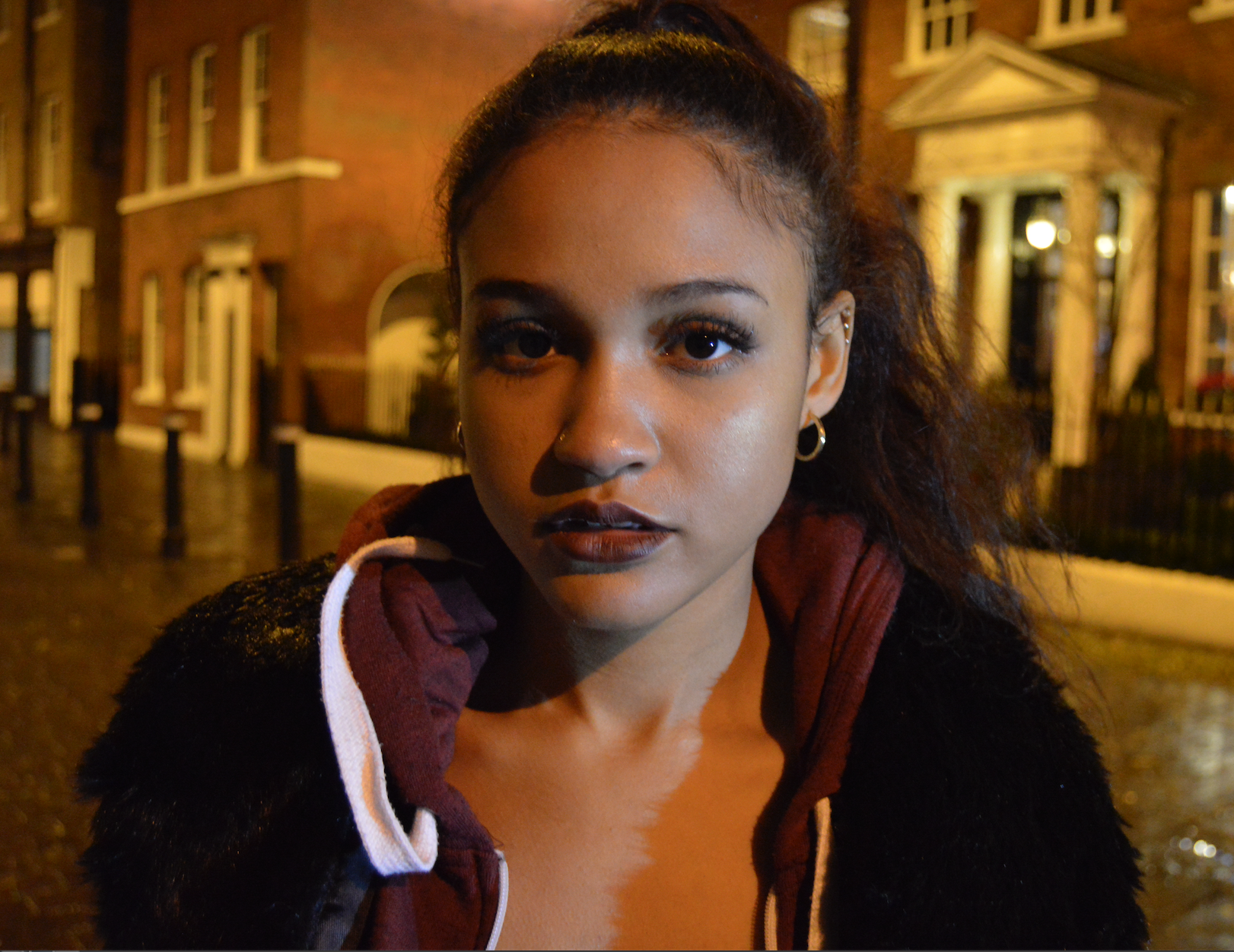 This is the shot we decided to use for the front of the digi pak, as katja is the singer in our music video, and one of the main characters. We decided that she should be looking straight into the camera, as though she is looking right at the audience, as this creates a link between the audience and the artist/character. 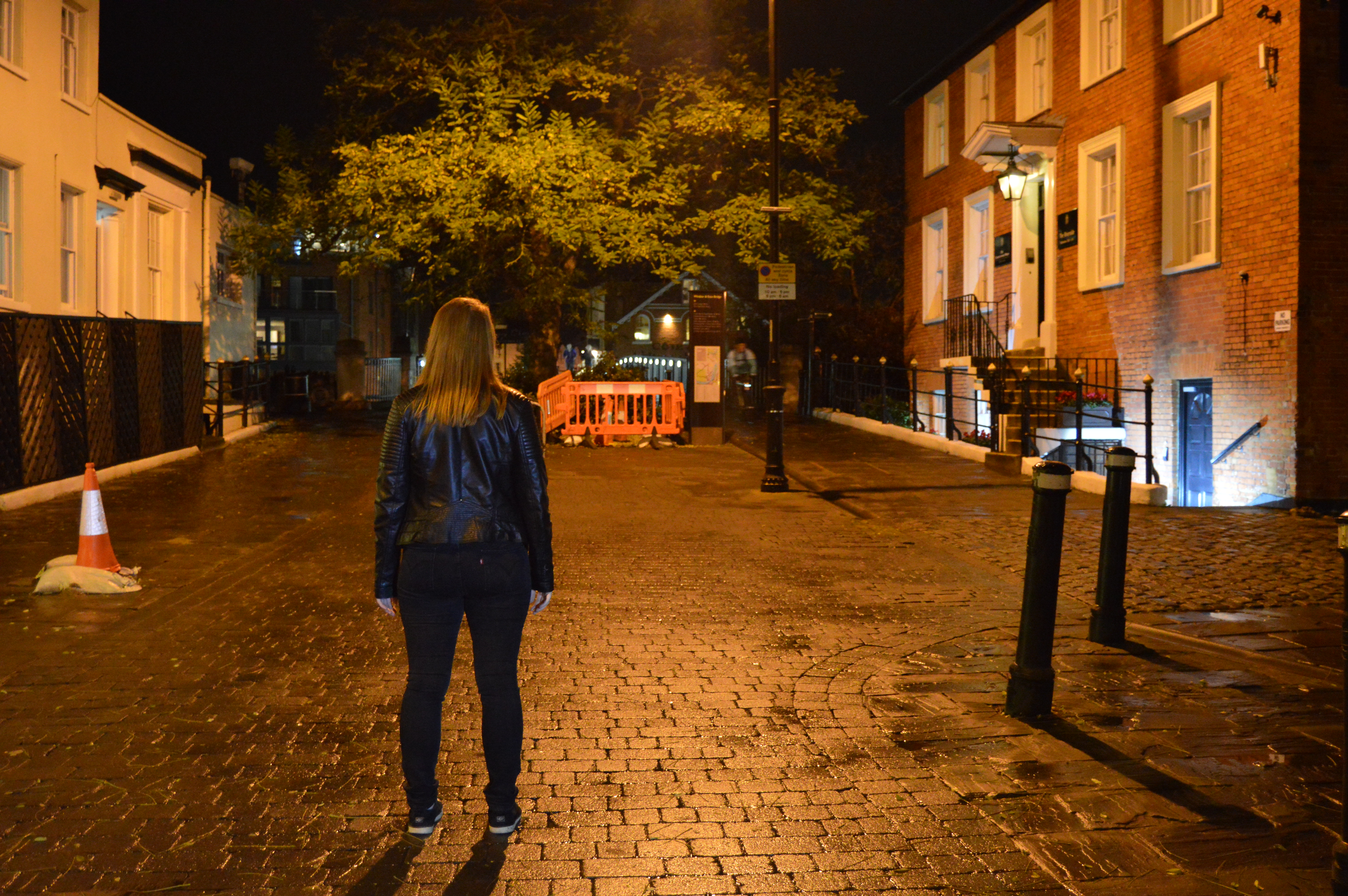 This is the shot that was decided to the back cover of our digi pak, as it shows the main character of our music video looking at the bridge beyond the tree. We decided that this was a better location than the forest, as our music video is about how she feels guilty for the death of her friend, and this is the place where her friend died, so therefore holds more meaning than the forest.  For the practice digi pak, we decided that these were the types of colours we were going to use for the actual CD disk. Practice Digi Pak: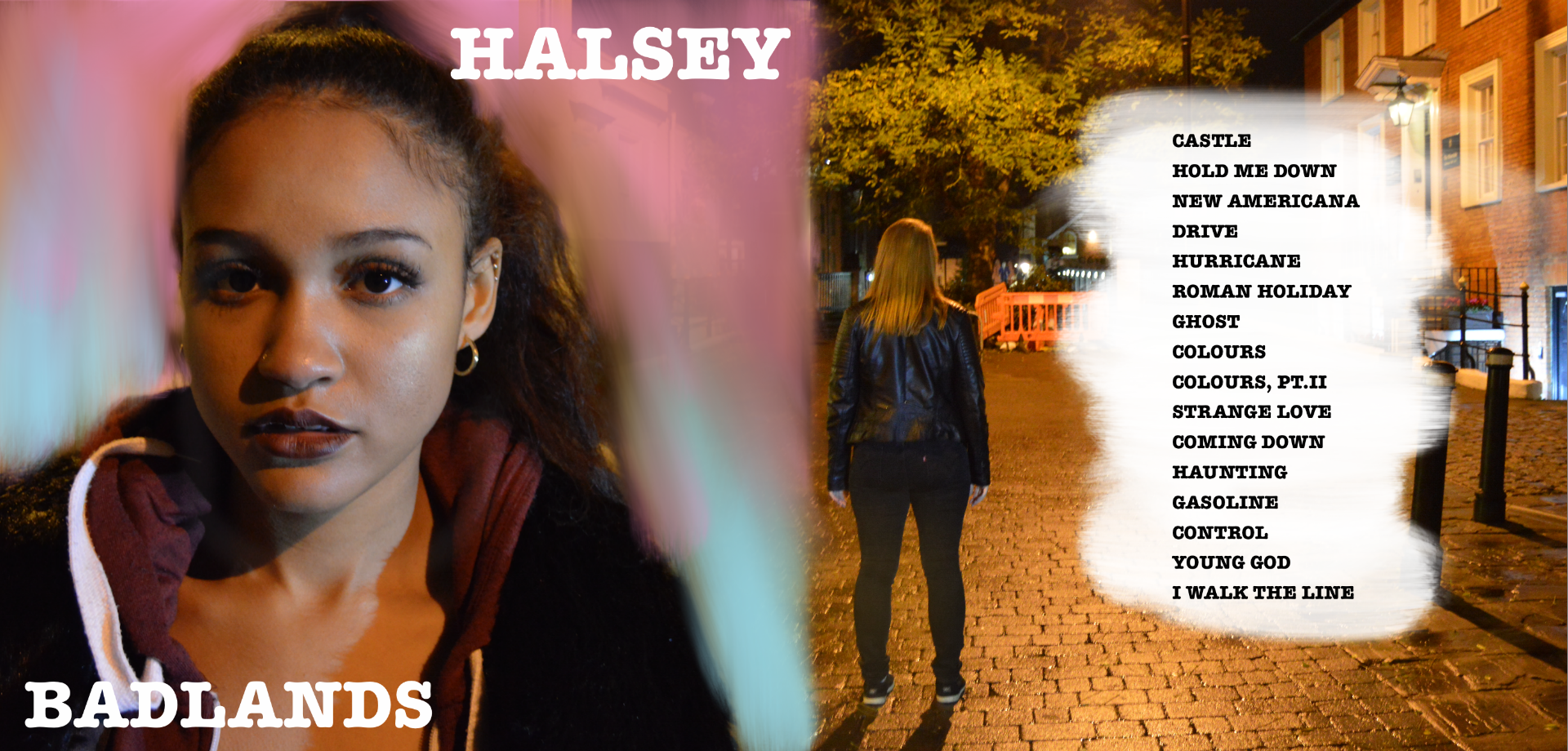 As you can see this is the back and front of the digi pak. We decided for the front to have the background in the Halsey colours, and to just have in plain white font "HALSEY", and "BADLANDS", which is the name of her album. For the back cover, we decided not to editing the colouring on this shot, as we like how it is a night time shot but is not actually dark in the shot, and it creates a nice affect.  For our CD disk we just decided to have colours on it but more dulled out, as we didn't want everything to be overcrowded. Post By Elise
|
AuthorWrite something about yourself. No need to be fancy, just an overview. Archives
May 2017
Categories |
- Welcome
- AS Level Blogs
- A2 Level Blogs
-
Useful Websites
-
AS EXAM INSTITUTIONS
- G322B1
- Digital Distribution
- Neurocinema and Focus Groups
- Intro to Audiences and Institutions
- Distribution
- Technological Convergence
- Marketing and Technological Convergence by Catilin
- Cross Media Convergence Revision
- Working TItle and Paul
- Pearl and Dean
- Understanding the Film Industry
- Media Ownership
- Documentary about Digital Grading in Lord of the Rings
- Marketing and Technological Convergence
- Benefits of Technological Convergence
- Film Distribution
- Digital Distribution of Film
- Working Title
- Warp Films
- Film Marketing
- Film Marketing
- Marketing and Technological Convergence by Alice and Rosanna
- AS EXAM TV DRAMA
 RSS Feed
