|
Below is our final magazine advert. I again kept to the same colour scheme and used the same picture and design as the album cover to make it more recognisable to the audience. The parental advisory sign is on the bottom left of the picture to advertise that the album is explicit. There is then what looks like a paper tear at the bottom of the picture and an avertisement of the singles released befefore the album to makee the artist more recognisable. There are then little details and information like the web adresses in a small font in the bottom left hand corner where the audience could find more information and the company logos in the bottom right hand corner. There is also a piece of text saying 'out now', teling the audience it is available for purchase. 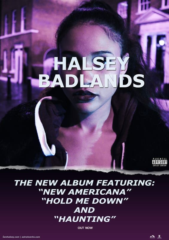 Post by Gina
0 Comments
Leave a Reply. |
AuthorWrite something about yourself. No need to be fancy, just an overview. Archives
May 2017
Categories |
- Welcome
- AS Level Blogs
- A2 Level Blogs
-
Useful Websites
-
AS EXAM INSTITUTIONS
- G322B1
- Digital Distribution
- Neurocinema and Focus Groups
- Intro to Audiences and Institutions
- Distribution
- Technological Convergence
- Marketing and Technological Convergence by Catilin
- Cross Media Convergence Revision
- Working TItle and Paul
- Pearl and Dean
- Understanding the Film Industry
- Media Ownership
- Documentary about Digital Grading in Lord of the Rings
- Marketing and Technological Convergence
- Benefits of Technological Convergence
- Film Distribution
- Digital Distribution of Film
- Working Title
- Warp Films
- Film Marketing
- Film Marketing
- Marketing and Technological Convergence by Alice and Rosanna
- AS EXAM TV DRAMA
 RSS Feed
