|
1. In what ways does your media product use, develop or challenge forms and conventions of real media products?
2. How effective is the combination of your main product and ancillary tasks (magazine advert and CD cover design)?
4. How did you use media technologies in the construction, research, planning and evaluation stages?When thinking about a creative way to answer the evaluation questions, we decided to make a mind map of ideas on what we could consider as 4 of our chosen ways to answer each questions. 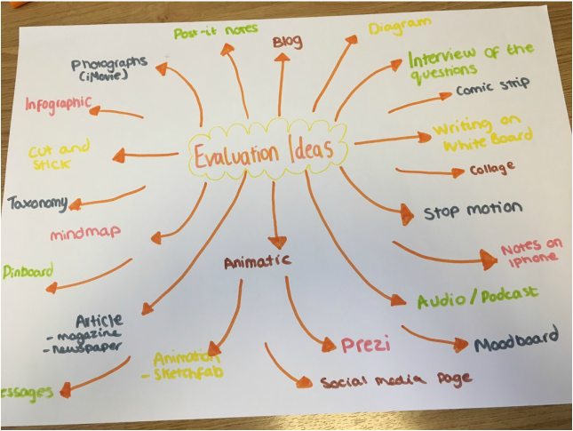
To evaluate on our rough cut, we asked two fellow media students to give us their feedback on what was good and what was bad/improve on because they would give their honest opinion. When asking these students they pointed out a jump cut which we hadn't noticed before, this was due to the time schedule we had but from this we could then go back and make the continutiy flow better. They also mentioned adding more shots with the rose petals as this was the main concept/prop that we wanted to include and make noticable to the audience (Rose has connotations of romance/love- but in this case its some what the opposite-dark love). Taking this into consideration we have now developed and edited our music video to include these main points.
Here is our rough cut for our final music video. After creating this, we asked some of our peers to give us some feedback which we have recorded in another post. This allowed us to use both our own ideas and some help from their feedback to create a much better and more crisp final product. After watching this through, we decided there were a few aspects we would change. We wanted to replace a clip with a much better, more fitting one and adapt the ending to have a bigger impact on our target audience. We feel by doing these things we will be more satisfied with our music video and will hopefully achieve a better grade. 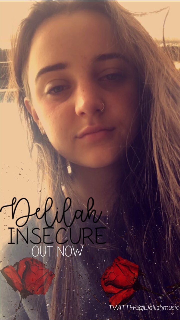 Above is our final poster for our music video. We chose this photo, as we felt that it was a good and simple representation of our music artist, Delilah. We used a slight red tint and included roses to continue our theme of romance, lust and danger, that we included throughout our music video. This allows our target audience to gain an insight in to what is to come in the music video and Delilah's style as an artist. We designed our poster, hoping that it would appeal to our chosen target audience and encourage them to watch the music video. We did a lot of research into other posters, trying to make ours look as professional as possible but also keeping it simple. We kept the same font throughout all of our ancillary tasks to continue are theme and again, appear professional.
1. What can be said about the photograph on the front cover?
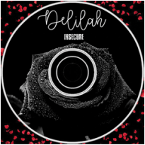
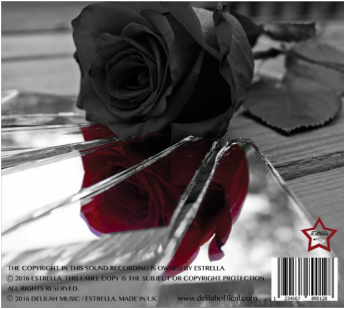
We chose to take a photograph of our artist closing her eyes looking down to show the fact that she is represented as being insecure. Not only this but the use of makeup (black eyeliner and mascara) shows how she feels she has to cover up herself to be happy in the relationship. This is a modern aspect that most girls do as well as the fact that she is wearing a nose piercing relating to the look of Delilah. We decided to only photograph half of her face as it fitted within our draft of what we made beforehand and could also mean, there are 2 sides to everything (good and bad side). The half profile face is hiding something that she does not want to show, but wants you indirectly to know. Using photoshop we edited 'Delilah's' lips from black to a dark red because we wanted to contrast it with the colour of the rose on the back cover and to also make the main focus be on the part we want it to. The red lips also connote love and danger which is shown though out the song 'Insecure'. We edited the main photo so that it was darker around her eyes and lighter on her cheeks. This was to show how she is tired and worn out because of her insecurity. 2. What meaning is communicated through the use of images and colour? For our final designs we decided on using three main colours: black, red and grey. We chose this because it reflects upon the image and mood of the song being dark and mysterious. The color gray is an emotionless, moody color that is typically associated with meanings of dull which sets the atmosphere of the song. Black is associated with power, fear, mystery, strength which is Delilah herself and the reason why we used a black and white photo for the front cover and the CD. The use of the rose illistrates love gone wrong due to 'Delilah' being insecure and is a prop we have used in our music video throughout. The images of petals falling down on the middle cover of our digipak mirrors Delilah's relationship and how it is falling apart. A mirror reflects the images of whatever is placed in front of it, so a broken mirror can symbolize the person looking into it not being able to see their true self. In the reflection we see how the rose is red but on the outside it is black which shows what she thinks of her inner self but what she actually is on the outside. This is also portrayed with the use of the red lipstick and the red rose within the artists eye. We used black for the writing on the front cover as it blends in with our colour theme and stands out capturing the audiences attention. However, on the middle of the digipak we used white writing instead to show up against the black CD. 3. Explain your decision for font style, font placing and font size and is this formal or informal? We chose 'feminine' writing for Delilah's name as we believe it reflected on her style and fitted the look she portrays. We placed this writing sideways in order for us to make the size bigger and eye catching for the audience. We also placed it here as it is next to the artist herself so people are aware what artist we are promoting. This type of style is informal due to it looking soft and delicate. When placing this style of font onto our CD we decided to place it at the very top to fit within the space and wouldn't take the focus away from the main image of the black rose. For Insecure we chose 'shattered glass' as a font effect as it contrasts itself and the fact that Delilah is insecure expressed through her lyrics. We placed this font sideways on the front cover next to 'Delilah' to show the name of the song that is featured within the album and also allow for us to make it a reasonable size so the audience is aware of it. This style of writing is informal as its not a style you would see used in everyday writing making our digipak different from any others. The main reason in why we have both 'Delilah' and 'Insecure' sideways is so that it doesn't take the focus away from the image of Delilah's face which will catch the audiences attention. These two different types of fonts help differentiate between types of messages. This was something that helped us extremely allowing us to portray what we wanted. One of the main reasons we combined these two styles after experimenting with others is the fact that they blended well together and created a nice designed effect. It was important for us as a group to choose the right font styles, sizes and where we were planing to place everything due to a number of reasons: Overall it gives it more value, gives the right message across to the right target audience, projects professionalism and adds more appeal to the digipak. 4. How does the digipak represent the artist and what did we learn from the research we looked into to help with the design of our own? The digipak represents the artist as it reflects on Delilah's style of music being dark and intense. The black colours used contrast this point as well as the red colours showing how a story about love is being told through her lyrics. The rose on the back cover of our digipak represents Delilah's beautiful and how other people see her compared to how she sees herself which is one of the main reasons why we used an image of a rose and the shattered mirror. The mirror represents her as it is a symbol of her physical and spiritual reflection. For example, a physical mirror is a reflection of how Delilah currently appears and the spiritual side reflects parts of Delilah's life she created for herself to where she is now as an artist. As mentioned before, the style of writing is another aspect that represents Delilah as she is a very modern/stereotypical artists in which her music videos show her feminine side. The research we did before hand helped us a lot when it came to designing our own. The Jason Derulo cover in which we analysed beforehand gave us an idea of the types of font we could use as well as images fitting within the artist. The research into colours allowed us to explore how the mood of each song reflected on the colours used on the digipak. This made us aware that we should use dark and dull colours to reflect onto the song and the artist. When analysing Jason Derulo's front cover and looking at other covers online we noticed how the main image on the front is of the artist. We conformed to this idea and took a photograph of our actor playing Delilah within are music video and made her the main focus. Using our draft we recreated our ideas and developed our own cover which is shown below. We used the same idea of the half face and red lipstick but decided we would make our 'Delilah' have closed eyes to show her insecurities affected her more. We used the same writing fonts and sizes as our draft idea as it was affective when asking people what they thought about it. 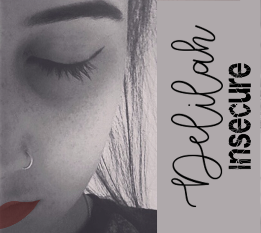 In order to create our own CD we researched the different types of CD art and using photoshop we experimented with our own ideas as shown below. As a group we looked into different font styles and thought that we would do two different styles so the artists name and the song title both stand out.
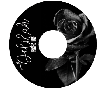
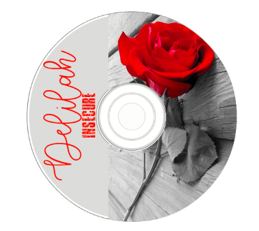
After designing these two drafts we decided on the black background and white writing with the rose centred in the middle as it was most appealing. The reason why we chose to use an image of a black rose is because it reflects on the song title 'insecure' and the mood/atmosphere of our music video. We chose 'feminine' writing for Delilah's name as we believe it reflected on her style and fitted the look she portrays. For Insecure we chose 'shattered glass' as an effect as it contrasts itself and the fact that Delilah is insecure. 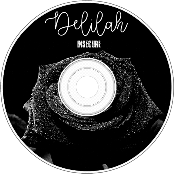 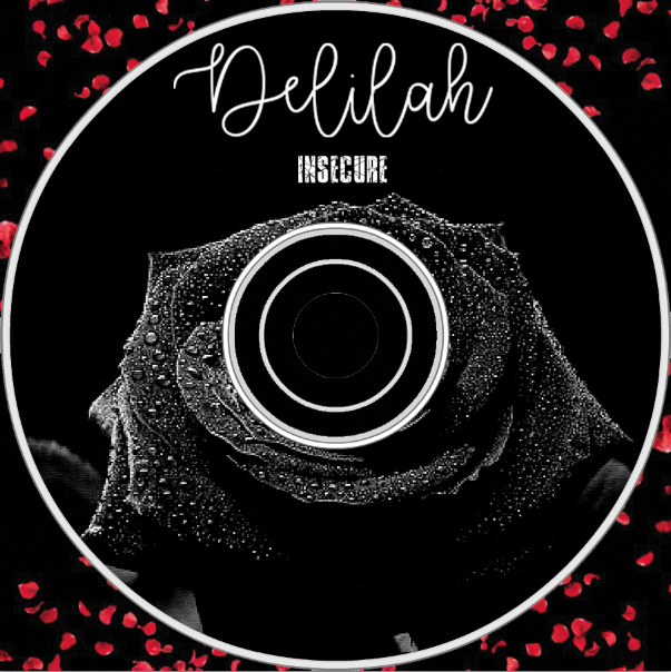 When coming to making our own CD we decided to make a draft to get an idea what we would like to do but also to help our skills when using Photoshop. The Draft we have made is made to fit the song insecure but also to engage our target audience by making it appealing. We had to think about both the front and the back and what we would where but we finally came to a conclusion and it ended up working perfectly. 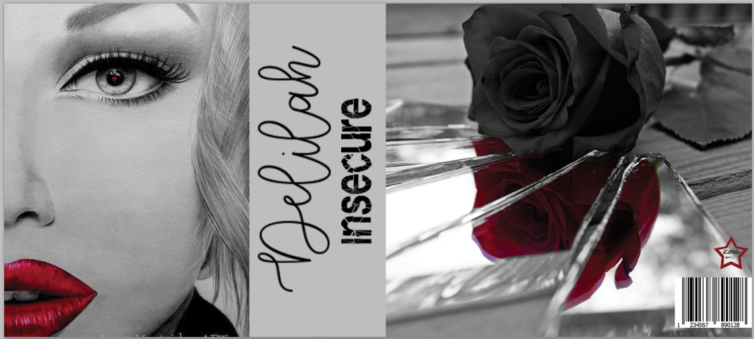 As our second draft we took a photograph of Delilah to match our first draft but when it come to putting it all together we decided to have her looking down as if she is afraid of herself. We experimented with a lot of different background colours that would blend in with the middle and back cover, an example shown below. 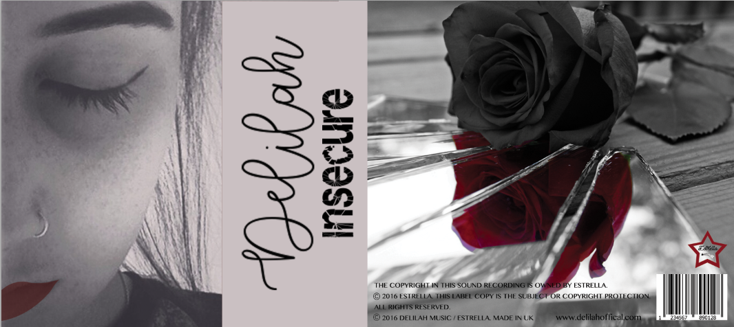 |
AuthorGeorgia Reynolds, Amber Teeder, Peggy Horn and Moon Aleston AuthorWrite something about yourself. No need to be fancy, just an overview. Archives
January 2017
Categories |
- Welcome
- AS Level Blogs
- A2 Level Blogs
-
Useful Websites
-
AS EXAM INSTITUTIONS
- G322B1
- Digital Distribution
- Neurocinema and Focus Groups
- Intro to Audiences and Institutions
- Distribution
- Technological Convergence
- Marketing and Technological Convergence by Catilin
- Cross Media Convergence Revision
- Working TItle and Paul
- Pearl and Dean
- Understanding the Film Industry
- Media Ownership
- Documentary about Digital Grading in Lord of the Rings
- Marketing and Technological Convergence
- Benefits of Technological Convergence
- Film Distribution
- Digital Distribution of Film
- Working Title
- Warp Films
- Film Marketing
- Film Marketing
- Marketing and Technological Convergence by Alice and Rosanna
- AS EXAM TV DRAMA
 RSS Feed
