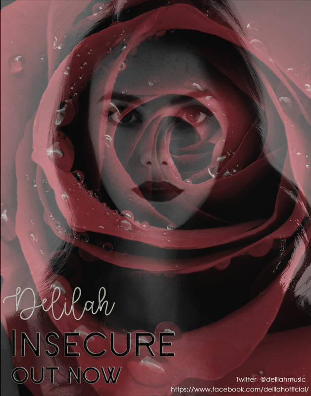
 We decided that we should practice creating a poster to ensure that we get the best result when we make our final poster. We came up with lots of different suggestions and chose a basic idea to create for our first draft. We used the idea of the red rose from our music video and a large picture of Delilah and for our poster. In this case we chose a random photograph and picture of rose to just gain an understanding of what it is we would like for our final poster.
By creating a draft it allowed us to practice different techniques and new aspects of photoshop so that we are prepared for when it comes to creating your final poster for our music video. We liked this draft and are going to use it as a template for when we make the final poster, however we may change some aspects to make sure we achieve a more professional finish. We may change the font type and potentially the location for our final poster as we are not sure it represents Delilah in a way we wish to portray her. We may also use a photograph of only half of Delilahs face, this will allow us to see more of her features and the rose will fit appropriately.
0 Comments
When starting to create our draft for our CD cover and Poster we had to look into the perfect font to fit with the name Delilah and Insecure. We used a website to help us look at varied fonts and came to a conclusion of these 6 fonts which appealed to us the most. These fonts will most likely be used in our final CD and Poster due to them fitting our ideas.
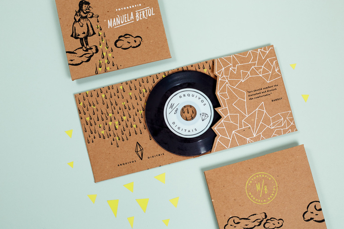
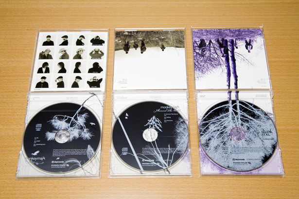
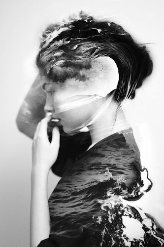
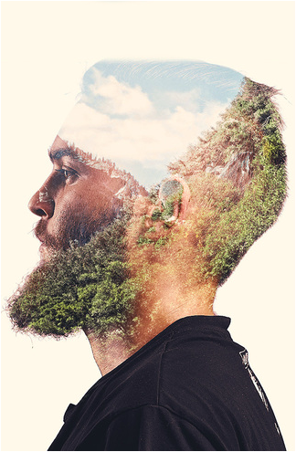
In order for us to create our own Digipak, we needed to brainstorm ideas of what we want to include in ours which would fit in within our theme. We looked online at existing images of ones which we have shown below that have helped us to picture what we are looking to do.
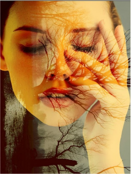
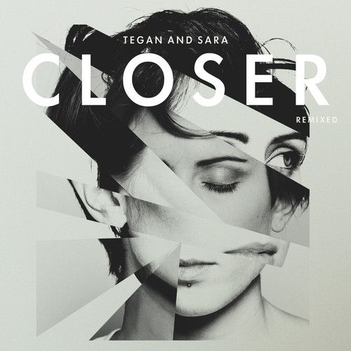
Looking into music posters allowed us to visualise what we want to do when producing our own. As a group we decided that we wanted something that is simple but effective, which the images below create and helped us with.
 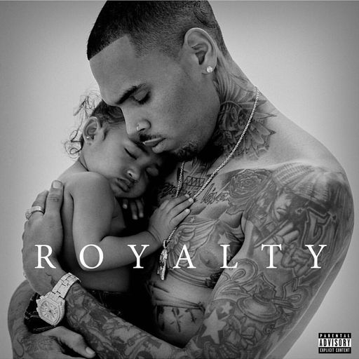 When it came to creating our own album cover for our digipack we decided we should look at existing album covers to analyse in order for us to gain an understanding of how to create our own.
We chose to analyse Chris Brown's album 'Royalty'. The album was released on December 18, 2015 and dedicated to his daughter Royalty Brown, hence the name. The name suggests that Chris thinks of his daughter as royalty, being very important to him and the fact Chris has said that 'he wants the art to show that his queen of a daughter is the only thing he lives for'. This allows the audience to see just how important both his music and daughter are to him and gives them an insight into his personal and possibly sensitive lifestyle. The album cover is a photograph of the two, With Christ holding Royalty in a warm embrace, this allows the audience to empathise with Chris as a parent and family man while he shows a sensitive side. The fact that they are sharing skin to skin contact also suggests a close relationship and gives a warm feeling to the picture. This could attract a wider audience to buy his album as it will not only be his long-term fans who know they enjoy his music but others may be attracted also. The use of black and white gives a sense of purity and warmth to the album, again drawing in a wider audience. The lack of colour allows you to focus on the image and its meaning rather than being distracted by colours. It also means that the title of the album stands out and makes it the main focus, so not to forget you are looking at the album cover, with a clear image of what it is based on. Although the album cover is very simple it is also extremely effective and was a huge success, debuting at number 3 on the US Billboard 200 with 162,000 album sales in its first week. This was more successful than Chris Browns' previous 3 albums. When researching for our music video CD cover, we decided to look at existing pop albums and came across a couple in which caught our attention which we will be analysing below. 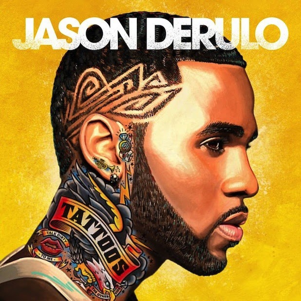 After producing records for several artists and writing songs for Cash Money Records, Young Money Entertainment, Jason Derulo signed to minor recording label Beluga Height after Beluga Heights became part of the Warner Music Group. Derulo announced via Twitter that his third album will be called Tattoos. This relates to the tattoo that is featured on Derulo's neck in the album cover above. This album was released on September 24, 2013. The album's second single, "Talk Dirty", was released internationally on July 27, 2013 (digitally and hardcopy). This song is also advertised on the album cover on the artists neck as a tattoo by the use of the lips and the writing. The image of a trumpet is clearly visible on his ear, signifying music entering his ear which promotes the song ‘trumpets’ on this album and showing how his career is based around listening to music. A skull is also shown on his ear which promotes the song ‘Rest of our life’ which reflects on the lyrics within the song and signifies death through the skull. The song 'The Other Side' is another tattoo that is on the artists neck which is being held in the mouth of the eagle suggesting how it could be an important song. The reason why an eagle is used may be the fact that it symbolises masculinity and power. This links in with the yellow/gold background which has connotations of social class and wealth. The artist’s name is written in a rustic like style, but bold. The white on yellow/gold background makes his name the main focus of the album cover and will allow people to notice it straight away. The colour of the font also compliments the white highlights in the background making it all blend together. The background is a mix of darker and lighter tones of yellow from the artistic drawing as well as white highlights around the artist’s face to make him stand out. The yellow/gold of the background also compliments the yellow in the graphics on the artist’s neck. The image of the artist is effective as it reveals the tattoos on his neck and his patterned hair style. It’s important that it is done this way to show the title of the album and featuring songs on his neck. This hairstyle is used as it is often associated with stereotypical African-American males, creating that stereotype and image for himself. The fact that this style is uses also shows the audience how he is a modern singer relating to the modern trends. The tattoos are another example of his music being modern as the younger generation are more typically to be seen showing of tattoos than the older generation. The red colour in the tattoos featured on his neck have connotations of love, danger and passion. These all reflect on him due to being in love at the time he was creating this album, which we found out by researching into his personal life and career. This is also shown through the tattoo of the ring with the lyrics and song title 'Marry Me' suggesting he is committed. This colour also represents passion in which he has for his music. We researched into Jason Derulo's songs and came across his website 'jasonderulo.com' shown below where his target audience are able to view his most recent albums. For each album you are able to stream this songs on spotify for free or buy them on iTunes. The website also includes his biography, tour dates, his store where you are able to purchase his merchandise from, and news about him and his songs. 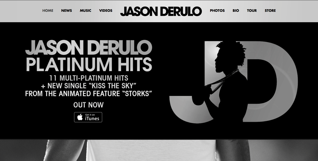 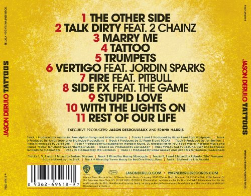 The songs featured within the album are numbered and typed clearly on the back cover. We see how they are all in capital letters making them stand out with only the name of the songs being in bold. The colours we see on the front of the album are also transferred onto the back of the cover which makes it looks professional due to the consistency. The fine print at the bottom of the cover allows to see the record label and information on legislation as well as the track order. This is something we will include in our digipak cover. Jason Derulo's official website is mentioned here with also the record companies website which allows you to see more of what the artist produces. The logo's are clearly visible on the back of this artists cover to advertise the company through more than one way. We also see a barcode in the left bottom corner which needs to be on every album in order for the audience to purchase.
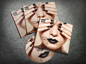
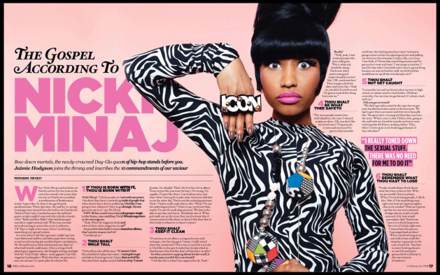
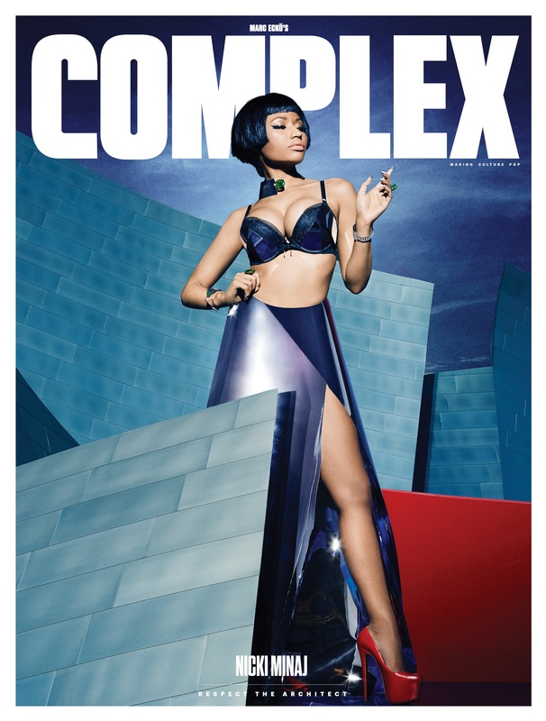
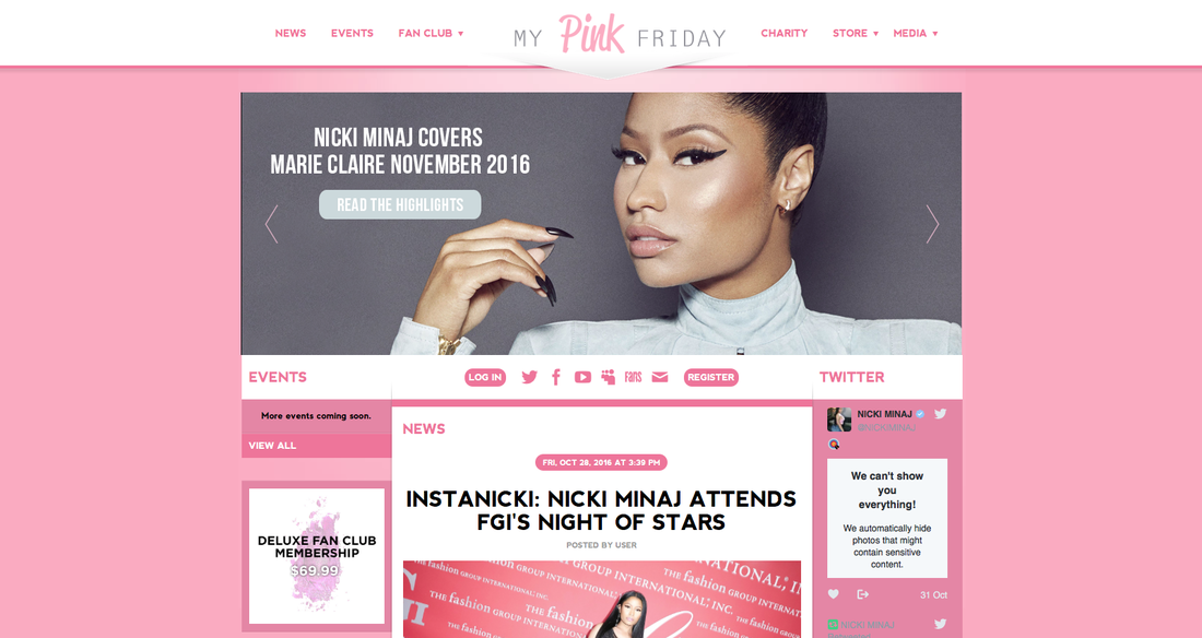
In order to create our own magazine article and CD cover digipak, we needed to look into existing ones of pop artists and analyse them. We chose Nicki Minaj to look at as she is a pop artists who is well known and is recent within the charts.
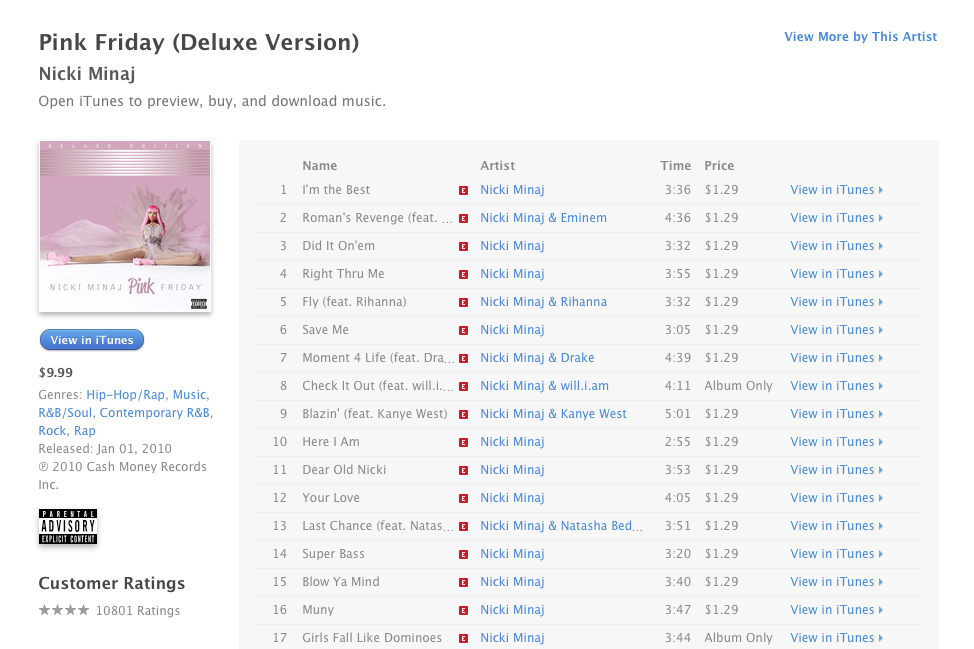
The first thing we looked into was magazine articles of our chosen artist and saw how she is portrayed. Minaj's physique has attracted positive attention from the media industry. In 2010, she said that although she originally felt obligated to mimic the provocative behavior of the "female rappers of her day", she intended to over come her sexuality because she wants people, especially young girls to know that in life, nothing is going to be based on sex appeal. Through these magazines we can see how Nicki Minaj is known for her costumes, cosmetics and wigs (bold&bright). We can clearly see how Nicki is the main focus in both of these magazine article/cover because of the way she is photographed. 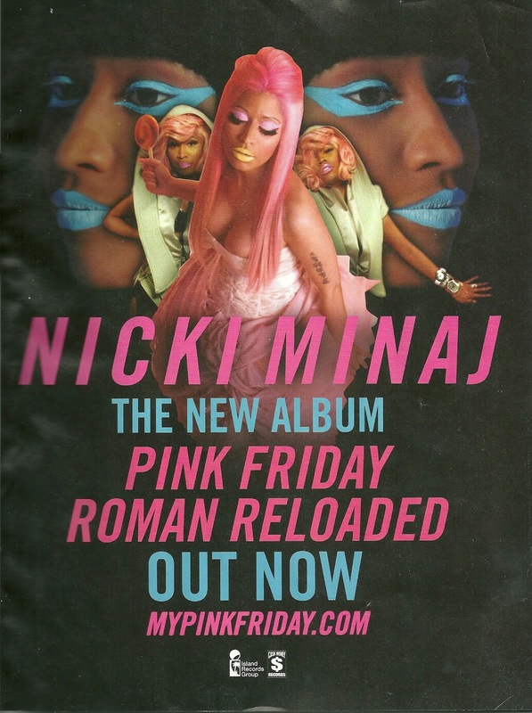 In this magazine article above, we see how Nicki Minaj is portrayed as having a unique style in which her fans are abel to identify her by. The colours of the text reflect on the makeup in which Nicki is wearing as well as her costume. The use of the blue and pink colours may also show how this magazine advert is targeted at both males and females, as well as the fact that this whole advert is based around advertising her new CD album 'Pink Friday' which was released on November 19th 2010. The labels that produced this downloadable CD was Young Money, Cash Money and Universal Motown. Looking into this album we came across a website 'MyPinkFriday' that advertised Nicki Minaj's songs which we have put below. Her first collaboration was an endorsement deal with MAC Cosmetics which sold a lipstick, "Pink 4 Friday", for four consecutive Fridays to promote her album Pink Friday. The style of the writing is bold making it clear for the audience to read and know about her new album that has recently been put onto the market. The style 'Italics' was used on the pink writing which is clear for us to see the most important information in which they want us to know. Both the pink and blue writing also reflects upon Nicki Minaj's makeup in these photos. In this advert they have included 'Roman Reloaded' which is one of Nicki Minaj's songs from this new album. This shows how they are trying to promote one of her songs in which may be one of the top charts so people recognise the album. A black background is used so that the images of Nicki and the text clearly stand out making it the main focus of the advert. This doesn't lead people to be distracted by other things and allows them to get straight to the point. We are able to see how Nicki Minaj's makeup and hair is very bold and out there. This links in with her own unusual and individual style in which she is presented as in her music videos. Her hair in the images above are different going from her wearing a black wig in the back pictures which blends in with the background, to a bright pink wig and pink dress that relates to the 'Pink Friday' theme. This is seen as a more modern aspect as not many artists wear wigs to change their appearance in each music video and advert. This magazine advert also is seen as a male gaze from the fact that the artist is wearing a dress that exposes herself in the main image used. The rapper has made autographing breasts part of her movement to empower women.
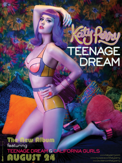 In order for us to create our own Album poster, we decided to do some research into some existing ones. Above Is an album cover of Katy Perry's, who works for Capitol Records. She released her 'Teenage Dream' album on the 10th August 2010, the album featured 12 songs (Teenage dream, Last Friday Night (TGIF), California Gurls, Firework, Peacock, Circle the Drain, The One That Got Away, E.T., Who Am I Living For?, Pearl, Hummingbird Heartbeat, Not Like The Movies) including her popular singles: 'Teenage Dream' and 'California Gurls'.
The album was released as a digital download on iTunes first and then later was distributed physically by EMI (Music recording company). Katy Perry has a very stereotypical 'pop' style; wearing very bright, colourful outfits which are often bold and outgoing. This links to her album poster which is full of bright, bold colours causing it to stand out and gain the attention of the audience. The colours suggest that Katy is a vibrant artist and gives off a 'party' vibe. For her album cover Katy went with a different colour scheme of more pastel colours, such as candy floss pink, this gives a much calmer feel but equally and colourful and fun. Katy's website is: http://www.katyperry.com, here you can find links to all of her social media, which she uses to promote both herself and her work as well as using her website for promotions of her new albums and songs. In regards to Katy's album 'Teenage Dream' she had mostly positive feedback, however she did face some criticisms some examples being: Billboard.com For all the pomp and watermelon costumes, Perry is primarily a smart and personal pop songwriter. And Teenage Dream shows-in carefully selected spots-that she's ready to grow up. BBC Music There's intelligence, individuality and character in abundance. But all too often it's caked in dollar-store body glitter and choked by feather boas. Slant Magazine The remainder of Teenage Dream is a raunchy pop nightmare, with A-list producers lining up to churn out some of the worst work of their careers. Before we started to film our main product, we decided to do some test shots to help us develop more of an understanding when it came to filming the actual media product. In these two clips below you can see that we filmed portrait instead of lanscape so when it came to editing it meant that we couldn't use these clips. From this we learnt that we made sure we filmed landscape. As well as this we filmed the rest of the clips more than once to make sure that they were perfect. |
AuthorGeorgia Reynolds, Amber Teeder, Peggy Horn and Moon Aleston AuthorWrite something about yourself. No need to be fancy, just an overview. Archives
January 2017
Categories |
- Welcome
- AS Level Blogs
- A2 Level Blogs
-
Useful Websites
-
AS EXAM INSTITUTIONS
- G322B1
- Digital Distribution
- Neurocinema and Focus Groups
- Intro to Audiences and Institutions
- Distribution
- Technological Convergence
- Marketing and Technological Convergence by Catilin
- Cross Media Convergence Revision
- Working TItle and Paul
- Pearl and Dean
- Understanding the Film Industry
- Media Ownership
- Documentary about Digital Grading in Lord of the Rings
- Marketing and Technological Convergence
- Benefits of Technological Convergence
- Film Distribution
- Digital Distribution of Film
- Working Title
- Warp Films
- Film Marketing
- Film Marketing
- Marketing and Technological Convergence by Alice and Rosanna
- AS EXAM TV DRAMA


 RSS Feed
