|
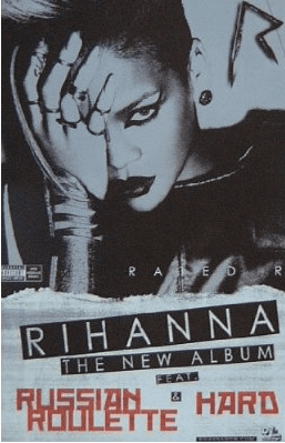
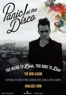
To get a better understanding of how to do our magazine advert, I have analyised 2 magazine advverts for current artists in the alternative and pop genre. The first magazne advert I have chosen to analyse is Rihanna's 'Rated R' and Panic! at the Disco's 'Too Weird to Live, Too Rare to Die'. I have chosen to analyse these two adverts as Rihannas reputation is slightly similar to Halsey's and Panic! at the Disco is in th alternative pop genre and most fans that like Halsey usually like this band too. Rihanna:
The words on this advert are very bold and stand out instantly. Rihanna's name is the biggest piece of text, which emphasises that she is a solo artist, along with the two singles on the album that were released beforehand. These would be 2 of the most familiar parts of the advert as it is a famous name and songs heard before, making the audience feel familiar with the album advertised already. Her name is the biggest text which is white in a black banner and the single names are in red, making these 2 pieces of text stand out the most in the advert. Panic! at the Disco:
The biggest piece of text on this advert is the band name in the top left corner. The part of the photo behind this part of the text is plain and light wich contrasts with the bold dark letters making the band name stand out the most. this would catch a fans attention as it is a familiar logo for the band. The album name is in white which contrast heavily with the dark part of the background which catches the eye. Other important information about the album is in yellow which stands out as it is against a black and white photo, adding a little bit of colour. The last piece of text which is not as noticeable as the others as it is grey which blends into the photo slightly. This pieece of text tells the audience about recent singles off of the album and as Panic! at the Disco is an alternative band and not top 40 charts sort of popular, this part of text is not as important.
_ These 2 magazine adverts advertise the artists new albums in different ways depending on the artists themselves. Rihanna's advert shows a close up of her face as she is well known whereas Panic! at the Discos' advert is a mishot. As Rihanna is an extrememly popular artist who has been in the chart multiple times, her singles are advertised bigger on her advert than Panic's are on theirs, although the names of the artists are the biggest and most noticeable pieces of text on both. Also both adverts have a web adress for the artist at the bottom as well as the record label the album is being released on. After analysing these 2 adverts, we now have a better idea on how to design our advert for Halsey. We will use the same picture from out digi pak and have her name stand out the most. We will make the picture slightly desaturated but not entirely and we will keep Halseys siignature colours which are pink and blue. Post by Gina
0 Comments
Leave a Reply. |
AuthorWrite something about yourself. No need to be fancy, just an overview. Archives
May 2017
Categories |
- Welcome
- AS Level Blogs
- A2 Level Blogs
-
Useful Websites
-
AS EXAM INSTITUTIONS
- G322B1
- Digital Distribution
- Neurocinema and Focus Groups
- Intro to Audiences and Institutions
- Distribution
- Technological Convergence
- Marketing and Technological Convergence by Catilin
- Cross Media Convergence Revision
- Working TItle and Paul
- Pearl and Dean
- Understanding the Film Industry
- Media Ownership
- Documentary about Digital Grading in Lord of the Rings
- Marketing and Technological Convergence
- Benefits of Technological Convergence
- Film Distribution
- Digital Distribution of Film
- Working Title
- Warp Films
- Film Marketing
- Film Marketing
- Marketing and Technological Convergence by Alice and Rosanna
- AS EXAM TV DRAMA
 RSS Feed
