|
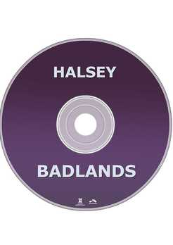
Below is our final digipak. We originally wanted the colour scheme to be pink and blue but given the dark lighting of the orignal photo the pink hues turned out more purple, which caused us to have more or a purple and blue colour scheme.  The right side of the digi pak is the album cover. It shows a close up of Katja who we cast as the singer in our music video. The artist name and album title are over the artists faec to ccreate an elment of mystery as this album is a concept album about a place called 'Badlands'. In the bottom left corner of the front cover, there is a bonus content sticker showing what version of the album it is (deluxe or standard) and advertising some featured tracks. In the bottom right corner of the front cover there is a parental advisory sign, showing that some songs on he album are explicit. The spine of the digipak was kept simple with a purple gradient and a bold, plain and readable text. The text is the same font used for the entire digipak as well as the magazine advert, this makes it recognisable to the audience. The back cover is a wide shot of our main actress who is in our video looking into the distance. This makes her look mysterius which helps set the tone for the album. On the right side of the back cover there is the tracklist o the album. It is in a bright white font and has a drop shadow to make it very eye catching and reble against all parts of the photo. I also paid attention to the details on the back cover. There is a barcode as well as small print at thhe bottom wth copyright information about the album. There are also company logos like Astralwerks and our logo for Gemini Porductions. There is also informatioon for Halsyes website as well as Astralwerks website.
Post by Gina
0 Comments
Leave a Reply. |
AuthorWrite something about yourself. No need to be fancy, just an overview. Archives
May 2017
Categories |
- Welcome
- AS Level Blogs
- A2 Level Blogs
-
Useful Websites
-
AS EXAM INSTITUTIONS
- G322B1
- Digital Distribution
- Neurocinema and Focus Groups
- Intro to Audiences and Institutions
- Distribution
- Technological Convergence
- Marketing and Technological Convergence by Catilin
- Cross Media Convergence Revision
- Working TItle and Paul
- Pearl and Dean
- Understanding the Film Industry
- Media Ownership
- Documentary about Digital Grading in Lord of the Rings
- Marketing and Technological Convergence
- Benefits of Technological Convergence
- Film Distribution
- Digital Distribution of Film
- Working Title
- Warp Films
- Film Marketing
- Film Marketing
- Marketing and Technological Convergence by Alice and Rosanna
- AS EXAM TV DRAMA
 RSS Feed
