|
Before starting on the main design for our digi pak we decided to first create a practice version of what we wanted to do. We decided that the first thing we would do for this task was to create a couple of sketches of some of the ideas that we had, and different colours we could use. Then we would take the shots we needed when we were filming, and apply them to the practice copy of the digi pak. Sketches: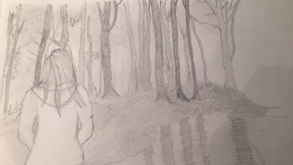 This was the sketch before we added colour to it. This would be the back of the CD cover, where it tells you what songs are featured on this album. This one of the ideas we had where we would have the main character of the music video, looking into the forest. 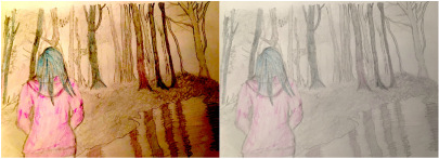 This is the same sketch but with different colouring added to them. The reason for the pink and the blue colouring is because the artist that we are using, uses these colours in her digi paks, and so we decided to use this in regards to our artist, Halsey. We didn't create anymore sketches as this was just to give us some idea of what we wanted to do and if the colours we wanted to use, worked well with our ideas, and the shots we needed in order to create the practice, and main digi pak. Pictures: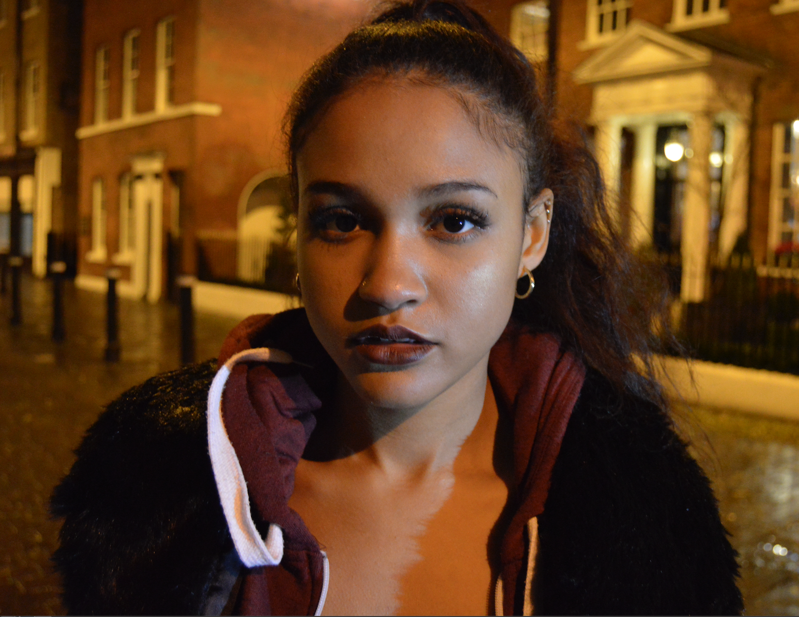 This is the shot we decided to use for the front of the digi pak, as katja is the singer in our music video, and one of the main characters. We decided that she should be looking straight into the camera, as though she is looking right at the audience, as this creates a link between the audience and the artist/character. 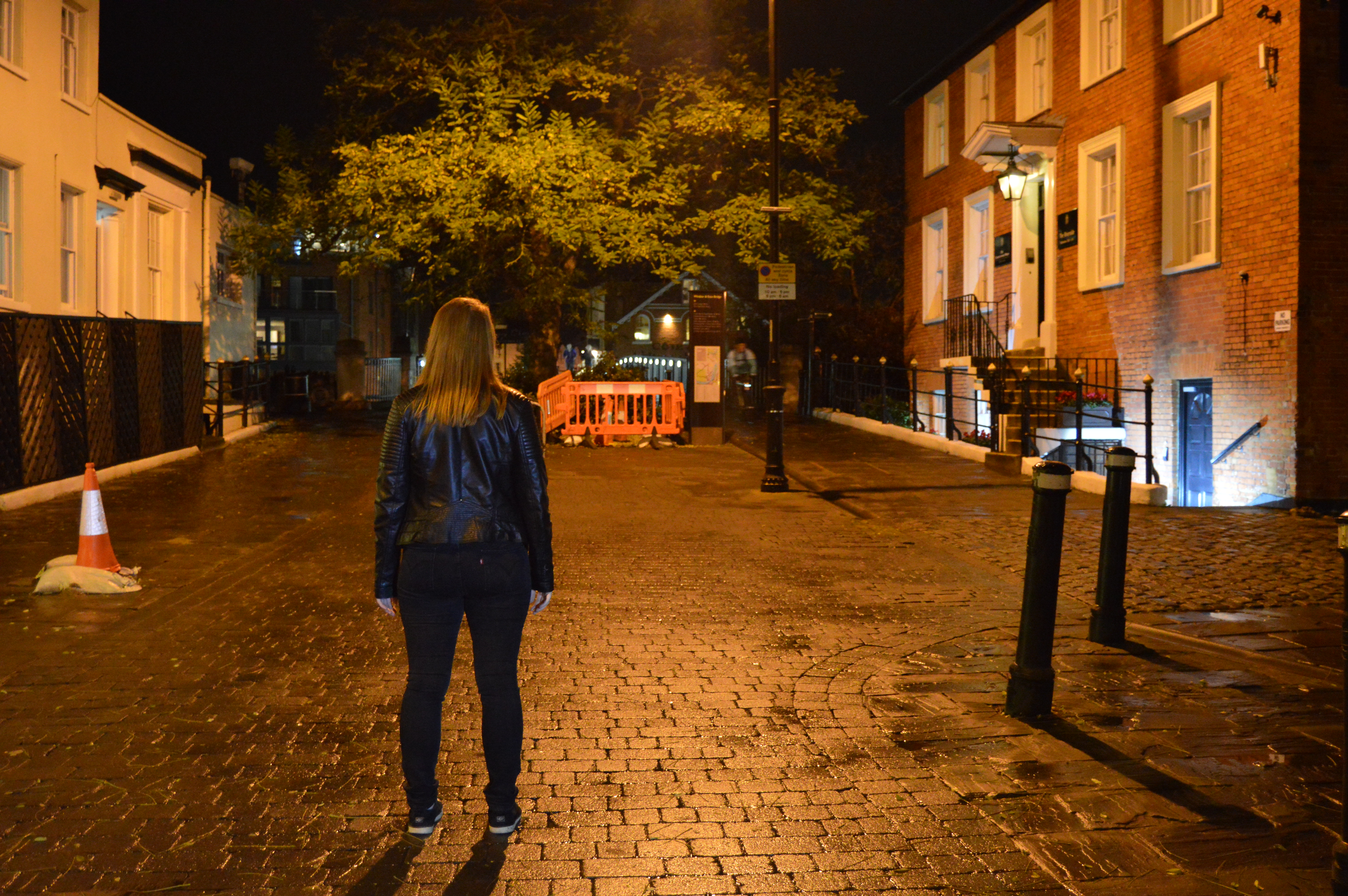 This is the shot that was decided to the back cover of our digi pak, as it shows the main character of our music video looking at the bridge beyond the tree. We decided that this was a better location than the forest, as our music video is about how she feels guilty for the death of her friend, and this is the place where her friend died, so therefore holds more meaning than the forest.  For the practice digi pak, we decided that these were the types of colours we were going to use for the actual CD disk. Practice Digi Pak: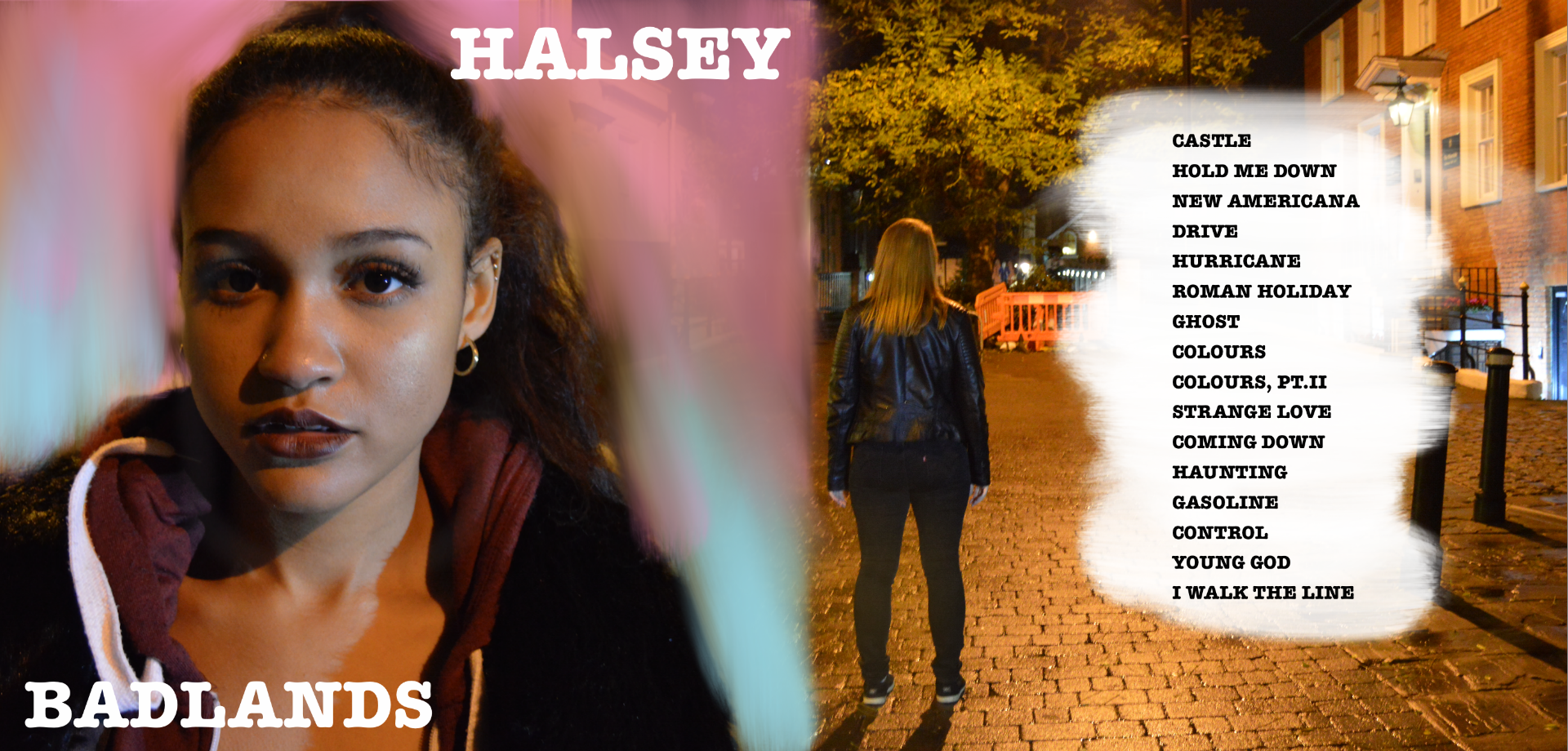 As you can see this is the back and front of the digi pak. We decided for the front to have the background in the Halsey colours, and to just have in plain white font "HALSEY", and "BADLANDS", which is the name of her album. For the back cover, we decided not to editing the colouring on this shot, as we like how it is a night time shot but is not actually dark in the shot, and it creates a nice affect.  For our CD disk we just decided to have colours on it but more dulled out, as we didn't want everything to be overcrowded. Post By Elise
0 Comments
Leave a Reply. |
AuthorWrite something about yourself. No need to be fancy, just an overview. Archives
May 2017
Categories |
- Welcome
- AS Level Blogs
- A2 Level Blogs
-
Useful Websites
-
AS EXAM INSTITUTIONS
- G322B1
- Digital Distribution
- Neurocinema and Focus Groups
- Intro to Audiences and Institutions
- Distribution
- Technological Convergence
- Marketing and Technological Convergence by Catilin
- Cross Media Convergence Revision
- Working TItle and Paul
- Pearl and Dean
- Understanding the Film Industry
- Media Ownership
- Documentary about Digital Grading in Lord of the Rings
- Marketing and Technological Convergence
- Benefits of Technological Convergence
- Film Distribution
- Digital Distribution of Film
- Working Title
- Warp Films
- Film Marketing
- Film Marketing
- Marketing and Technological Convergence by Alice and Rosanna
- AS EXAM TV DRAMA
 RSS Feed
