|
In order for our music video to be more professional, I will be looking at the original music video of see you again. This is also so that as a group we would know the difference between an amateur and a professional so we know what do do so that our music video is professional. This is the professional music video for see you again. The song is for an action movie called for furious 7 and dedicated to Paul Walker (an actor who passed away). The first verse is written from the perspective of the cast and crew of furious 7 and the 2nd verse is written from the perspective of Paul Walker where they are shown to appreciate his friendship which is shown to be more than an ordinary friendship.  Difference in angles: The image on the left shows the professional music video of See You again and the right side shows the students version of See you again. There is a difference in the camera used as the students use an affordable camera. The first image shows both boys on the piano and straight away I can see that the students want to copy some aspects of the professional music video to make it more professional. The amateur music video starts with a title at the bottom which is more used in professional music videos. The second image shows a the start of the music video for the professional and the amateurs version of what they had done in the professional music video. The professional starts of with an extreme long shot of a landscape, the landscape is shown to be very photogenic and pretty. however the amateur version of this is a less photogenic as the tree is in front of the sky so the audience cannot see the sky properly, also there is a cloud in the sky and this is seen to be less worthy. The last two pictures show both music videos using a car as a prop. As shown on the image the professional music video is using a very high angle to show both cars going different directions. However the amateur music video shows both boys in a car driving. The reason for the amateur not using this angle is because they have not got the props to go at such a high angle.  This image shows people looking over at the city, and both images are long shots so that the audience can see everything that the actors can see. The image at the top was filmed during the day however it then goes onto a time lapse to the night. As the song is dedicated to an actor who died after filming. The juxtaposition of going from day to night could symbolise the change that has happened after the death of Paul Walker. The editing of the music video is basic, there are slightly softer cuts where the screen fades to black and then to the next shot, this gives the music video a softer and emotional feeling as it is dealing with the death of the actor. When Wiz Khalifa has his rapping scene, there are a lot of short shot duration and this is so that the audience have more feeling that Wiz Khalifa is rapping fast.  Throughout the music video there are lots of medium shots and close up of both Puth and khalifas face. This is to show their emotions to the audience watching and to tribute the song to the death of the actor.  Both of the images show a close up of the amateurs work. The students have also managed to put medium shots of the actors looking upset as in their music video the friend had died as well. The images show a close up of the student looking upset and also showing his emotion towards the death, which makes their music video look more professional as there is good acting. In the music video Puth is playing the piano whilst miming the words in sync with the audio. The students work does show good miming as no words are out of place and the words are in sync with the actual song and the pacing of the words are also in time. This shows that the students have taken great precautions in order for their miming to be on time and this also makes their music video more professional.  The dress code of Wiz Khalifa is very casual, his tattoos are also shown off as he is wearing no sleeves. Wiz Khalifa is more of a rap artist so he normally wears normal clothing, this includes the denim jacket and a beanie hat. Puth on the other hand is wearing more smart/casual clothing and also fitting the conventions of someone associated with his genre. In the amateur music video the clothing are also very casual for both actors, but their clothing would be much cheaper whereas the clothing of the professional music video would be branded clothing and much more expensive.  This images show what the student actors are wearing throughout the music video. The outfits are shown to be very simple as they are wearing just jacket,jeans and a t-shirt. The outfits are simple because the music video is slow and so the outfits would match the theme of the song better. As the actors are also young (teenagers) that is the sort of outfit that they would wear. What the actors are wearing also matches what Charlie Puth is wearing in the actual music video, and this has been done so that the music video matches the professional music video more.
Post by Fatma.
0 Comments
To understand how available each member of the group was for filming, we all sat down during our lessons and free periods to discuss what days were best to film during the week and created a flat plan. This gave us a clearer understanding as to how we were going to film as well as arrange, as a team, the timings for filming each day as well as an average of how long we would film so it would fit into our schedules. This also made it easier for others in our class as it enabled us to give them times we wouldn't be using the tripods so that they could have time to use them for their own productions. For example, some members of the group had to work so therefore we had to organise around that so we could all be a part of the filming experience and each have an equal input. The production schedule shows the equipment we would need each day, which would help organise ourselves more. The date and time are also very important for us as we must make sure it was not too late to film our day scenes as it got dark earlier- lighting I a vital part we need to take into consideration so that is why we took time into consideration. As a group, we had decided to film our music video during the half term which was from 21st-30th October. We had made this decision because it would give us a week to film and more time during the day to film as we have day and night scenes to film. Everyone in the group was also more available during this week than school days, so it was a suitable opportunity for us to film. Each column has separate information that all links together for our filming: Scene, Date/Time, Location, People, Equipment, Props and Notes. 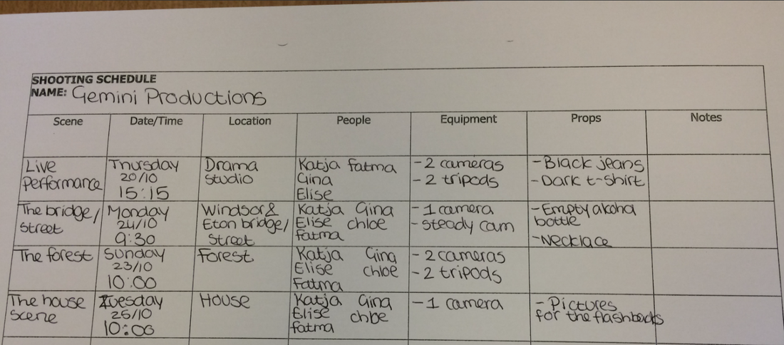 Post by Fatma.
Some of the writing done by Katja We will be going Digi-pak analysis' in order to pick up some inspiration for our own design as well as pointers on how to execute our to that of a professional standard. This will help us understand how to really sell the song through, not only the photography, but also the colours, font and layout. The Digi pak I have chosen to analyse is for Rihanna's album 'Loud'. As she is a well known artist it would make sense to analyse something of hers as she has a high standard of quality in her design layouts.  This is the main image of the Digi Pak. The picture is a close up portrait shot of Rihanna's face to show her beauty and calm facial expression which could connote her elegance. The audience can straight away see the boldness of her red lipstick which gives out a 'sexy' feel to the album,and red hair. The main colour is red, red represents love and passion which also reflects her music the red hair and lips really stand out from the digipak. The name of the album is very minimal. The writing is white and white represent purity and love. the digipak does not show any other writing as the image mainly speaks for the album. Her name is also shown very subtle at the top and this is to show her fame, she doesn't need big writing for her name as people can see from the image that it is Rihanna. The front cover would be appealing for young females as they are attracted to her beauty which will also target the male audiences.  The cover of the CD is a pale pink rose and this shows that Rihanna is not the only beautiful image of the cd but the music that can be played from the album too. The rose symbolises love as most songs of the album are about love and this gives the divi pak a theme of romance. Feminine colours are used for the digi pak for example red and pale pink which gives the idea that it is a feminine album and more appealing to the female audiences.  This is the inside picture of the digipak and it shows a lot of emotion which relates to the front image of the album . The background shows a lot of red roses. The image is eye catching, the colour red is used again in this image and it could be seen from a male gaze as she is almost seen as a sex object as there is a lot red in the image. However the image is not too provocative as she is not showing much of her skin, but still attractive enough for her male audiences. Post by Fatma
In order to have a clear understanding of what elements of mise-en-scene we have used in our music video have conformed to the typical styles used in our song genre we will be going over what we have chosen to do. There are many things we have taken into consideration regarding our music video, from lighting to costume. Lighting and Colour Scheme:For our music video, we will be using dark lighting for the majority as it will coincide with our song choice. Darkness also connotes death which will also be an apparent theme in our music video. From looking at our blog research on music videos anyone could tell that most artists of the alternative genre, in general, use dark lighting. It will be easier for us to show the contrast between good and evil/ life and death by using dark and bright lighting. By doing this it will help us create a clear narrative whilst editing. For our colour scheme we will be using pastel pinks, purples and blues as it goes with the artist's album colours and we have noticed that another artist in this genre use this sort of colour scheme. The pink colours are quite feminine but the other pastel shades have that hazy dream like feel which is what we want to present. The haziness of the colours will not only go with the theme of the artist’s album, but also show that we are trying to present faded memories. The femininity is purely because this music video revolves around women. 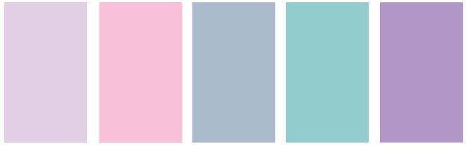 Costume: There will be two different costumes for our main actress, Chloe, as we want to bridge the difference in how she is throughout the video. When the video shows that she is in her happy memories, she will be wearing a white shirt and jeans. White has connotations of peace and purity which is what we will be trying to show. In the other half of the video where she is her haunted self, she will be wearing a black shirt to signify death and pain. Black and white are binary opposites which will be good elements to incorporate into our music video. A lot of alternative music videos use the typical white shirt and black jeans look as this sort of outfit tends to represent what a typical teen would wear in a simplistic manner.  For one of the scenes in our music video there will be a change in costume as they will be partying and reflecting teenage youth. They will be wearing heels and dark clothing. From researching music videos of our we can tell that many use teenagers and the themes of the video tend to reflect teenage rebellion as well as the joy of being a teen. We all felt more drawn to using this kind of concept in our music video. Location:In our blog we have done a location report as to where we will be shooting our video. We chose to use forests as it is very enigmatic as well as interesting to viewers as many think of it as the unknown because of what could be buried or done there. Streets are typically used in music videos for dark themes as well young clubbing scenes- we choose this as we want to evoke both ideas. Homes are something that is associated with peace and well being and we wanted to use this surrounding in our scenes of happiness as well as sadness to juxtapose what is going on.  Alcohol is typically associated with teenage youth and will be of vital importance to our music video as it gives the answer to our progressing enigma. Alcohol is used in many artist's videos such as our artist's video- Halsey.  Heart necklaces are seen to be what often is used to bridge a friendship and that is what we intend to do in our video. This prop will not be as relevant but just a small touch that we thought would be original to our genre.  We will be using a camera and some printed photos as props to show how close the friendship in the video was. Post by Katja
 We made our shot list very in depth so that we would know exactly what we needed when filming. The song timings are also included on here so that we would know whats shots to use during editing. As well as using these shots, we will also film some experimental shots and scenic shots so that we can use the where we see fit during editing. Post by Gina
We will be doing two Digipak analysis' in order to gain an understanding of how we will design and set out our own in a professional way. I am going to analyse Ellie Goulding's album cover for "Halcyon Days", which was released on August 23rd, 2013. 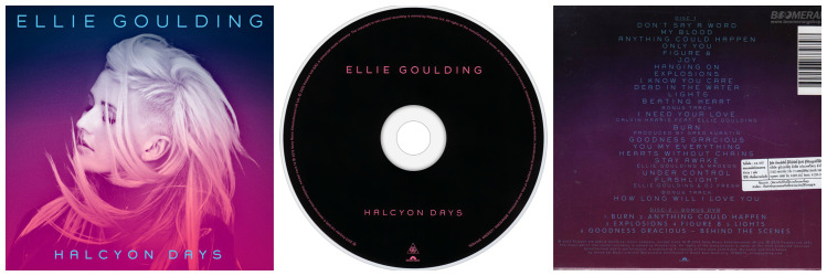 Ellie Goulding is an artist who focuses on the alternative, indie pop, and dance genres of the music industry. The colouring of her cover is purples and pinks. The top of the cover starts off as a dark purple and fades into a bright pink, reminding the audience of lighting in a club. Her hair is also a bit all over the place, as though she has been dancing and jumping around, this hints to the audience that she does focus on the dance genre as well. Her facial expression appears to be calm, but also sort of sad, and you can tell that this is probably effective in how she wants the audience to feel when listening to her song. Calming, but also emotional. The colours also help with this, as these colours and be seen as emotional colours but also have a calming and relaxed feel to them. The way the colours fade into each other, with blue at the top, comes across as the night time. This coincides with her facial expression as it has that dream like effect. This attention to detail lets the audience into how the artist wants us to feel. When researching Goodwin's theory, i found that record companies like to do close-up shots of the arts, and this is the same for this front cover as well. We can clearly see a close-up of Ellie Goulding even though there is hair covering most of her face. The actual disk is just a pain black colour with pink writing of the artist and album name, and although there is not a lot going on, it still looks nice and does appeal to people. I looked up the font that is used for all the writing on the digipak, and it is a font called "Grover". I like this font as it is very different from other fonts on CD covers. The only criticism is that the font colour blends a lot into the background colours so it could sort of be taken a little too easy on the eyes and its hard to really see. I chose to analyse this cover because it caught my eye. Even though it is very simple, it is very effect and definitely appeals to the audience. Post by Elise
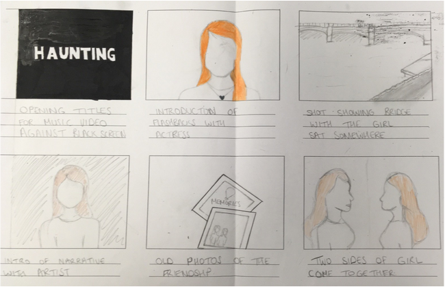
In order to have an understanding of what our narrative is for our music video we sat down and wrote out a narrative. After this I drew up a story board and briefly wrote up in pencil what was what.
 Post by Katja
This is the pictures from our storyboard put together into a short video so we can get sort of an idea of hopefully what our final product might look like and what shots we should decide to use to make our music video as successful as we can. Post by Elise
Performance: Janet Jackson- Dammn BabyPerformance music videos are typically centred around the artist. At the start of music video production, most music videos were performance based. Not many are purely performance anymore as more artist like to have some sort of narrative. For example, our group would preferably like to have narrative mixed with performance. The genre 'Rock' tends to mainly use performance now and often commonly used in pop, however artist such as Janet Jackson used it in her music video for 'Dammn Baby'. Performance music videos mainly contain:
 Here is a shot of Janet actually performing the dance to her song whilst lip syncing which gives a audience an insight to what her stages are like. Whilst she performing you can see she is on a random white set which is also seen in some typical performance music videos.  In the music video she is actually wearing a costume that reflects her image and what she tends to wear in music videos. She tends to wear the black leather outfits which is what she also wears in her song with Michael Jackson 'Scream'. In performance music videos the artist's personality is what is brought out typically by the clothing as it is their professional image.  There are some mid to close up shots of her singing the song which is what is typically found in performance videos in order to get up close and personal with the artist. It also allows the use of the notion of gaze which attracts people in video. Narrative: Carrie Underwood- Before He CheatsNarrative music videos tend to tell a story which coincide with the lyrics, for example: boy/girl cheats on partner. Now, in our generation, a lot of artist tend to make narrative music videos to get the meaning of their lyrics across to the audience. Artists such as Carrie Underwood used a narrative music video to show that she caught her boyfriend cheating on her with another woman in her music video 'Before He Cheats'. Narrative music videos mainly contain:
Concept: Thirty Seconds To Mars- Up In The AirConcept music videos tend to be based around an idea the artist has bad even though it may not seem like it has any relation to the lyrics. Concept videos are usually unusual to the eye.They tend to keep the audience entertained when executed well. There are often items involved of symbolic meaning and use of montages. The shots can be fast paced and involve lighting that sets the mood of the music video. The lyrics can also be contradicted by the shots and objects used to keep things interesting. In the music video 'Up In The Air' by Thirty Seconds to Mars there is the use of random objects with the slight mix of them performing singular as if they wont work together. It is clear that this was a concept video and that the random shots were used to show the artists thoughts are literally up in the air. Concept music videos mainly contain:
What type of video would ours fit under?After researching the different types of videos, as a group we feel that we are all drawn to the idea of having a narrative as well as performance as we want to tell out story as well as have the singer singing the song for effect. We would also like to reflect our artist lyrics in a story which is what is used in a narrative by many artists in the industry. Post by Katja
Feedback: After presenting our pitch we spoke as a class and discussed some feedback from other class members. This helped us a lot as we are able to know what we need to work on and what was our strong points. In order for us to gain an understanding of what we even needed to accomplish we needed to listen to our class members. Positive: Costume choice- The choice of using black and white to juxtapose each other and show the contrast between happiness/life and sadness/death. It also helps with showing the difference in our narrative. What we need to work on:
Post by Katja, Elise, Gina and Fatma
|
AuthorWrite something about yourself. No need to be fancy, just an overview. Archives
May 2017
Categories |
- Welcome
- AS Level Blogs
- A2 Level Blogs
-
Useful Websites
-
AS EXAM INSTITUTIONS
- G322B1
- Digital Distribution
- Neurocinema and Focus Groups
- Intro to Audiences and Institutions
- Distribution
- Technological Convergence
- Marketing and Technological Convergence by Catilin
- Cross Media Convergence Revision
- Working TItle and Paul
- Pearl and Dean
- Understanding the Film Industry
- Media Ownership
- Documentary about Digital Grading in Lord of the Rings
- Marketing and Technological Convergence
- Benefits of Technological Convergence
- Film Distribution
- Digital Distribution of Film
- Working Title
- Warp Films
- Film Marketing
- Film Marketing
- Marketing and Technological Convergence by Alice and Rosanna
- AS EXAM TV DRAMA
 RSS Feed
