Q1 - In what ways does your media product use, develop or challenge forms and conventions of real media products?Q2 - How effective is the combination of your main product and ancillary tests?Q3 - What have you learned from your audience feedback?
Q4 - How did you use media technologies in the construction and research, planning and evaluation stages?
0 Comments
The Hunt Film PosterFor part of our ancillary task we were instructed to create a film poster to go alongside our short film in order for our film to be marketed. We therefore wanted this to look as professional as possible and to link in with our film as much as we could. We used the picture of the main character Amy holding the necklace in front of her face, to show the importance the necklace plays within the film. As you can see by the images we edited the necklace on Photoshop to make the colours really stand out. This will catch peoples attention which will also emphasise the importance of the necklace in our piece. We are happy with how our film poster turned out, and we think it looks as professional as we could possibly look. Below is the final poster for our short film.   The Hunt Film Magazine ReviewWhen thinking of magazine review ideas we thought of one which we all liked the idea of, however we quickly realised that it was quite complex, especially having an image that took up the whole page, with the text over the image. We decided to use one half of the double page spread for the only image on our piece, which has the necklace and flowers that are very important to our piece. We then put all the text and information on the other side. The layout is quite simple, however we think this makes it quite professional looking. We also particularly like the bright colours in the review as they link to the film poster also. We created the magazine review on Photoshop so we have also created a 9 frame visual to show how it was made and what we included. Also below is our final magazine review.   By looking at and researching other film magazine reviews I know what elements I should include in order to make my magazine review eye catching and informative. From the research I have found that we need a main photo which will take up half of the 2 page spread. This is because the photo will attract the viewers attention and will then make them read the article. The photo we will use can be a still taken from our short film and should be colourful so it stands out. The title of the film should be in bold and big letters so they reader will know straight away what film it is. Information about the film, tagline, actors and age rating should be listed somewhere in the article. I noticed that most magazine reviews have a star rating which tell the audience whether the film is worth watching or not.  I have analysed a film magazine review as this promotes the film and is used to market the film. I looked at other magazines reviews so I knew what kind of elements to include on our review.  I researched different film posters to know what we can include on our film poster and what features are important. We need a bold title which will stand out and catch the viewers attention and will make them intrigued to find out more information. Our film title 'The Hunt' will be in white letters and in a font that is bold and in capital letters. I found out from the research that most film posters have a catchy tagline placed underneath the title which leaves the audience wanting to know more. The tagline which we will include on our film poster will be "the past doesn't forget...". We decided on this tagline because we had scenes which were set in the 1940s so thought it would be good to mention the past while also creating mystery. Here below are some examples of good fonts which look very effective.
Another thing to include on our film poster is an age rating which shows that it has been classed by the BBFC. The age rating of our film is a 12 which can been recognised by the audience from the 12 symbol. From the research I noticed that not all of the film posters include the age rating so it is not essential. Another element to include would be the release date of the film, this could be cleverly thought out so that the viewer remembers the date of when it is being released. Some posters I looked at had 'Coming Soon' instead of a specific date which will make the audience more intrigued so we will be doing the same with our poster.  From researching film posters I have noticed that they include the names of the actors and if the film has well known actors starring in it they are in bold and big letters which can be noticed easily. If a film includes famous actors then this could entire people to watch the film if they are a fan of that particular actor. As our actors are not well known they will be listed at the bottom of our film poster. The film poster should also include a main photo which should be interesting which will attractive people to look at the poster and read the information. The photo we will use on our poster will be colourful and will include our main character in our film and the necklace which is an important object.
As a group we discussed which poster design/layout they preferred and which one was better suited to our genre. We thought that the second design which featured the actor Amy and te necklace which was hanging in front of her face. We decided that this would be better as it featured the main character in the film Amy and the main object which was the necklace. For this design the necklace would be in focus which will create a depth of field as Amy will be blurred. I think this design works really well with our genre as it gives a sense of mystery with the necklace being in the foreground. We design the poster like this to show a hidden meaning that the necklace was controlling Amy's dreams/mind.   This is a design for our potential film poster. We have used a photo which includes the main objects we used in the short film. I think the colours in the photo that we will use will really stand out. The title will be at the top of the poster so it instantly attracts attention. The font will be bold and in capital letters. There will be the actors names and other information about the film including the release date at the bottom of the poster. It could be improved by using a better font and if the necklace was on the centre of the photo.  This is another potential film poster design. This features a photo we took of Ashley, holding up the necklace in front of her face. We like this because it features the main character, and also the necklace, which is an important part of the film. We are going to edit the photo so that the necklace really stands out. There will be a short piece of writing at the top (such as 'coming soon' or the name of our actors) and the title and the rest of the writing will all be together near the bottom of the page.We think this film poster will be very effective, and will attract the audiences attention, enticing them to watch our film.
 We took some photos when we went out to film which we could use as our film poster. The first photo is taken of the roses, which features in the film, placed on the bench with the necklace laid over the flowers. I think this photo works really well and I like it as the colours are bright and contrasting which will make the poster eye catching and will stand out. I think this photo will be good to use as it features the main props from our short film.  The second photo that we could use as our film poster is featuring the girl Amy, who is the main character in the film, and the necklace which is an important object in the film as it causes all the flashbacks to happen to Amy. The necklace is in the foreground of the photo which looks like Amy is being 'hypnotised' by the necklace which suggests the reasons behind the flashbacks. If we use this photo, we could match the text to be the same colour as the necklace stone which will look effective. I really like the depth of field used in this image and the photo relates well to our short film.
I have looked at the film poster for The Maze Runner as it has a similar genre to our short film. By researching other film posters it gives us more ideas of what to include and what colour scheme to have. The Maze Runner film was released in 2014 and they have a target audience of teenagers so the age rating of the film is 12. This was a good film poster to analyse as it included all the elements and is a very effective and interesting film poster and targets the audience perfectly. 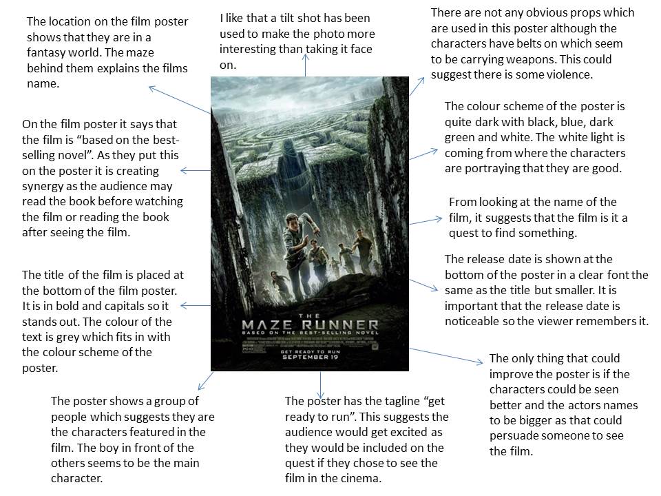  I will be analysing the film poster Insurgent by looking at the colour schemes used, how it attracts the audience and what features it includes. I am researching other film posters so I know what to include and how to make a film poster effective for the target audience for when we make a film poster for our short film. The poster provides basic information about the film like the title, release date and actors to the audience. The poster should influence the audience to want to go and watch the film in the cinema.  By analysing the Insurgent film poster and the image that is used, the audience can find out a lot of information about the film. This includes the characters in the film and the location of where it is set. On the film poster the audience can see the buildings and things being destroyed which can tell the audience some more information and what might happen in the film. The audience can also see two of the characters who will be in the film but not very clearly as they are in the background of the image. The image on the poster is quite light and dark as the two characters are being illuminated from behind them however this is being contrasted as they are both holding a gun. The layout of the poster is very effective as it looks like a mirrored effect was used which makes it more interesting and appealing to look at.
 We made a rough quick edit of our short film which we then presented to the class and received feedback for this and took in everything they said. The class and our teacher gave us improvements that we could do in order to make our film better. They also guided us on what kind of music we should include as our background music in order for it to be effective. We also got given advice and suggestions on how to cut down the time of our film. A point that was raised a couple of times was that the cuts needed to cleaner and more smooth. We will do this by adding transitions and will take out any clips which don't flow well. They also commented on the length of the beginning as it was way too long. We are going to improve this by cutting out irrelevant scenes like when Amy is getting ready for bed and use quick cuts instead. We also need to work on the sound by inserting the music which we have created to create the suspense and excitement throughout the film. We also need to adjust the sound levels when the actors are speaking so it sounds consistent throughout. We will also add sound effects where needed. Our class also suggested that we should add an effect to the scenes with the flashback/dream so the audience can tell what is real and what is the dream. The class suggested that we could filters such as black and white or sepia.
The positive feedback we received was that we had a variety of shots, angles and had good shot reverse shot. They also said that they liked the structure of our film and that it has a interesting storyline. Gathering feedback from peers and the teacher is very useful as it can help us improve our film in ways which we didn't think of as a group. It also helps us listen to other peoples opinions as they will be the target audience for our film so we need to ensure they like it. This is our rough first edit for our short film. We have gathered some feedback in order to help us with the final edit. We have not put the music that we will be using in the film as of yet.
Day Two- 13.12.15
 Day 3- 14.12.15
I have created a mood board to represent what our short film will be about with just using a collection of images I got from the internet. By using images to show what our film is about this is a visual way for the audience to understand the rough plot and they get an insight into what happens in the film.  We created a Twitter page to promote our film as social media is a great way to advertise and market our short film for free and is great if production companies are on a low budget. As our short film is targeted at teenagers we feel that using social media can help us connect with our target audience successfully. After our audience sees the short film they may choose to share their thoughts on social media which will lead to their friends being influenced to watch the film.   This is our shooting schedule for our short film as we need to have a clear schedule in order to be organised. This will help us remember when we are filming and what actors we will need to contact for each day. We have also listed the props that we will be bringing so we don't forget to bring anything with us when filming. I have also written down the locations that we will be using.
In our lesson, we presented a pitch to the class and our teacher which showed our ideas and plot for our short film. We then received feedback and ideas from our class which gave us opinions from people outside of our group. This was very useful for us and developed our initial ideas more. Our class asked questions such as how would we avoid the members of the public when filming and asked how we would represent our film as the 1940s. These questions helped us think about how we would solve these problems so they will not be an issue for us when filming. They also said how we would need to stick to the codes and conventions of adventure films and not to drift off too much to another sub genre. Presenting our pitch to the class gave us some valuable market research and helped us improve our ideas for our short film.
For our flashbacks within our short film our location will be Alexandra Gardens in Windsor. This is because if we film these scenes outside then it will be easier for us to make it look like the 1940s era.
We also planned to film in a loft in a house as we thought this would be a good location for the scene that included a lot of mystery. However I went to assess whether it was safe to film and if we had enough space and unfortunately it will be very unpractical and would put the actors at risk if we filmed there. We have also considered filming in a garage but it would be too dark and cold so we have decided that we will use a shed at the bottom of the garden. We feel that this will give the connotations of mystery. To ensure the lighting isn't too dark we will use professional lighting.
We will also be filming in Amy's bedroom as there is a scene where she goes to bed and starts having flashbacks. We will be using a stereotypical teenage girls room to represent Amy. This location will be suitable and will not cause any risks. The only thing we need to consider and make sure is up to standard is the lighting in the bedroom as for some of it Amy will be sleeping.  Our final location is a shed at the bottom of the garden and we will use this location when Amy finds the box. We will clear everything out of the shed to make room for the camera/tripod, lighting and the actors. We think that this is a suitable location because it fits well with our genre of adventure and mystery as the floor is quite dusty and the location has connotations of curiosity as the shed is based at the bottom of the garden and is quite isolated and alone.
We have came to a decision for the name of our short film. We think the name 'The Hunt' will be a good name for an adventure short film. We decided on this name because the film is an adventure with elements of mystery and the girl Amy is hunting for the answer of why she is getting the dreams with flashbacks. This is therefore causing a constant suspense and we think the name suits this.  We created a logo for our production company which is called 'Dusk to Dawn productions'. We wanted our logo to be simple but at the same time effective. We think that the logo we created looks very professional and we are happy with the outcome. As our name is Dusk to Dawn this means from the morning to the evening so we decided to have the logo with the sun and moon. I think the black and white makes the logo look of high quality and the burst of colour with the yellow sun. We used the programme Illistrator to create this logo.  In the film One Day, The two main character met on the date 15th July and throughout the film it shows them meeting on the same date. At the end of the film the women dies on that same date which links in with the dates shown throughout the film. We thought that we could do a similar thing to this and include the same date on the letter the grandma had and the date she died which is shown on the funeral programme.  As a group we discussed names for our adventure short film. I have created a mind map to display all the possible names that we thought of.  For our props that we featured in our adventure film we wanted the teenage girl to find a box full of old stuff which belonged to her grandma. We stained newspapers and cards to make them look old and had a notebook which belonged to her grandma. We also included the necklace in the box which is the object which the film is based around. Here are some photos of what our props looked like.
|
AuthorDusk To Dawn Productions presents... Archives
February 2016
Categories
All
|
- Welcome
- AS Level Blogs
- A2 Level Blogs
-
Useful Websites
-
AS EXAM INSTITUTIONS
- G322B1
- Digital Distribution
- Neurocinema and Focus Groups
- Intro to Audiences and Institutions
- Distribution
- Technological Convergence
- Marketing and Technological Convergence by Catilin
- Cross Media Convergence Revision
- Working TItle and Paul
- Pearl and Dean
- Understanding the Film Industry
- Media Ownership
- Documentary about Digital Grading in Lord of the Rings
- Marketing and Technological Convergence
- Benefits of Technological Convergence
- Film Distribution
- Digital Distribution of Film
- Working Title
- Warp Films
- Film Marketing
- Film Marketing
- Marketing and Technological Convergence by Alice and Rosanna
- AS EXAM TV DRAMA


 RSS Feed
