0 Comments
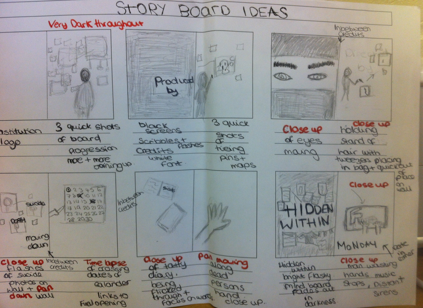
The shots above are the main locations where our production is going to be based. The first image of the front of the house is showing the main setting for where our film is based. Houses are often used in psychological thrillers as audiences can identify with the familiarity. The second image is of the front room of where the man will do most of his work. The table in the middle will be useful to put everything on. The use of dark colours on the walls and the reds fit into the mise-en-scene well in order to create a sense of tension. The third image of the alleyway fits well with the codes and conventions of the thriller genre as it connotes potential danger and isolation. The fourth image is of the road which could be used as an establishing shot linking. The fifth location shows a wall which is what we will use to put all the newspaper clippings and photographs on to create mystery. The sink is for when we use a close up of the man washing the blood off his hands. We added music to our animatic storyboard to get a feel of what type of music we will use in our real production.
We wanted to create some non diegetic music for our animatic storyboard. We tried different variations of sound effects to create the connotations of horror. The first few attempts were good but we wanted more of climax in the middle rather than it staying the same the whole way through so we added another sound effect which did this. Our final piece has the connotations that we wanted of horror and psychological.  Thinking about our upcoming production, I felt that it was necessary to look further into the lives and interests of those of our target audience in order to gain a better idea of what to include in our production to engage the viewers. I brainstormed ideas of where these people would shop, spend their free time and even their music tastes. After doing so, I realised that the array of social demographic groups was vast. This lead me onto thinking about how the viewers would identify with certain characters in our production and the codes and conventions that need to correlate with the viewers interests. 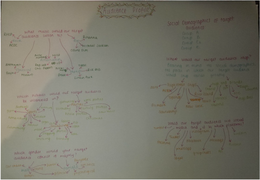 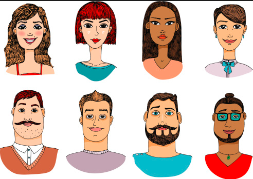 It is typical for thriller films to not have a niche target audience as the genre is so widely attractive however we were able to determine the social demographic groups that would be interested in our production of a psychological thriller. To illustrate this further I felt that it was appropriate to create typical avatars from each group to emphasise the disparity in our target audience. We felt that the main groups interested in our production would be groups: A-E 16-35 age range.
Identifying a potential target audience is so important and so we wanted to find out whether our ideas would attract consumers. We wanted to make something our age group would engage with (16-25) so we brainstormed what this demographic would be interested in in order to inform production further. 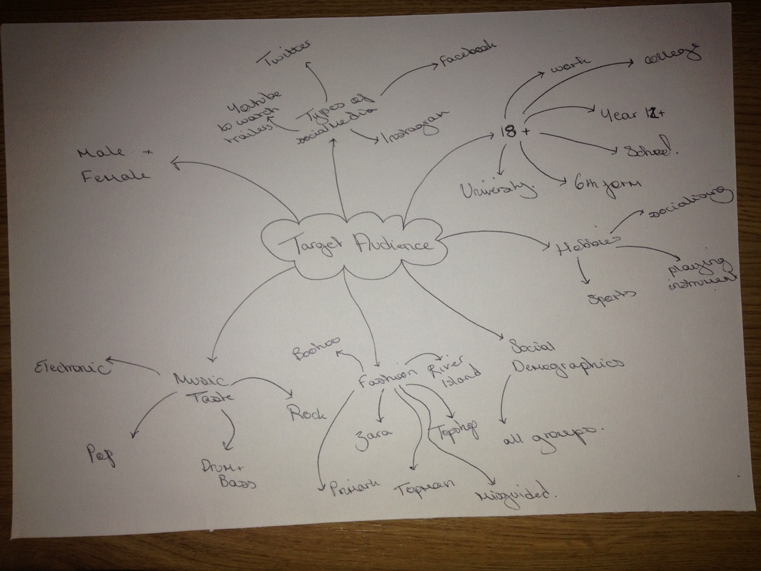 As our company focuses on a the specific thriller genre, we wanted our logo to reflect this. And so, we decided on making the background a panning shot following a trail of smoke. We looked at different images of smokey backgrounds to try and pinpoint the style of smoke we wanted to use.   We then decided that we wanted to incorporate a filmstrip into our logo to emphasise our speciality. Looking further into the styles of font we could use, I looked at a website called 'Dafont" which allowed me to download various different fonts. These are a few of the ones we were deciding between:     Ultimately we found designing the logo very difficult and so we brainstormed many different ideas. 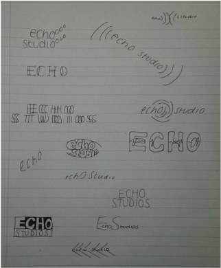 |
Archives
February 2015
Categories
All
|
- Welcome
- AS Level Blogs
- A2 Level Blogs
-
Useful Websites
-
AS EXAM INSTITUTIONS
- G322B1
- Digital Distribution
- Neurocinema and Focus Groups
- Intro to Audiences and Institutions
- Distribution
- Technological Convergence
- Marketing and Technological Convergence by Catilin
- Cross Media Convergence Revision
- Working TItle and Paul
- Pearl and Dean
- Understanding the Film Industry
- Media Ownership
- Documentary about Digital Grading in Lord of the Rings
- Marketing and Technological Convergence
- Benefits of Technological Convergence
- Film Distribution
- Digital Distribution of Film
- Working Title
- Warp Films
- Film Marketing
- Film Marketing
- Marketing and Technological Convergence by Alice and Rosanna
- AS EXAM TV DRAMA


 RSS Feed
