 Below are some examples of which are used in typical thriller films which you can see in the mood board above.
-Night time driving -Isolated areas -Dark alleys -Shadows -Gargoyles -Creepy creatures -corpses -Plastic mannequins -Tension building non diegetic music -gore -Kidnap Murder -Graveyards -Oversized insects -Abnormal diseases -Lifelike dolls Creepy diseases
0 Comments
We recently watched a documentary on fear and how it is creates fear to the audience and techniques and types of shots they use. We decided to watch the documentary because we could get techniques and ideas on how to create fear in our opening sequence.
In these shots you can see a young girl hiding under the blanket/duvet after hearing loud and potentially threatening noises. In the screenshot on the right you can see she are tickling themselves on the knee this shows she is trying to distract herself from reality. The low key dark lighting creates a sense of fear as this normally connotes danger. The close up of her face on the left makes the audience focus on her facial expressions and how she is really feeling in this moment this really helps the audience connect with her and feel what she is feeling.
In these shots you can see a man laying down on his back on a bed he seems to be frozen in fear and looking up in shock. In the shot on the right his hands are placed in a vulnerable position and his facial expressions suggest that he is screaming at something. The dark lighting around the bed makes us focus on him and feel what he is feeling. As you can see his shirt has been ripped open between the shots this suggests that he could be being attacked by something that the camera frame does not shows us which, creates and builds up on suspense.
 Lionsgate Entertainment: Lions Gate Entertainment is an institution found by Frank Guistra which have produced various thriller films including:
It is the largest and most successful mini-major film studio in North America. The original name was Cinepix Film Properties (CFP) but was changed to Lionsgate entertainment on June 1998. It focuses on foreign and independent films and has a distributed various commercially successful film series, including the Twilight Saga and the Divergent series. American Pyscho was it's first major Box Office and had a whopping budget of around 7 million dollars. In 2000, they decided to focus on the profits of DVD's and began buying struggling firms that controlled big libraries. The two most notable acquisitions were Trimark Holdings and Artisan Entertainment. The Trimark purchase also included CinemaNow, a broadband streaming website where Lions Gate could feature it's own movies. These two firms alone gave Lions Gate the second largest DVD library. Lionsgate has grown to make more independent films in many different markets- films, TV shows, video, record label and music publishing. It has grown to become a $2 billion diversified global entertainment corporation and is the next generation film studio as it is commercially the most successful independent film distribution company in North America. Paramount Pictures: Paramount Pictures is a film institution which was founded by Adolph Zukor and they produce/distribute films. They have produced a large numerous amount of films including:
It was originally named Famous Players Film Company in 1912 and is the longest operating and only major film studio remaining in Hollywood. It is ranked as one of the "Big Six" film studios of Hollywood, the other 5 include Fox, Columbia, Warner Bros, Disney and Universal. It is a subsidiary of the U.S media conglomerate Viacom. It is a world wide institution and is the fifth oldest surviving film studio in the world. it is also America's oldest running studio. The year 2012 marked an exceptional milestone for Paramount Pictures as it was it's 100th year in show business. Paramount Pictures is the parent of Dream Works Animation Pictures and Dune Entertainment. In 2014, Paramount Pictures became the first major Hollywood studio to distribute all of its films in digital-form only. Paramount has set the standard in cinema for a century and continues to deliver the highest caliber of entertainment to audiences worldwide. The decade was dominated by the release of Titanic in December 1997, which reigned for more than a decade as Hollywood's top box-office attraction. The Paramount story: Adolph Zukor, Jesse L. Lasky and Cecil B. DeMille are credited as Paramount's principal founding fathers. The visionary Zukor laid the foundation for the company by acquiring the U.S. distribution rights to the silent French film Queen Elizabeth. Its overwhelming success transformed the business of entertainment forever making the institution very recognisable and globally popular.   The first opening scene is very dark which could suggest to the audience that something 'dark' is going to happen to the woman skinny-dipping into the sea. The wide shot shows that she's all alone and the beach in the shot is emphasised making her look vulnerable. She's running into the water not being aware of what could be lurking in it which shows how unaware and naive she is. Non-diegetic music is also playing in the background which crescendo's. This indicates to the audience that something is going to happen or an action is going to place.  As she enters the water, a low angle shot is taken of the young woman swimming showing that there is something watching her from below. Again a wide shot is taken emphasising that she's by herself. This creates tension and engages the audience making them want to watch the next scene to see what happens.  She's relaxing in the water because she's totally oblivious that she's not alone and because she's unobservant of her surroundings, the wait is dragged out even more. This audience would be feeling anxious and scared at this point as they don't know what is going to happen.  This low angle shot taken by the camera slowly approaching her builds up excitement and anxiety for the audience because by this point the audience know the young girl isn't alone in the water. The non-diegetic music also emphasises the build up of tension.  In this scene where the young girl is being attacked by the shark under water and the non-diegetic sound playing in the background has a fast tempo which shows danger. This is supported by the high pitch of the music.  This wide shot of the man laying on the beach indicates that time has passed and that he still hasn't realised the young girl is being attacked. The attack took place in the morning because the sun was setting which means that they would have been completely alone on the beach and that the attack was no expected.
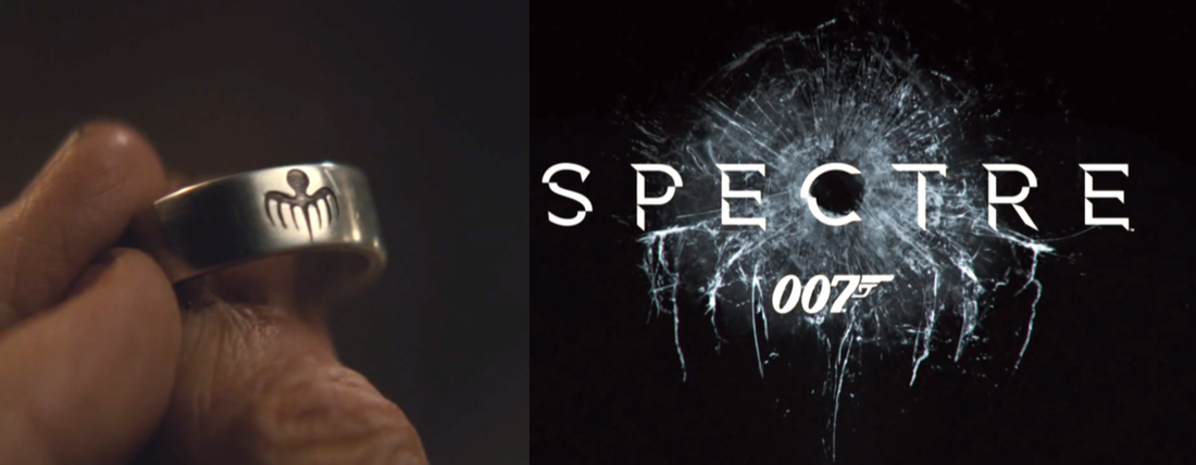 We decided to to analyse the title of the SPECTRE film because it will be useful when we come to make our opening sequence.
The bold, metal-like font juxtaposes with the black background, there seems to be a layer of glass between the black background and the title where a bullet has gone through directly in centre of the camera frame which connotes action and violence. The metal like text connotes strength and safety and the capital letters make sure it is seen and how important the title is in the film. The gunshot glass seems to have been shattered in the shape in the shape of the SPECTRE symbol as you can see in the image above on the left. Also the shattered glass suggests that there has been a disaster and increasingly spreads.  Karishma and I (Jenna) also analysed the SPECTRE film poster we thought this would help us because it is a good example of a thriller film we also wanted to find some features that are mostly used in a typical thriller action film poster and techniques that we could use for our project.
The poster has bright central focus of light on bond as he is the main character using an indirect mode of address as he is staring directly at you and connecting with the audience.The poster features the plain theme colours of blue and white, along with hints of gold. Bond is also a holding a gun which means he is armed and dangerous. However, the red corsage in his all white blazer draws attention to itself as red is a strikingly a bold colour and has connotations of blood, death, violence, and possibly love, as Bond is a potentially dangerous man and everyone knows from the character that this interpretation is true. The way he is positioned, directly in the centre of the poster tells us that he is the protagonist of the film, and the slightly lowered camera angle, shows he is standing in a strong and powerful pose and his arms are folded over his chest which denøtes he is protecting himself. His white blazer contrasts with the red corsage and makes it stand out, also white is the colour of purity and innocence, possibly telling us that there is more than one side to him. His facial expression, were his eyebrows are scrunched, showing he looks concerned or angry. He is looking directly into the camera as if making eye contact with the consumer, another example of how he is imposing authority on the audience. Because he is A-list actor as well as his co actors, his name is not on the poster due to the fact that either people already know his name as he has been in more than one of the James Bond franchise. The day of the dead skull in the background is from the opening scene and the camera angle suggests it was a stolen shot, as if the character was not aware that he was being photographed. The skull represents death, and due to his full black attire, juxtaposes the white blazer that James Bond is wearing in the main photo at the front. Jenna and I (Karishma) decided to watch the new action thriller franchise James Bond (SPECTRE). We thought it would be useful to blog the movie because it relates to our coursework and gave us ideas for our opening sequence. We learnt interesting techniques that are used in typical thriller films and how to engage the audience. Plot of SPECTRE: A cryptic message from the past leads James Bond (Daniel Craig) to Mexico City and Rome, where he meets the beautiful widow (Monica Bellucci) of an infamous criminal. After infiltrating a secret meeting, 007 uncovers the existence of the sinister organization SPECTRE. Needing the help of the daughter of an old nemesis, he embarks on a mission to find her. As Bond ventures toward the heart of SPECTRE, he discovers a chilling connection between himself and the enemy (Christoph Waltz) he seeks. The opening sequence in "Spectre", starts with a intense action juddering scene, as it has always been in every previous Bond films. The residents and crowds were celebrating the day of the dead in Mexico City , the film sets its path with an well choreographed string of exhilarating events, featuring Bond carrying-out an asassination, and immediately followed by a massive, ground-shaking building collapse, a brutal foot chase on top of rooftops, and a battle of fists in a spiralling helicopter. A jaw-dropping scene started in full technical glory, above a square, full of swarming crowd in panic. James Bond swings back and forth on a helicopter, he made an entire building crumble within a few shots, He is capable and mighty to confront death, this is shown by the use of action within certain scenes and still come out unscratched, ready to fight again. And as Sam Smith sings "Writings on the Wall" for the long title sequence, it gets easier to be convinced that a lot more of these explosive visuals are still to be in the action-packed film.   The reason why I am analysing thriller posters is to see all the similar aspects that they all have, for example they might all have a similar colour combination. This would be good to know because when we make our thriller film we will need a good poster to go with it, something that will make people want to watch it  This is the film poster for X-MEN DAYS OF FUTURE PAST this poster introduces us to most of the characters in the film, with each character showing their super power, this makes it clear that the film is going to be a fantasy film with super heroes. Some of the characters are larger than others this could mean that they are more powerful than the smaller characters but also it could mean that they are the ones we should be aware of in the film because they are towering over the other characters. At the bottom of the poster you can see the skyline of a city with a massive explosion coming from underneath the characters, this shows us that the film will have a lot of action and possibly deaths. The reason why the explosion would of been positioned under the characters could mean that they are the cause of the destruction but also shows how powerful they are because they are emerging from a deathly explosion but it can also indicate to us that there will be a big fight in the film. The sky in the poster has been split into two, the left of the poster has reds and oranges which connotes danger and anger whereas on the right side of the poster the sky is blue and green which connotes being calm and relaxed, these colours are the complete opposite of each other which can mean that there will be enemies in the film, people who are against each other. To support this theory there are characters flying in the red part of the sky with fire coming out from their feet, this could be introducing new characters and most likely the enemies. The colours used in the title are yellows, golds and silvers which connote material wealth but also impatience, criticism, cowardice and mystery. So depending what the film is about would be how you decide on what the colours will be.  This is the film poster for MAZE RUNNER - SCORCH TRIALS the poster doesn't make it clear who the characters are but it does show the audience that the film is going to include a lot of danger because all you can see is 6 characters running across what looks like a building which has fallen across two mountain creating a flimsy bridge between them. It is clear that the poster is an extreme wide shot of a mountains in a desert this is because the photo was taken from a low angle making the mountains look extremely all also showing us the deathly drop down if someone was to fall or if the bridge was to collapse. You can't see the characters faces or what they are running to/from which creates mystery because you can't see what is going on. This makes the audience want to watch the film and find out what it is. The sky in the poster is cloudy which could reflect the charters emotions, the fact that it is cloudy shows us mystery because you can't see what is behind it but also this could mean that the characters are trying to find something out too. There is bright sunlight with visible sun rays shining through the clouds which connotes happiness and hope,this shows the audience that there could be a happy ending to the film. The bottom of the poster is a lot darker than the rest, it is from the mountains shadows, but the shadows can connote evil and mystery which implies to the audience that the film isn't going to be all happy and that there is going to be something bad happening in the film. The text at the top of the posters says "The maze was just the beginning" this indicates to us that this film is a sequel and it shows that more action is going to happen it means that if you think that the first film was good and shocking then you're going to love this one. When we create our film poster we will consider text which can give clues to the audience but also give mystery to what is going to happen.  This is the film poster for SOUTH PAW the poster introduces the two main characters as a couple, this is shown by the way they are standing, the woman is positioned standing up between the mans legs whilst he is sitting down, her arms are gently resting on his shoulders whilst are hands are on the back of his neck bringing their heads close together with foreheads touching. Both of their eyes are closed showing silence but also a strong connections between them. The man in the poster is muscly, sweaty and wearing boxing gloves this shows to the audience that the film is going to be about boxing with a romantic side. The woman in the poster has her hair done in curls, nails manicured and wearing a tight dress this represents her to the audience as girly. Although the poster isn't in black and white, the colours in the poster do not stand out very much, most of the colours are dull but the only bright thing in the poster is the boxing gloves. The boxing gloves are a bright red, red connotes blood and danger which are all things to do with boxing but why didn't they chose black gloves to match the rest of the poster? They used red because it stands out and shows us that it is going to have a big impact on the film. The lighting in the poster is very low with a few highlight points in the womans' hair this could show that she could be in danger or that she effects the mans boxing. The corners of the poster are blacked out making the audience draw their attention to the couple even more. The text at the bottom of the poster says "believe in hope" this shows to the audience that something happens in the film and they need hope to help them, but also because it shows how some people don't believe in it and they do need to, to watch the film.  This is the film poster for THE BOURNE IDENTITY the poster introduces the main character from the film, the poster also includes two scenes from the film one consisting of fighting and another but kissing. This shows the consumers that this will be a romantic thriller but with a lot of action involved. The poster has a gun target on the main characters body this shows the audience that people are trying to kill him, he's a fugitive or he's being hunted down.
The main colours in the poster are blue/purple and gold, the colours are separated by the characters body this could mean he has two sides to his personality but also blue/purple connotes being calm but also very energised this is emphasised with the white flash going on behind. The colour gold however connotes success, achievement and triumph this could the audience that there will be a happy ending to the action packed film. The mise-en-scene in the poster including the characters choice of clothing and props show us that with his big puffy jacket, it makes him look big and important but also looks like some sort of protection. Also all of the clothes that he is wearing are very dark this could mean that he doesn't want to be notice but also shows mystery within the character. He is also carrying a gun this shows that the film is full of action and danger there could possibly be a few deaths involved too. "AN ADRENALINE RUSH!" has been put at the bottom of the poster, it is quoted to show that someone who has already watched the film has reviewed it like that, also proves to people that it will be a good film and for those who like to feel an adrenaline rush that it will fix their expectations. The main characters real name MATT DAMON is in the top left of the poster this shows that he is well known and a famous actor, including his name will attract fans of his and a particular age group. As a group we decided to look at past students work and analyse it by using microelements such as; camera movements, the mise en scene, editing and sound.
The AS opening sequence starts with quiet and intense non-diagetic music, which is commonly used in spy movies. The opening sequence starts with the group logo, which is then shortly followed by a loading sign, which is also used in spy movies this suggests that this short opening sequence involves action and spying. The first scene starts with the diagetic of typing and a close up of someone typing. The mise en scene is low-key and dark lighting, which suggests that the person typing is doing some very important work. There is then another close up of the computer screen the camera frame shows an intelligence report. There is then a quick edit cut the non-diagetic music cuts to busy street noise and the camera frame shows a bus. There is then another cut back to the dark room and the person typing and then another cut from the inside of the bus from the point of view of a passenger. The scene then cuts back to an over the shoulder shot of the anonymous person typing showing the screen and then a close up of a baby monitor the camera frame shows the person picking up the baby monitor and placing it back down however, in this scene there are two diagetic sounds created by a person typing and a baby crying, which suggests that something bad is going to happen. There is then a wide shot of the bus with the diagetic noise of a busy road in a city followed by a panning shot. There is yet another edit cut back to the room and a close up of the baby monitor and the crying getting louder. There is then another cut of a panning shot of the camera following the bus followed by another close of the baby monitor and the diagetic sound of the baby crying continues. Within this scene there is another close up of the computer screen with a notification popping up as the diagetic sound of the baby crying continues and slows dies out. The scene then cuts back to a slow panning shot and as the camera stops there is an explosion follow a loud bang. The use of quick editing warned the audience that something bad was going to happen. The next scene then starts with news reports and the diagetic sound of news reports continues throughout the whole scene. The use of dialect suggests that the news reporters are commenting on the number of deaths and stating the facts and figures. There is a wide shot of recovered CCTV footage of the accident a high angle shot of roads a split screen of the reporter and the incident. There are then a wide shot of the roads and a quick jump cut to another wide shot the use of different camera angles and different stories suggests there are different views on the story. There is then a half tracking shot of the camera following the ambulance. There is then a close up o the accident then camera then quickly zooms out and across the camera frame police tape is shown this suggests that the accident was very dangerous and has recently happened so people are not allowed to close. There is then a close up of the police officers assuring the audience that they are quick to respond. There is then another wide shot the mise en scene is very dark, and is shot in a bedroom, which suggests its very early morning or late at night. The camera moves towards the alarm clock, which goes off at 5:00 the diagetic beeping noise of the alarm clock gets louder. The camera frame shows one of the characters switching it off, getting out of bed and leaving the room, which suggests they have to do something important, as it is very early morning. The camera frame then shows the main character working out the use of jump cuts suggests that a lot of time has passed and the fact that he has to work out in the morning suggests that he has an athletic job. The next scene then shows a close up of kettle and pouring water into a mug. There is then a jump cut of the character putting on a jacket, which is followed by a upwards tilt shot showing the full character for the first time which suggests he has a high profile job and needs to hide his identity. The next scene starts with a wide shot focusing on the British flag, which is in the centre of the camera frame, which suggests he works for the country. There are then panning shots and wide of iconic buildings in the UK. Which suggests the accident took place in London. Within this scene there is a quiet and simple non-diagetic sounds created by music to create suspense. The next series of shots follows the boy walking. There is a wide shot of the boy walking towards the camera followed by a high angle pan of him walking and a wide shot from the back of him walking again, which keeps the audience on edge because anything could happen at any time. There is then a wide shot of a building with ‘Secret intelligence service’ written across it. There is then a jump cut of the secret agent walking down the stairs and CCTV of him walking to an unknown location there is a quick edit cut of the boy walking towards the gate and opening it in a top secret location. As a group we decided to in cooperate our group logo so we decided to re-search how logos are used in opening sequences. We also decided to do some background re-search on two organisations; hammer productions and summit entertainment. Hammer productions Hammer productions were founded in 1934 they are a British film production company in London, best known for their horror films made between 1950 until the 1970s. Hammer productions also produced other sub genres of thrillers such as; science fiction, film noir thrillers and comedies however, hammer were most recognized for the horror genre they have produced films such as; 'The Mummy' and 'Dracula'.  Hammer productions decided to create a bold and memorable logo, which would be shown at the beginning of the opening sequence. Hammer productions created a logo specifically designed to represent the horror genre. The word ‘hammer’ is written in capital letters and a bold red font, red connotes blood, danger, murder and love. The bold red font is written across a black background this makes the red really stand out and makes the logo seem very intense, which could reflect the tension and suspense of their films. The black background connotes darkness, power and mystery because there is the fear of the unknown. Summit entertainment Summit Entertainment is an American film production company and distributor. Summit was originally founded in 1991 and is now a subsidiary of Lions Gate Entertainment. Summit entertainments are well known for their intense horror and action movies such as the twilight saga and spider man 3. Summit entertainment produces many films from all genres.  Summit entertainment uses simple yet effective colours like their films. Their official colour scheme is blue, black and white. The logo is a blue and white ribbon, which appears to be blue at the top and white towards the end of the ribbon, which forms a mountain. The light blue colour at the top of the mountain connotes peace and infinity and white connotes innocence and purity. The mountain represents the highs and lows of the movies they produce. The two colours stand out from the black background the darkness of their films and makes the and juxtaposes to the innocence and peace of the two colours. The black background connotes power and the fear of the unknown. The 'summit' writing is in clear, strong white font, well spaced apart to fill the space without being too overpowering underneath ‘summit’, which is written in capital letters the line underneath emphasis the word and makes it standout and memorable.
|
Archivesva
February 2016
AuthorElla Categories |
- Welcome
- AS Level Blogs
- A2 Level Blogs
-
Useful Websites
-
AS EXAM INSTITUTIONS
- G322B1
- Digital Distribution
- Neurocinema and Focus Groups
- Intro to Audiences and Institutions
- Distribution
- Technological Convergence
- Marketing and Technological Convergence by Catilin
- Cross Media Convergence Revision
- Working TItle and Paul
- Pearl and Dean
- Understanding the Film Industry
- Media Ownership
- Documentary about Digital Grading in Lord of the Rings
- Marketing and Technological Convergence
- Benefits of Technological Convergence
- Film Distribution
- Digital Distribution of Film
- Working Title
- Warp Films
- Film Marketing
- Film Marketing
- Marketing and Technological Convergence by Alice and Rosanna
- AS EXAM TV DRAMA


 RSS Feed
