 I researched the Metro- Goldwyn-Mayer company logo as they have been around since 1924 and is still running to present day. Leo the Lion is the mascot for the Hollywood film studio Metro-Goldwyn-Mayer and one of its predecessors, Goldwyn Pictures, featured in the studio's production logo, which was created by the Paramount Studios art director Lionel S. Reiss. Since 1924 there have been around seven different lions used for the MGM logo; these lions include Tanner and Leo, the current (and seventh) lion. At the time of the 1940s the logo was bright with gold has been a major part of their logo so I had to incorporate this in my logo because our company is Royal Productions and I felt that this logo was a perfect influence.  I decided I would use Lucida Grande as it looked old fashioned. I made the font gold as it reflected the royal aspect. Then I gave it a shiny look by adding shade and tone using the colour settings. The background was hard to decide as I could not get the right pattern but I chose in the end a plain black background as it made the company name stand out. As a group we wanted a spinning coin so I had to incorporate that in. I inserted a photo of a coin from the internet and cropped it into a circle. I made it spin by using the animation setting. I slightly delayed its turning as at the beginning it was going too fast and you could not see the face of the coin. Our teacher suggested that instead of the word fading in, it should turn like the coin so it looks more professional. I repeated the coin frosts to get the animation. I think the logo came out really well and looks minimal and professional.  At this point we had intended for this to be our final logo but we found that when trying to add it to our film the two programmes were not compatible and so we could not use this logo. I had to come up with another logo that was not as good as the first. I made it using an online logo maker as it was the only programme that was compatible, but it did mean that it was no longer animated. However it still reflected our royal theme but it was the completely wrong colour scheme. So i was very disappointed but I feel I made a logo that followed the theme in the time I had to make it.
In order to create visual variety in our film opening we had to consider some interesting shots that are applicable to a film noir. We tried out a couple of ideas before actually filming on set in order to save time effectively, ruling out the camera angles or filming compositions that didn't work. We practiced using a dutch tilt as we had decided that it can be used to create a hypnotic or chaotic mood due to the tilted, unusual angle. We thought that perhaps it could be placed into our opening as a way of breaking up the long match on action sequences, as they can become quite repetitive. We hadn't used a dutch tilt in our preliminary and so this technique was new to us all, however we had observed how to film them on YouTube. Our dutch tilt can be found at 1:40  After researching the typical camera angles used in thrillers - Film noir thrillers to be concise, we decided that an extreme close up was necessary for our production. We first found this type of shot applied to Hitchcock's 'Vertigo' and so then we decided to practice replicating the shot style. Having concluded that the close up can be used to break down long sequences and express the characters vulnerability placing emphasis on her eyes, we filmed and edited it into our main task. Our Extreme close up can be found at 2:21 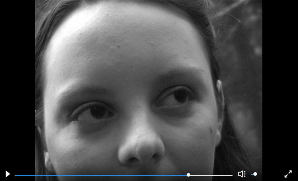 Issues that we found from practicing the shots were the poor quality of zoom in the cameras and the positioning of the tripod. Instead we simply overcame these by holding the camera closer to the actor's face to avoid poor zoom quality, and by placing the camera on the floor for stability rather than a tripod.
Within our opening sequence we had to choose an appropriate font to go with the film. Initially we chose a simple font, however it was clear that we needed to change it. We wanted the font to be long and fine, as seen in the openings of film noires. It appeared difficult as most of the fonts that we had to choose from were quite normal looking and boring, something that links with what you would expect to see in the opening titles from a film such as Vertigo, with an almost slightly retro feel. From the beginning we knew the colour had to be grey so it stood out enough with the black and white shots behind. Eventually in the end we chose the font 'bordeaux roman bold let' as it for filled the necessities needed within the opening sequence of a film noire. It is tall, thin, and slightly retro but with a feel as if it is shouting. 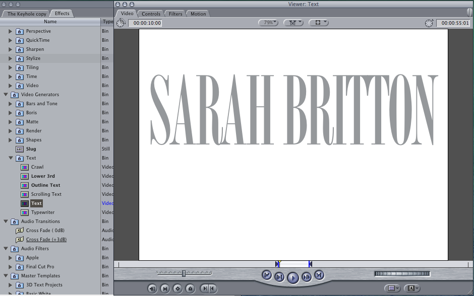  This is a picture of our group chat on Facebook, we used this to organise what we were going to do and when we were going to film. We decided when and where we were going to meet, what we were going to do and what we all needed to bring. Using technological convergence via Facebook apps on our smart phones we were able to communicate together as a group, contributing ideas equally. In effect our time management was more substantial.
|
Author
|
- Welcome
- AS Level Blogs
- A2 Level Blogs
-
Useful Websites
-
AS EXAM INSTITUTIONS
- G322B1
- Digital Distribution
- Neurocinema and Focus Groups
- Intro to Audiences and Institutions
- Distribution
- Technological Convergence
- Marketing and Technological Convergence by Catilin
- Cross Media Convergence Revision
- Working TItle and Paul
- Pearl and Dean
- Understanding the Film Industry
- Media Ownership
- Documentary about Digital Grading in Lord of the Rings
- Marketing and Technological Convergence
- Benefits of Technological Convergence
- Film Distribution
- Digital Distribution of Film
- Working Title
- Warp Films
- Film Marketing
- Film Marketing
- Marketing and Technological Convergence by Alice and Rosanna
- AS EXAM TV DRAMA
 RSS Feed
