|
Throughout the process of creating the our production, the key jobs were split, in order for it to be done as well as possible.
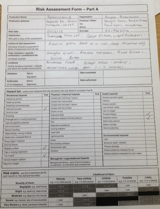
My main contribution to the task was the editing of our opening sequence 'Reminiscience'. In order to create the best possible opening, I worked alongside Ariadne Terizakis, since our collabortive skills created a faster pace and also better ideas. The opening sequence was formulated on the professional software 'Final Cut Pro', where I edited, cut and transitions from the wide use of tools on the software . Having previously used Final Cut Pro for a rather short length of time on our preliminary task; Ariadne and I knew the very basics, such as cutting and the tools. However, in order to reflect how we saw the Film noir Directors work- Alfred Hitchcock, we felt to include strong, effective and obvious transitions- which I believe was found rather difficult since the cuts between each little scene needed to flow, although we eventually found a way to reflect Hitchcock and have a flowing effect. The opening sequence of Reminiscence is somewhat a flashback as to which we see the characters memories as we zoomed towards her eye, to eventually come back out of her eye- but when we come back out of the eye, we had to take the first shot of Sarah and reverse it so we are almost leaving her flash backs. This also created some real struggles since we did not know if that was even possible to do on the Software, but fortunately we used the help book and also online and found that it was completely doable and therefore made a circular feel to the opening sequence. Obviously, as our genre of film is 'Film noir' we needed to turn the sequence into black and white, which we believed best to do at the end of the editing, just in case any small or possibly large problems occurred whilst attempting this. Luckily once again we searched about, and looked for the obvious to eventually come across the filter options. It was a rather long process creating a suitable and effective opening sequence (especially for a film noir) since there is many aspects to consider when it comes to the visuals, therefore I feel Ariadne and I did a rather good job, since it appears esthetically pleasing. We believed it would be a rather tricky process to create what we wanted to fir our description, which it was- yet fortunately I eventually became rather used to it and could successfully get on with it each lesson. The British Board of Film Classification is an independent, non-governmental body which has classified cinema films since it was set up in 1912 and videos/DVDs since the Video Recordings Act was passed in 1984. It was set up as an an independent body to bring a degree of uniformity to the classification of film nationally. All classification decisions are based on the BBFC’s published and regularly updated Guidelines. The Guidelines are the product of extensive public consultation, research and the accumulated experience of the BBFC over many years. They reflect current views on film, DVD and video game regulation. Those who examine the films etc look at issues such as discrimination, drugs, horror, imitable behaviour, language, nudity, sex, sexual violence, theme and violence when making decisions. They also consider context, the tone and impact of a work (eg how it makes the audience feel) and even the release format (for example, as DVDs are watched in the home, there is a higher risk of underage viewing). The following symbols are the age ratings seen on the products...  The U symbol stands for Universal. A U film should be suitable for audiences aged four years and over. However, it is impossible to predict what might upset a particular child, especially at this lower end of the category range.  PG stands for Parental Guidance. Meaning a film is suitable for general viewing, however there is the possibility that some scenes may not be suitable for young children. A PG film should not unsettle a child aged around eight or older. Parents should consider whether the content may upset younger, or more sensitive, children. 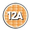 The 12A requires an adult to accompany any child under 12 seeing a 12A film at the cinema. This is enforced by cinema staff and a cinema may lose its license if adult accompaniment is not enforced for children under 12 admitted to a 12A film. 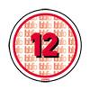 Accompanied viewing cannot be enforced in the home, so the 12 certificate remains for DVD/Blu-ray, rather than the 12A. The 12 is also a simpler system for retailers. It means they cannot sell or rent the item unless the customer is over the age of 12. 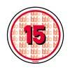 No-one under 15 is allowed to see a 15 film at the cinema or buy/rent a ‘15 rated video. 15 rated works are not suitable for children under 15 years of age. No theme is prohibited, provided the treatment is appropriate for 15 year olds. 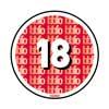 Films rated 18 are for adults. No-one under 18 is allowed to see an 18 film at the cinema or buy/rent an 18 rated video. No 18 rated works are suitable for children. No theme is prohibited at 18. Adults are free to choose their own entertainment provided the material is not illegal or potentially harmful, so it is possible some themes tackled at 18 may be offensive even to some adult viewers.  The R18 category is a special and legally-restricted classification primarily for explicit works of consenting sex or strong fetish material involving adults. Films may only be shown to adults in specially licensed cinemas, and video works may be supplied to adults only in licensed sex shops. R18 videos may not be supplied by mail order. R18 titles are filtered out from the main public search as they can have explicit and/or offensive titles. Due to the many age categories that your film could fall into, it is crucial that it must be concluded as to what age rating the film will be before it is release in ordeer to attract the correct target audience. Since there is the possibility that if a film is believed to be a 12 and over, yet is shown to the BBFC and it is actually a 15, it cuts of those who were possibly wanted to see the film. There is times however when the film is advertised on the television; for example, and TBC is in the corner rather then a rating since there is no confirmation as to what category it falls into, almost leaving people in suspense as to whether they are viable to view it in the cinema.
As our film-'Reminiscence' is a thriller as well as a film noir, it does not appear to fall into the category suitable for twelve year olds, due to the fact if the story where to be adapted, the film would most likely turn into a rather violent, twisted, physcological thriller with rather strong langue and scenes that would not be fitted to a twelve year old. Fortunately, our original target audience was to be of teens around 15-18 (hipsters) wanting to see the film noir, for this reason we have not encouraged any target audience that would not get the option to view it in the cinemas etc. Shutter Island The opening sequence of shutter island lets us understand and believe as to why the film is named 'Shutter Island'. We are introduced to men travelling inland towards this island that appears to be very secluded and 'shut off'. It establishes the location and therefore will allow us to understand the consequences of certain things within the film.  Panic Room- Within the opening sequence of the film 'Panic Room' we are introduced to many different aspects of a large city whilst the titles are shown, however it appears there is some slight irony within the opening sequence as one usually perceives a panic room to be a small and confide space, therefore they have juxtaposes what we believe to be a panic room, with a large city- which somewhat implies an odd twist to the film. The title 'Panic Room' now creates us to believe it connotes another meaning. 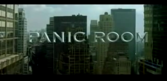 Within the opening sequence of 'No Country For Old Men' the editing seems of some significance- even though it is not easy to understand as to why we are being shown wide establishing shots of this landscape but at this point have to make the assumption it is of some importance. The editing is therefore used to capture the 'important bits' highlighting what we believe to be a relevant location in for this film. This way the audiences attention is focusing towards the preferred meanings that has been encoded in the shots. The pacing of how long is left to linger also embeds a tone to the feeling allowed for the audience to interpret. A scene quickly edited denotes action, violence, emergency etc, whereas a scene with slower edits usually has less connotations to do with fast paced action. However, after the slow cuts through the landscape, it then cuts to a police officer making an arrest, leading us to believe this slow opening with not many connotations, will lead to a faster edits and a more action-packed film.
The lighting in the opening of 'No Country For Old Men' is a significant component, helping set the scene. The screen stars black with no footage, then as the narrative dialogue is heard on top, the setting (of what we assume is a dessert rock) appears. The lighting is dim as we see the sun raise in the horizon over the rock in blue, orange tones. As the establishing shot changes to yet another establishing shot, the sun appears stronger. The dim desert sun changes to a brighter yellow as the shots continue. In one shot, the sun is seen peering through the top of some dusty rocks creating a glare effect, this lighting helps us to understand just how desolate the setting is. The idea of watching the sun rise gradually compliments the idea that the story is about to unfold, the start of both the film and the day creates anticipation for the audience as they don't know what to expect. The lighting reaches full day light, and the natural lighting reflected on the desert's rocky ground creates a stillness. It is almost an eerie atmosphere as we scan the different locations, as if the audience is meant to try and see something, almost like a criminal stakeout. The warmth of the lighting parallels the idea that the desert is commonly associated with heat. In the fist scene where characters are introduced (a man in handcuffs being led by a Texas officer) we can see that the police siren lights are still flashing as the car is pulled up to the side of the road, adding emphasis to the status of the police force, reflecting what the narrative voice had previously described. At first, we are only aware of the narration, obviously a man with an American accent, rather gravelly in tone, he lets us know straight away that he is a Sheriff and tells of old time policemen and a past case. However, as you become attuned you then hear the background noise of wind, it is constant and obviously blowing in an open space. This is reinforced as the sun comes up and a bird is heard singing, the setting is in open country. Apart from these three sounds, it is absolutely quiet, this must be a long way from any buildings, there isn't even any sound of traffic, just a squeaky wind generator. The wind is always there but even the bird has stopped singing, it is just the narrator, but suddenly the sound of footsteps on a stony surface shows that there is at least one person around, the fact that there are two people is not obvious as their footsteps are synchronised perfectly as they walk to the car. The sound of the car door being opened is quite sudden and propels you into the story, then the metallic bell like tone of the strange canister being put into the front seat leaves us with a question, what is it? The car is started and revved up to a high speed straight away, the policeman obviously wants to get his prisoner back in a hurry. Within our opening sequence we had to choose an appropriate font to go with the film. Initially we chose a simple font, however it was clear that we needed to change it. We wanted the font to be long and fine, as seen in the openings of film noires. It appeared difficult as most of the fonts that we had to choose from were quite normal looking and boring, something that links with what you would expect to see in the opening titles from a film such as Vertigo, with an almost slightly retro feel. From the beginning we knew the colour had to be grey so it stood out enough with the black and white shots behind. Eventually in the end we chose the font 'bordeaux roman bold let' as it for filled the necessities needed within the opening sequence of a film noire. It is tall, thin, and slightly retro but with a feel as if it is shouting. 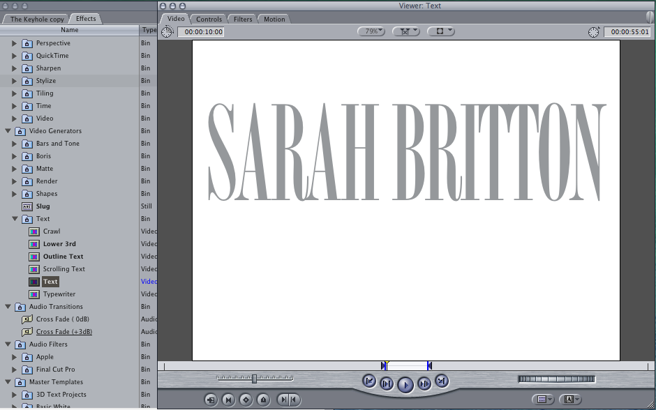  This is a picture of our group chat on Facebook, we used this to organise what we were going to do and when we were going to film. We decided when and where we were going to meet, what we were going to do and what we all needed to bring. Using technological convergence via Facebook apps on our smart phones we were able to communicate together as a group, contributing ideas equally. In effect our time management was more substantial.
For this story board, the music is just a random song that was on the software since we had not yet made our own composition for our opening sequence. The storyboard shown is almost a plan of how we imagined our sequence to look, therefore if we had made the music first it would not have matched the filming sequence. Timing would have been more difficult to keep in sync (the music next to motion).
 Throughout the editing process we decided to change then name of our project from 'The Keyhole' to 'Reminiscence'. We did some extra research on Hitchcock & Film noir names, collectively we came to the conclusion that this would be a more stylistic and appropriate name. Some examples of film noir names are: 'psycho' 'Notorious'
 Mid shot- Our first shot in Reminiscence will be a mid shot of Sarah's character, which will establish some of the environment she is in and the props around her, which will hopefully lead to connotations of the typical fem fatale. <--- An example of a mid shot.  Zoom and close up of eye- Our next planned shot, was for us to zoom into the eye where there is now an extreme close up to then go to the taunting memories of Sarah's past. The inspiration for the eye close up was taken from the opening of Alfred Hitchcock's opening to Vertigo.  A low angle shot- is put in, in order to capture the above surroundings and lighting within the area our character we be in. (will also return after pov shot).  A point of view shot- will be used whilst running through the forest in order to raise intensity levels, and let the audience feel rushed and panicked, as if they where in our characters position.  A wide shot- will be put in place to capture Sarah running through the woods panicking, it will therefore establish her body language and the environment she is in.  A dutch tilt- is going to be used, since they are deliberately slanted to one side they create a strong dramatic effect, and helps portrays unease, which is them aim at this point for our character Sarah.  Another wide shot put in place once again to create unease (this time panning).  Close up- Firstly of Sarah spinning, to create a lost and confused sensation, and secondly a still close up of Sarah's face in the forest, concentrating on her eyes in order to capture her looking about. |
Author
|
- Welcome
- AS Level Blogs
- A2 Level Blogs
-
Useful Websites
-
AS EXAM INSTITUTIONS
- G322B1
- Digital Distribution
- Neurocinema and Focus Groups
- Intro to Audiences and Institutions
- Distribution
- Technological Convergence
- Marketing and Technological Convergence by Catilin
- Cross Media Convergence Revision
- Working TItle and Paul
- Pearl and Dean
- Understanding the Film Industry
- Media Ownership
- Documentary about Digital Grading in Lord of the Rings
- Marketing and Technological Convergence
- Benefits of Technological Convergence
- Film Distribution
- Digital Distribution of Film
- Working Title
- Warp Films
- Film Marketing
- Film Marketing
- Marketing and Technological Convergence by Alice and Rosanna
- AS EXAM TV DRAMA
 RSS Feed
