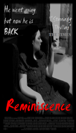
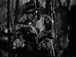
 I designed this poster to be in the style of both old and modern noir films. The main thing that came out of researching film noir posters was that they had a bold title, maybe a catchphrase, and on most posters they had credits of the film at the bottom of the poster. I also included a review from a fake 'Times' review.
Having a snippet of a review is very common on posters because they prove to the target audience that the movie is worth seeing. I chose 'The Times' deliberately because my target audience would most likely read 'The Times'. While editing, I chose a freeze frame from our opening sequence with the main character sitting in a chair. This was deliberate because it suits the period and most film posters feature the main charter. Using the brush effect on the photo made it look older and because film noir posters were originally painted (not computer done) this fitted well. The photo is in black and white, it keeps to the noir theme and it makes the tile stand out. choosing to use a smudged text on the tiles gave the effect of looking rushed and suspicious. The red is to cogitate both the sexuality and a manipulative women but also may represent blood. I used the same font for the catchphrase and the review, but it was in a a grey tone so it was not as bold. For 'The Times' part of the review I used a different font because I wanted it to be clear. I also added a five star rating. lastly I made the black frame around the photo and added the credits at the bottom to make it look more professional. Here are some examples of music for thrillers. Some of the elements that I have pointed out can be found in our film production. I have listed two more modern film thrillers and a film noir, of which inspiration can be found. The Music from 'Vertigo' uses an array of classical instruments matching the Film Noir. The melody that resembles a simple scale of notes creates a hypnotic mood and tone. The High pitched violins illustrate a dangerous atmosphere. As the piano scale melody is broken by brass instruments ever so often, the audience grow tense, not knowing what to expect next. The iconic music from 'Jaws' displays how tension can be created and built up using a simplistic melody consisting of two notes. Previous to this segment of music, the film has no other background music - therefore when this piece is introduced into the film, the audience register that it is used for dramatic effect. As the music gradually crescendos and repeats the bars faster, the audience grow tense with the anticipation created, assuming that some bad event is being foreshadowed from the music itself. The music from 'Sin City' uses a low base to initially create a dark and intense atmosphere. Sharp sounds are echoed on top of the base and an audience gains an insight of the film having a grudge undertone to it. The music is later accompanied by a saxophone melody, creating a seductive and jazzy tone, indicating this theme for throughout the film. Some of the notes are sharp, making it almost hard to listen to. The intense build up of instruments creates a dramatic climax.
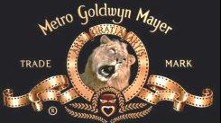 I researched the Metro- Goldwyn-Mayer company logo as they have been around since 1924 and is still running to present day. Leo the Lion is the mascot for the Hollywood film studio Metro-Goldwyn-Mayer and one of its predecessors, Goldwyn Pictures, featured in the studio's production logo, which was created by the Paramount Studios art director Lionel S. Reiss. Since 1924 there have been around seven different lions used for the MGM logo; these lions include Tanner and Leo, the current (and seventh) lion. At the time of the 1940s the logo was bright with gold has been a major part of their logo so I had to incorporate this in my logo because our company is Royal Productions and I felt that this logo was a perfect influence.  I decided I would use Lucida Grande as it looked old fashioned. I made the font gold as it reflected the royal aspect. Then I gave it a shiny look by adding shade and tone using the colour settings. The background was hard to decide as I could not get the right pattern but I chose in the end a plain black background as it made the company name stand out. As a group we wanted a spinning coin so I had to incorporate that in. I inserted a photo of a coin from the internet and cropped it into a circle. I made it spin by using the animation setting. I slightly delayed its turning as at the beginning it was going too fast and you could not see the face of the coin. Our teacher suggested that instead of the word fading in, it should turn like the coin so it looks more professional. I repeated the coin frosts to get the animation. I think the logo came out really well and looks minimal and professional.  At this point we had intended for this to be our final logo but we found that when trying to add it to our film the two programmes were not compatible and so we could not use this logo. I had to come up with another logo that was not as good as the first. I made it using an online logo maker as it was the only programme that was compatible, but it did mean that it was no longer animated. However it still reflected our royal theme but it was the completely wrong colour scheme. So i was very disappointed but I feel I made a logo that followed the theme in the time I had to make it.
Within our opening sequence we had to choose an appropriate font to go with the film. Initially we chose a simple font, however it was clear that we needed to change it. We wanted the font to be long and fine, as seen in the openings of film noires. It appeared difficult as most of the fonts that we had to choose from were quite normal looking and boring, something that links with what you would expect to see in the opening titles from a film such as Vertigo, with an almost slightly retro feel. From the beginning we knew the colour had to be grey so it stood out enough with the black and white shots behind. Eventually in the end we chose the font 'bordeaux roman bold let' as it for filled the necessities needed within the opening sequence of a film noire. It is tall, thin, and slightly retro but with a feel as if it is shouting. 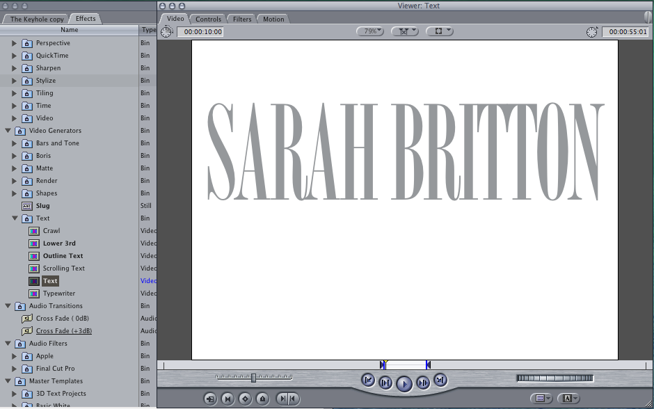  This is a picture of our group chat on Facebook, we used this to organise what we were going to do and when we were going to film. We decided when and where we were going to meet, what we were going to do and what we all needed to bring. Using technological convergence via Facebook apps on our smart phones we were able to communicate together as a group, contributing ideas equally. In effect our time management was more substantial.
For this story board, the music is just a random song that was on the software since we had not yet made our own composition for our opening sequence. The storyboard shown is almost a plan of how we imagined our sequence to look, therefore if we had made the music first it would not have matched the filming sequence. Timing would have been more difficult to keep in sync (the music next to motion).
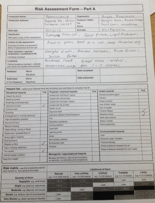
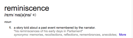 Throughout the editing process we decided to change then name of our project from 'The Keyhole' to 'Reminiscence'. We did some extra research on Hitchcock & Film noir names, collectively we came to the conclusion that this would be a more stylistic and appropriate name. Some examples of film noir names are: 'psycho' 'Notorious'
 A Forest setting is perfect for a film noir. The silhouettes of the tree branches create a shadow effect, commonly found in Film noirs in order to add mystery and dramatic effect. The secluded setting offers an immediate idea of danger to audiences. The great mass of the forest makes any character seem small and vulnerable, this adds to the character ideology of a feminine woman that is commonly found in film nor thrillers. 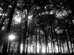 A wide location shot can set the scene and setting and sun rays peering through the branches can create a picturesque effect... (Unfortunately there wasn't much sun on the December day that we filmed!)  Nevertheless, the cloudy fog created an eerie atmosphere throughout the forest and the black and white effect enhanced this. 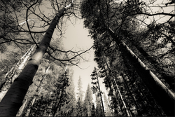 This image or nature shot can be used to break up action sequences of match on action. A simple fade transition can lead to a short image of woodland to reiterate the fact that the character is swallowed in the forest. 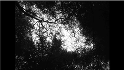 We used a tripod to film a pan around of the sky through the trees. The spiral effect method worked well with the idea of the character sharing a memory or a dream like effect, linking with the name of our production, 'Reminiscence'. The black and white effect creates dark and scary imagery of the trees.   This modern day woodland setting replicates the research we gathered from vintage film noirs that also contain scenes of forest landscapes. As you can see from the comparison, the black and white shots connote a dark and gloomy atmosphere adding tension as it creates a tense atmosphere for the audience to watch. Once our footage was at the stage of editing, we added a black and white effect in order to follow the style of a film noir - automatically our sequence became darker and more intense... the typical codes and conventions included in film noir thrillers.
|
Author
|
- Welcome
- AS Level Blogs
- A2 Level Blogs
-
Useful Websites
-
AS EXAM INSTITUTIONS
- G322B1
- Digital Distribution
- Neurocinema and Focus Groups
- Intro to Audiences and Institutions
- Distribution
- Technological Convergence
- Marketing and Technological Convergence by Catilin
- Cross Media Convergence Revision
- Working TItle and Paul
- Pearl and Dean
- Understanding the Film Industry
- Media Ownership
- Documentary about Digital Grading in Lord of the Rings
- Marketing and Technological Convergence
- Benefits of Technological Convergence
- Film Distribution
- Digital Distribution of Film
- Working Title
- Warp Films
- Film Marketing
- Film Marketing
- Marketing and Technological Convergence by Alice and Rosanna
- AS EXAM TV DRAMA
 RSS Feed
