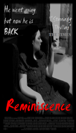
 I designed this poster to be in the style of both old and modern noir films. The main thing that came out of researching film noir posters was that they had a bold title, maybe a catchphrase, and on most posters they had credits of the film at the bottom of the poster. I also included a review from a fake 'Times' review.
Having a snippet of a review is very common on posters because they prove to the target audience that the movie is worth seeing. I chose 'The Times' deliberately because my target audience would most likely read 'The Times'. While editing, I chose a freeze frame from our opening sequence with the main character sitting in a chair. This was deliberate because it suits the period and most film posters feature the main charter. Using the brush effect on the photo made it look older and because film noir posters were originally painted (not computer done) this fitted well. The photo is in black and white, it keeps to the noir theme and it makes the tile stand out. choosing to use a smudged text on the tiles gave the effect of looking rushed and suspicious. The red is to cogitate both the sexuality and a manipulative women but also may represent blood. I used the same font for the catchphrase and the review, but it was in a a grey tone so it was not as bold. For 'The Times' part of the review I used a different font because I wanted it to be clear. I also added a five star rating. lastly I made the black frame around the photo and added the credits at the bottom to make it look more professional. Comments are closed.
|
Author
|
- Welcome
- AS Level Blogs
- A2 Level Blogs
-
Useful Websites
-
AS EXAM INSTITUTIONS
- G322B1
- Digital Distribution
- Neurocinema and Focus Groups
- Intro to Audiences and Institutions
- Distribution
- Technological Convergence
- Marketing and Technological Convergence by Catilin
- Cross Media Convergence Revision
- Working TItle and Paul
- Pearl and Dean
- Understanding the Film Industry
- Media Ownership
- Documentary about Digital Grading in Lord of the Rings
- Marketing and Technological Convergence
- Benefits of Technological Convergence
- Film Distribution
- Digital Distribution of Film
- Working Title
- Warp Films
- Film Marketing
- Film Marketing
- Marketing and Technological Convergence by Alice and Rosanna
- AS EXAM TV DRAMA
 RSS Feed
