|
My main contribution to our opening title was the mise en scene. I found my costume which had to be of a certain 1940s style. This was an important part, as if we did not have the correct look it would ruin the whole mood of the work. We had chosen the 1940s, as that was when most film noir films were made and we wanted to show our research into that period of time. The costume itself was a flowered knee length dress, and black lace up mid heel shoes. The dress and shoes were in dark colours as our final product would be black and white, and we needed them to come out on the film clearly. The character was meant to look quite sophisticated and feminine and the costume reflected this. Originally, I was just going to wear the dress and shoes, but because it was so cold, I had to wear my purple coat, which fortunately turned out to be of the right period look. The makeup had to be quite minimal with bright red lipstick and the hair was a simple 1940s flick, this gave it the complete 40s look.
The setting of the forest meant we could not control the lighting conditions, but as it was a cloudy murky day, it made our shots look very atmospheric and scary. The inside of Ge’s house was where we did all the inside shots and we chose an old fashioned looking arm chair. We then moved it against a brick wall to cover hide the obvious Christmas decorations in the background. The background also was in our favour because it had no particular style, meaning it fitted into our time period. When it came to putting the final product together, I chose the font for the opening titles, as the original one was not so interesting and did not fit the theme. The font we finally picked was Bordeaux Roman bold Ltd as it fitted it perfectly. 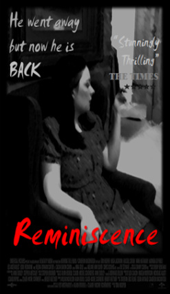 I designed this poster to be in the style of both old and modern noir films. The main thing that came out of researching film noir posters was that they had a bold title, maybe a catchphrase, and on most posters they had credits of the film at the bottom of the poster. I also included a review from a fake 'Times' review.
Having a snippet of a review is very common on posters because they prove to the target audience that the movie is worth seeing. I chose 'The Times' deliberately because my target audience would most likely read 'The Times'. While editing, I chose a freeze frame from our opening sequence with the main character sitting in a chair. This was deliberate because it suits the period and most film posters feature the main charter. Using the brush effect on the photo made it look older and because film noir posters were originally painted (not computer done) this fitted well. The photo is in black and white, it keeps to the noir theme and it makes the tile stand out. choosing to use a smudged text on the tiles gave the effect of looking rushed and suspicious. The red is to cogitate both the sexuality and a manipulative women but also may represent blood. I used the same font for the catchphrase and the review, but it was in a a grey tone so it was not as bold. For 'The Times' part of the review I used a different font because I wanted it to be clear. I also added a five star rating. lastly I made the black frame around the photo and added the credits at the bottom to make it look more professional. In a motion picture the opening credits are shown at the very beginning and list the most important members of the production. They are usually shown as bold text on a blank screen or static pictures, or sometimes on top of action in the show. There may or may not be accompanying music. For our opening titles we will have music and it will have text over an action shot. Opening credits since the early 1980s, identify the major actors and crew, while the closing credits list an extensive cast and production crew. When researching we came up with the most common mentions in the credits. so this influenced our credits as we wanted it to be realistic.
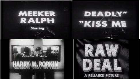 Here are some examples of opening titles from film Noir films. These were taken from the films Deadly "Kiss Me and Raw Deal. This supports my research of opening titles having moving backgrounds and bold fonts.
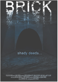 Brick is a 2005 American neo-noir thriller film. The story is about Brendan Frye a loner who seeks for the answers behind the death of his ex-girlfriend. The main obvious thing is that the poster is a dark blue colour. This is meant to represent water as the tunnel is flooded. The tunnel is foreboding with no sign of light coming from it. You can see the ripples of water on the top an bottom of the poster,this makes the audience feel as if there underwater or maybe drowning. There is some lighting from the water but seems far away and distant. The title brick is in white and is dripping and peeling away into the water like ripples of light, making the tile look neglected and sinister. The only other writing of the text is the shady deeds.. having the writing in dark blue makes it almost blend in, making this mysterious and potentially scary because it may connote murder or a crime that happens in the film. There are no people or obvious objects in the film making it simple but powerful to look at. As are opening title is in the style of film noir our poster will be simple but bold like this one.  The house at the end of the street is about 17-year-old daughter Elissa who has just moved with her mum to house there to a house were there was young psychotic girl who murders her parents, Four years later she has moved in. Carrie Anne's brother, Ryan Jacobson is the sole survivor. When Elissa stats having a relationship with Ryan strange things start to happen. On this film poster it shows the title House at the end of the street. This font is in capital letters and in the colour yellow this is so the title stands out and makes a big impact. having the title slanted and running makes it look like it has been done quickly and as if in panic. The poster is dark and moody with the only light coming from behind the house and o the characters face. This may be a trick positioning,as maybe we she is the one seeing the ouse and we are looking at i from her vision. Her eyes are looking straight out and this gets the audience involved with her more as a character. The mist on the house in the background creates an isolation which helps to create a darker feel to the poster. The use of a snippet of review comments helps advertise the film give an impression of being a really scary and great film to see.  Black Swan was a 2013 film that lies within psychological thriller/horror film genre. The film is about a ballet dancer who gets the main part in swan lake,but throughout the movie she because more and more confused resulting in acts of madness both in her head on in real life. Nina (Natalie Portman) is the only one in the shot, this reveals to us that she is the main character or protagonist in the film and that the action will revolve around her. Her eyes are looking straight at the camera and out into the audience, so it's like she's looking at the viewer. This makes the poster engaging and rather intense. her makeup is natural but has that dark and alluring most likely to reflect the dark swan part of her character. The black background behind her makes her white pure skin stand out making her look vulnerable . Her innocent expression actually makes her look more sinister. The split down her face connotes that she's fragile and is one of the most prominent parts of the poster. It can also suggest that this ballerina's is under pressure, she is broken and not like other dancers. The writing on the bottom says 'Black Swan in black capital lettings suggesting that this will be a bold and dark film. 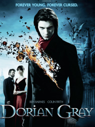 The film is about Dorian Gray and is a 2009 British fantasy-thriller drama film based on Oscar Wilde's 1890 novel The Picture of Dorian Gray.
Grey is in the centre of the poster , showing the audience who the central character is, but there are also two figures in the background, suggesting they are also very important to the storyline. The women in the background, is wearing a red skirt maybe showing that she is a sexy or a love interest in the film. Also the people in the posters have pale faces. this suggests that they are ghostlike characters and are not all quite human. The poster has very cold colours with dark blue misty edges. It could suggest that the film is going to be gothic, but the storyline cold and sinister. At the top of the poster, it says 'Forever young, forever cursed'. We can see that Dorian is young on the poster. We aren't sure what the curse is from the poster, but it probable is suggesting that being young forever has bad consequences to it. what we can see is the fire burning away part of his body. like the burning of a painting suggesting this has something to do with it. He is looking into the camera, which is engaging with the audience and is quite intense. In the background, there is a big statue suggesting the victorian era, along with the clothes, it suggests that the characters are well off. Dorian appears to be dressed very well and raver sexy, a long coat and scarf, typical of the wealthy in that era. 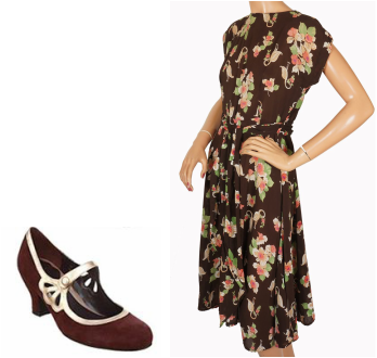 The females in film noir were either of two types (or archetypes) - The feminine, dutiful, reliable, trustworthy loving and most of the time the victim. They would be dresses in some simple but famine dress. Because are character is shown as the victim in are opening tittles she will were something like the dress on the right. i have sourced a dress in blue that is very similar to this. Shoes were slight heels with minimal embellishment, I have a pair that are similar to this that we will use. As our film is in black and white the colours will not matter too much. 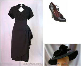 On the other side the dangerous and desperate women. Dazzling, devious sirens surrounded themselves in half-truths, whole lies, and the best silk money could buy. These women would be feminine but are more sexy and seductive in the way they dress,always look perfect. A lot of women would wear a large hat and glasses in order to hide their face from the world. Shoes would be the same as the good girls.  The makeup was simple but bold. Ladies would have dark eyebrows and bright red lipstick. Women would also make their eyes stand out as much as possible. Eyes would be smoky and mysterious looking. This look would be the same for both innocent and bad women, but unlike the bad women innocent girls would not were bright lipstick and would most likely be a minimal version.
Hair would mostlikely be in curles and be in a short hairstyle but some women would have theres in a very short hairstyle like and mans.  Having a completely black background hints at the darkness of the films they make, this is probably horror and thriller genre as the font is modern gothic, the red lettering also may represent blood or murder. The H in the middle is bigger then the rest of the words so it is eye catching, it is very like a blood clot in itself, the highlight emphasises this, also the font has sharp ends to it making it look vaguely like a knife or sword.  The background of the logo is intense black and consequently a little menacing, this could reflect the darkness of some of their films. The blue shining ribbon looks like a peak, and is obviously signifying the top of a mountain, the blue is cold with a pale summit which draws the eye. The 'summit' writing is in clear, strong font, well spaced apart to fill the space without being too overpowering.
Within the opening sequence of 'No Country For Old Men' the editing seems of some significance- even though it is not easy to understand as to why we are being shown wide establishing shots of this landscape but at this point have to make the assumption it is of some importance. The editing is therefore used to capture the 'important bits' highlighting what we believe to be a relevant location in for this film. This way the audiences attention is focusing towards the preferred meanings that has been encoded in the shots. The pacing of how long is left to linger also embeds a tone to the feeling allowed for the audience to interpret. A scene quickly edited denotes action, violence, emergency etc, whereas a scene with slower edits usually has less connotations to do with fast paced action. However, after the slow cuts through the landscape, it then cuts to a police officer making an arrest, leading us to believe this slow opening with not many connotations, will lead to a faster edits and a more action-packed film.
The lighting in the opening of 'No Country For Old Men' is a significant component, helping set the scene. The screen stars black with no footage, then as the narrative dialogue is heard on top, the setting (of what we assume is a dessert rock) appears. The lighting is dim as we see the sun raise in the horizon over the rock in blue, orange tones. As the establishing shot changes to yet another establishing shot, the sun appears stronger. The dim desert sun changes to a brighter yellow as the shots continue. In one shot, the sun is seen peering through the top of some dusty rocks creating a glare effect, this lighting helps us to understand just how desolate the setting is. The idea of watching the sun rise gradually compliments the idea that the story is about to unfold, the start of both the film and the day creates anticipation for the audience as they don't know what to expect. The lighting reaches full day light, and the natural lighting reflected on the desert's rocky ground creates a stillness. It is almost an eerie atmosphere as we scan the different locations, as if the audience is meant to try and see something, almost like a criminal stakeout. The warmth of the lighting parallels the idea that the desert is commonly associated with heat. In the fist scene where characters are introduced (a man in handcuffs being led by a Texas officer) we can see that the police siren lights are still flashing as the car is pulled up to the side of the road, adding emphasis to the status of the police force, reflecting what the narrative voice had previously described. At first, we are only aware of the narration, obviously a man with an American accent, rather gravelly in tone, he lets us know straight away that he is a Sheriff and tells of old time policemen and a past case. However, as you become attuned you then hear the background noise of wind, it is constant and obviously blowing in an open space. This is reinforced as the sun comes up and a bird is heard singing, the setting is in open country. Apart from these three sounds, it is absolutely quiet, this must be a long way from any buildings, there isn't even any sound of traffic, just a squeaky wind generator. The wind is always there but even the bird has stopped singing, it is just the narrator, but suddenly the sound of footsteps on a stony surface shows that there is at least one person around, the fact that there are two people is not obvious as their footsteps are synchronised perfectly as they walk to the car. The sound of the car door being opened is quite sudden and propels you into the story, then the metallic bell like tone of the strange canister being put into the front seat leaves us with a question, what is it? The car is started and revved up to a high speed straight away, the policeman obviously wants to get his prisoner back in a hurry. 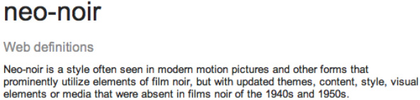 When researching noir films we came across neo-noir, this string of noir became useful when finding modern films for inspiration. one such movie is Sin City made in 2005.  I researched the Metro- Goldwyn-Mayer company logo as they have been around since 1924 and is still running to present day. Leo the Lion is the mascot for the Hollywood film studio Metro-Goldwyn-Mayer and one of its predecessors, Goldwyn Pictures, featured in the studio's production logo, which was created by the Paramount Studios art director Lionel S. Reiss. Since 1924 there have been around seven different lions used for the MGM logo; these lions include Tanner and Leo, the current (and seventh) lion. At the time of the 1940s the logo was bright with gold has been a major part of their logo so I had to incorporate this in my logo because our company is Royal Productions and I felt that this logo was a perfect influence.  I decided I would use Lucida Grande as it looked old fashioned. I made the font gold as it reflected the royal aspect. Then I gave it a shiny look by adding shade and tone using the colour settings. The background was hard to decide as I could not get the right pattern but I chose in the end a plain black background as it made the company name stand out. As a group we wanted a spinning coin so I had to incorporate that in. I inserted a photo of a coin from the internet and cropped it into a circle. I made it spin by using the animation setting. I slightly delayed its turning as at the beginning it was going too fast and you could not see the face of the coin. Our teacher suggested that instead of the word fading in, it should turn like the coin so it looks more professional. I repeated the coin frosts to get the animation. I think the logo came out really well and looks minimal and professional.  At this point we had intended for this to be our final logo but we found that when trying to add it to our film the two programmes were not compatible and so we could not use this logo. I had to come up with another logo that was not as good as the first. I made it using an online logo maker as it was the only programme that was compatible, but it did mean that it was no longer animated. However it still reflected our royal theme but it was the completely wrong colour scheme. So i was very disappointed but I feel I made a logo that followed the theme in the time I had to make it.
Within our opening sequence we had to choose an appropriate font to go with the film. Initially we chose a simple font, however it was clear that we needed to change it. We wanted the font to be long and fine, as seen in the openings of film noires. It appeared difficult as most of the fonts that we had to choose from were quite normal looking and boring, something that links with what you would expect to see in the opening titles from a film such as Vertigo, with an almost slightly retro feel. From the beginning we knew the colour had to be grey so it stood out enough with the black and white shots behind. Eventually in the end we chose the font 'bordeaux roman bold let' as it for filled the necessities needed within the opening sequence of a film noire. It is tall, thin, and slightly retro but with a feel as if it is shouting. 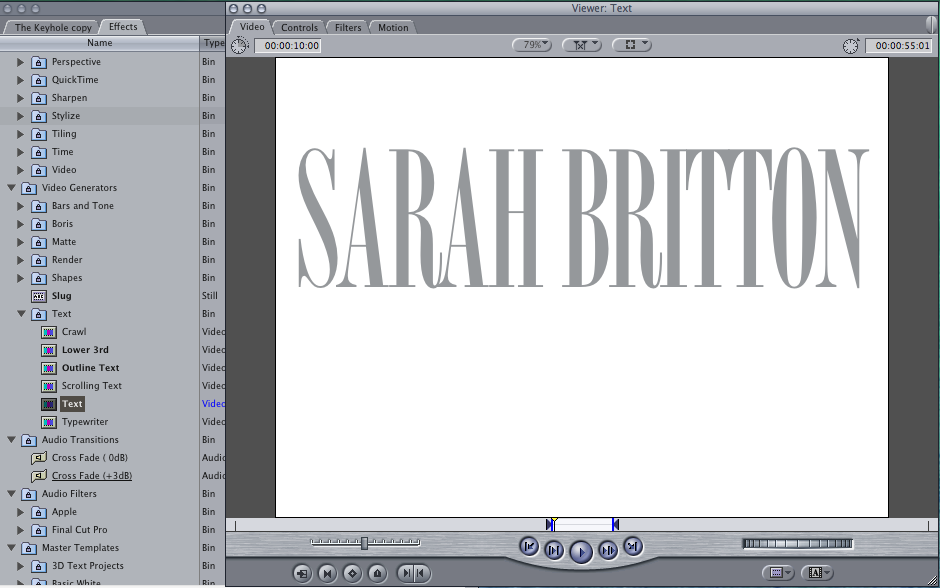 |
Author
|
- Welcome
- AS Level Blogs
- A2 Level Blogs
-
Useful Websites
-
AS EXAM INSTITUTIONS
- G322B1
- Digital Distribution
- Neurocinema and Focus Groups
- Intro to Audiences and Institutions
- Distribution
- Technological Convergence
- Marketing and Technological Convergence by Catilin
- Cross Media Convergence Revision
- Working TItle and Paul
- Pearl and Dean
- Understanding the Film Industry
- Media Ownership
- Documentary about Digital Grading in Lord of the Rings
- Marketing and Technological Convergence
- Benefits of Technological Convergence
- Film Distribution
- Digital Distribution of Film
- Working Title
- Warp Films
- Film Marketing
- Film Marketing
- Marketing and Technological Convergence by Alice and Rosanna
- AS EXAM TV DRAMA
 RSS Feed
