|
What have you learned from your audience feedback?
Our Pitch Presentation Feedback; When we presented our pitch presentation in front of the other students in our class we received very positive feedback and some constructive criticism, which we found very useful. Most the criticism came from our idea to try and film our video about summer when in fact it was nearly the end of the year and winter was around the corner. Everybody questioned us about what we were going to do. We checked the weather for the week every single day until there was a sunny day forecasted. This was actually a good thing because it gave us loads of time in-between to finish our course work and plan our video to the best of our ability and it also gave us time to order props to use in our video and this made sure we could film almost everything we had planned in the one day. Another criticism to our video was that we had too many suggested locations, we had so many different ideas and good locations that we wanted to include in our video but we was told that too many looked messy and was told to pick 4 strong, main locations to film as it will look tidier and more like a professional music video. Our original idea for the ending of our video was us all driving away in the car off to university but we were told that it would be hard for the audience to understand what’s going on if you all drive off together so we changed it to Gina driving off in the car and Emma waiting at the bus stop to leave. Our costumes were originally going to be summery and casual but another student in our class suggested that we should all wear the same thing or at least find a way which our outfits could tie in together as we would look more like a girl band, we agreed with this idea and made sure we all wore a dress or skirt in the field scenes and we all had the same flower garland on. When we filmed the other bits we made sure we all wore black jeans and a plain white top. When we looked back over our footage after we filmed we thought this looked very effective and it made our video look even better! Feedback From Our Teachers; Throughout all our blog work, filming and our final piece we received lots of useful feedback from our two teachers. When it came to our coursework, some of our blog posts were too vague so we were directed on what we should include and how to structure our posts the best way. We were told to include as many photos as we wanted as the more the better. Our teacher was the one who came up with the idea to order in some props to help us portray the summer vibe. We then as a group decided what we would like to include and what would look the best, we decided to all order a matching flower garland for our hair, we ordered some packets of holi paint to throw over each other, we got a packet of balloons to use when filming the field scenes, some sparklers and Chinese lanterns for the night time footage our teacher placed the order for us and they all came in time for filming. The beginning of our music video is filmed at school and in fact our teacher was the one behind the camera filming us making sure it was to the best quality, she directed us where we should be positioned and advised us on what we should do. We found this so useful and the footage came our very good. When we finished filming we started putting together the clips and editing it all together how we thought looked best. When we showed our media teacher she advised us to move a few clips into a different order and told us to try and get the lip singing synced as close to the music as we could or we would loose marks. After hours of editing she was really impressed with how the footage came out and how we used the props. Rough Cut Feedback Our rough cut was the first minute of our music video, which we showed to the rest of our class to receive some feedback. They liked it when we ran out the school doors and it faded into us running through the field, they said they loved the transition it was really effective and worked perfectly with the best of the song, everybody commented saying it felt like a really feel good video that you cant help but smile this was really positive and made us confident. The only criticism was that it would look better if we kept all the night time footage to the end instead of putting in-between the day time footage as it looks random.
0 Comments
After creating our rough cut, showing our teacher and peers and taking on board all of their feedback we finalised our video and this is the final product. Enjoy! 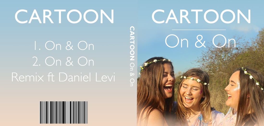 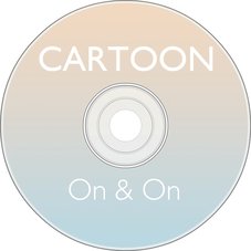 We made our CD cover using photoshop in a very similar way to our poster. Firstly we inserted the photo of us all onto the CD cover template, moved it around so we all fitted in at the bottom. We used the text tool to type the artist name and song name onto the front and also used it to type the number of songs onto the back and the spine. We used the gradiant tool for the back to create the blue background merging into the nude. For the barcode we just googled the image and copy and pasted it onto photoshop. Creating our CD was very easy, we just used the gradiant tool on photoshop to create the background colour of the blue and nude and then just used the text tool to type our artist name and song. We then moved them around until we was happy with the positioning. 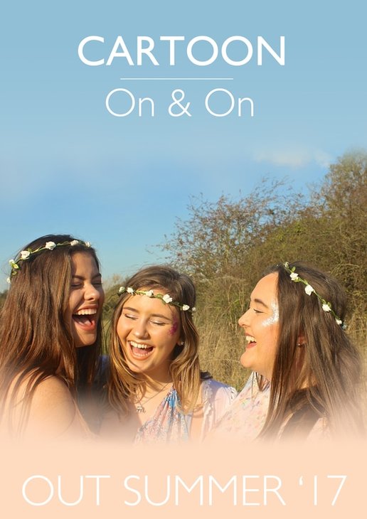 To make our poster we created an A4 document in photoshop, inserted the picture we took with Ginas professional cannon camera when filming and paste it in the centre and used an eraser tool to take away the sharpness from the edges and then filled in the top with blue to merge with the blue sky and filled the bottom with a neutral nude colour. We used the text tool to type the band name and the name of the single and moved it into the top centre as we believed this looked best and typed the release date at the bottom of the poster to balance it out. We then used the line tool to create the thin line between the artists name and song. We did our pitch presentation as a group infront of our class members and our media teacher. When we had finished presenting, they gave us some feedback to help us make sure our music video is the best we can get it.
Positive Feedback:
Constructive Critisism:
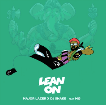  Major Lazer X DJ Snake - Lean On The CD cover of this single features a cartoon image which covers the majority of the front cover. This is a man who seems to signify one of the artists who is featured on the single. He is sat in the lap of an indian god-like elephant. This is effective in two ways: 1) The cover correspods with the music video, which is set in India and feautures native temples with similar spectacles as the elephant, and 2) The image plays on the name of the song as the man is physically leaning on the elephant. The cover is in an eye catching bright green colour, highlighting the man who is wearing different bright colours. At the bottom of the front cover there is the title of the single aswell as the artists it features in a cartoon bubble writing effect font. Overall the cd cover represents the artists in the fun and exciting way they like to be seen, which is parallel to the beat and feel of the song. 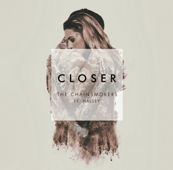  The Chainsmokers ft. Halsey - Closer
This cover features a realistic oil painting in the centre of the cover on a plain neautral background, on top of the image is a box which contains the name of the song as well as the artists names. As the main image is in the centre of the cover, it draws the audience in more to what is happening in the picture. The painted image features a man and woman holding eachother, which corresponds with the songs title 'Closer'. You cannot see much of their faces, just their tattoed bodies, which is eyetching and mysterious to whoever is viewing the cover. The font used in the title is bold so it stands out, yet serious, unlike the bubble writing in 'Lean On'. The colours throughout the front cover are very neutral and subtle in comparison to Major Lazer's CD cover. Overall i believe the CD cover does not represent the style or genre of the artist or song in a typical way. Most dance electronic songs, have a cover that is bright and fun to correspond with the style of the song. This cover seems as though it would be for a song in the soul music genre. However this is interesting as it is so different to what would be expected.  The colour of Rihanna's advert is very dark she only uses black, white and grey tones with red writing at the bottom. These dark colours represent her as a dark and mysterious character. She's wearing heavy jewellery lots of rings, a thick bracelet, big earrings and black lipstick with big winged black eyeliner. She is also hiding her identity slightly by covering half of her face with her hand. The layout of the advert is simple, Rihanna is positioned at the back of the advert with her name and the single at the bottom of the advert in block capital letters, her song title is written in red which is a connotation of 'Russian roulette'. All that is on the advert is Rihannas name and the name of her new single.  Wretch 32s advert is opposite to Rihanna's, it is all over much lighter and more positive with blue skies with blue stripes behind him like a rainbow, he is wearing white which is a much more approachable friendly colour than all black like RIhanna. Wretch 32 has both his hands in his jeans pocket giving him a strong look to other people. His advert just has his name and the release date of his album written in white capital letters across the front of his torso. We plan to use many similar editing techniques for our video as those seen in many chart music videos today. Certain editing techniques we plan to use are:  This editing technique is seen in similarly fast paced music videos such as 'all of the lights'. Filters: We plan to use coloured filters to highlight and exentuate scenes to look more summery and colourful. This will make the video more visually appealing and give it an overall more fun feel.  Beyonce's 'Single Ladies' music video also features a filter, but in a different way to how we would like to. This whole music video is in black and white as her song is more promiscuous and sexualised and as it is mostly dancing against a plain white/black backdrop there is no need for any colours to be exentuated through the use of a filter. Slow & Fast Motion We plan to speed certain scenes up to make them more exciting and fun, and slow others down (particularly evening scenes when using lights) to make them appear more mesmerising. Using a range of slow and fast motion clips will make our video diverse and eye catching.  Jessie J uses this editing technique in the 'Price Tag' video, which features many fast motion clips to make her movements appear more puppet like.
Scenery: Our chosen genre is dance electronic. We plan to set our music video in a glum school to start with, as we see the characters are fed up with their day to day lives at school, and then outdoors for the rest of the video as the girls enjoy summer. This is similar to dance electronic artist: Avicci's 'i can be the one' music video which has similar scenery from start to finish as the character leaves her job and moves abroad.
Props: Balloons and lanterns are all ideas of ours to make our music video interesting and fun. We plan to do this as other music video's from the same genre as ours: dance electronic, do not feature props such as these, and they are featured more in Pop music videos. However as our song is up beat and our story about girls enjoying summer we think this will work well. An example of a pop music video using balloons is Cher Lloyds: With Your Love. From watching this we can see the balloons make the video a lot more colourful and give the narrative a sense of warmth, this is something we aspire to recreate.
Costume: We plan to at first wear boring monochrome school uniforms in the beginning setting of the school, and then through the rest of the film wear bohemian style dresses as well as other colourful outfits and flower crowns, which is fitting with our summery theme. We also want to wear glitter on our faces. Like our prop ideas, this kind of costume is seen more in pop style videos so does not necessarily conform to the conventions of our chosen genre, however we think this will still look effective and work with our theme and narrative. This kind of costume and makeup is seen in Little Mix's: 'shout out to my ex'.
Overall our chosen mise en scene elements do not completely conform to those usually seen in Dance Electronic songs but we think this will make our video stand out.
|
AuthorWrite something about yourself. No need to be fancy, just an overview. Archives
May 2017
Categories |
- Welcome
- AS Level Blogs
- A2 Level Blogs
-
Useful Websites
-
AS EXAM INSTITUTIONS
- G322B1
- Digital Distribution
- Neurocinema and Focus Groups
- Intro to Audiences and Institutions
- Distribution
- Technological Convergence
- Marketing and Technological Convergence by Catilin
- Cross Media Convergence Revision
- Working TItle and Paul
- Pearl and Dean
- Understanding the Film Industry
- Media Ownership
- Documentary about Digital Grading in Lord of the Rings
- Marketing and Technological Convergence
- Benefits of Technological Convergence
- Film Distribution
- Digital Distribution of Film
- Working Title
- Warp Films
- Film Marketing
- Film Marketing
- Marketing and Technological Convergence by Alice and Rosanna
- AS EXAM TV DRAMA


 RSS Feed
