|
For our opening scene, we used GarageBand to compose and construct various music pieces that would suggest themes of a thriller and add a suspenseful build up. Through developing the piece, we've often changed the music to match the scene more closely.
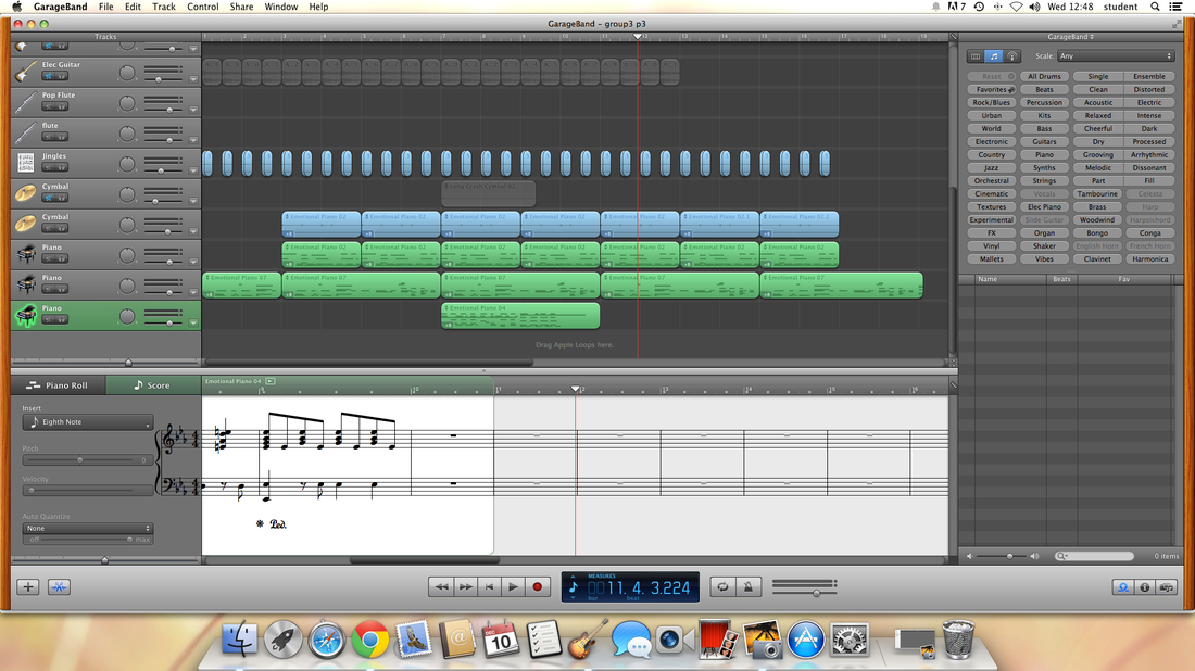 After trial and error with a few different sounds and tunes, we finally decided on this. It starts with a solo piano, playing a short minor piece, connoting that something frightening is going to happen or that there is something strange going on. There is a heartbeat style drum that is kept throughout the whole piece as I feel this makes the atmosphere more tense. I have layered different piano tunes on top of each other as this created a darker effect once I had adjusted the pitches to turn it into minor and for it to match. After much thought, we decided to scrap the teddy bear's picnic idea as we felt this would go better and that the teddy bear's picnic recreation would be too difficult to recreate with the software we have.
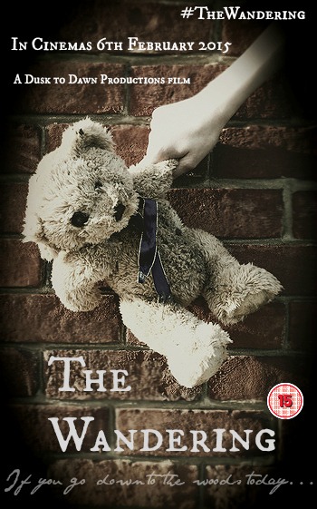 This is our film poster for our thriller film. We looked at other current film posters like The Purge to see what to include. We included the title, a tagline, an age rating, a release date, our institution name and a social media link. Overall we are very happy with our film poster as we think it looks professional and the font and the main picture works well together.
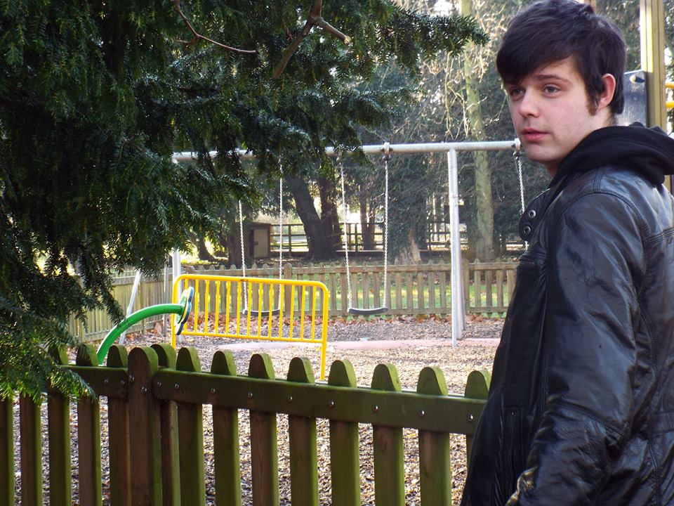
We decided to make a film poster to help advertise our film. If the film poster looks interesting, it will entice someone to come and see the film. It is a good way to show the genre of the film to our target audience. We used the teddy bear as it is the main prop in the film, so it would be a memorable part of the film.  Here, I am working on music for our production, and getting myself used to Garageband. I have decided to create an eery sounding music and have put in minor in order to give it a scary and tense atmosphere. We originally wanted to create a particular tune in Garageband, but I have realised that this is too difficult right now, and could potentially be something we have to change due to the difficulty of creating an original tune using the software. We may use another programme for creating that one section of tune, however, this could potentially ruin the atmosphere of what we have already and we could lose the quality of sound if we did so.
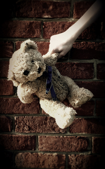
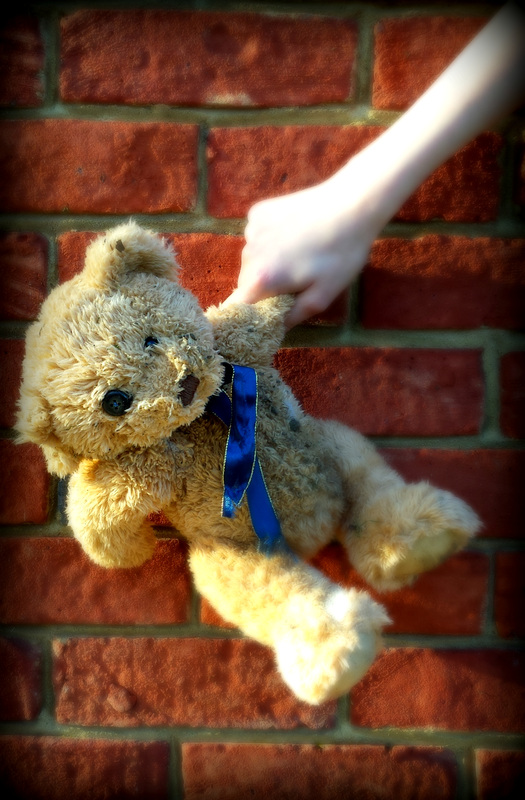
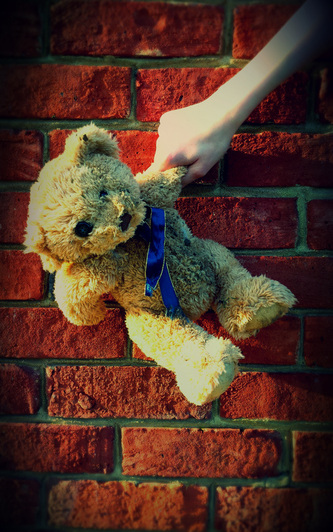
We wanted a photo of the bear as it symbolises the innocence of the child in the film, but also the destruction of the innocence as we destroyed the bear. We experimented with different settings for the photo, including against a wall, a tree and a white background. We decided to use the wall as the final picture as we felt it looked the best, and the bear contrasted well against the red brick. We have tried editing the picture in different ways, using two different editing programs to see the effects we like. These are the possible film posters we came up with. Our story is quite dark, so we explored dark colourings and focused the attention on different parts of the poster to come up with something we all liked. The use of the teddy bear has strong links with our opening sequence as it is the main prop.
 Psycho. 0:00 - 3:52 As it first starts, we see the institution's logo and name. There is then several cuts of black and grey stripes which reveal the opening credits. The fact that black and grey lines are used suggest that it is a thriller because these are dark colours. If light colours were used, we would be expecting a film such as a romance or a children's film. At 2:13, there is lot's of buildings, which shows that the film is set in the city. This is a good setting for a Thriller as it is a large place and can often be connoted with crime and danger. The scene then moves onto a dark bedroom with a woman lying on the bed and a man standing over her. This gives us an idea of the time it was set in, as well as their clothes, as it suggests that he has power over her. We immediately have the impression that these two are a couple and this suggests to us that it could be a romantic thriller. In the scene after, the plain, horizontal blinds on the window suggest that they do not have much money, and the lack of decoration suggests this too. |
Archives
March 2015
AuthorAS Media Group 3 Categories
All
|
- Welcome
- AS Level Blogs
- A2 Level Blogs
-
Useful Websites
-
AS EXAM INSTITUTIONS
- G322B1
- Digital Distribution
- Neurocinema and Focus Groups
- Intro to Audiences and Institutions
- Distribution
- Technological Convergence
- Marketing and Technological Convergence by Catilin
- Cross Media Convergence Revision
- Working TItle and Paul
- Pearl and Dean
- Understanding the Film Industry
- Media Ownership
- Documentary about Digital Grading in Lord of the Rings
- Marketing and Technological Convergence
- Benefits of Technological Convergence
- Film Distribution
- Digital Distribution of Film
- Working Title
- Warp Films
- Film Marketing
- Film Marketing
- Marketing and Technological Convergence by Alice and Rosanna
- AS EXAM TV DRAMA
 RSS Feed
