   We decided to overlay the credits over our piece. We kept the font quite plain and simple, without any effects, and placed it in the corner of the screen. We decided to do this because although we wanted the audience to notice the credits, we didn't want them to be too distracting, and keep them from concentrating on what was happening in the opening sequence.
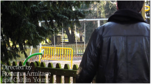
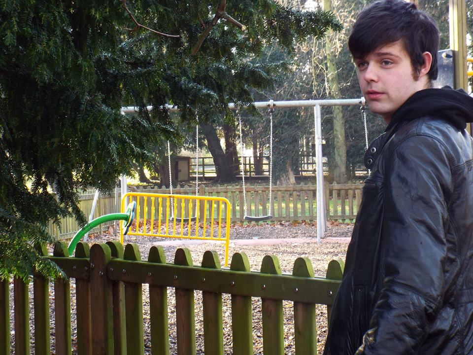
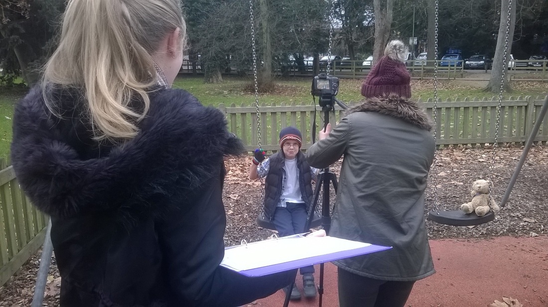
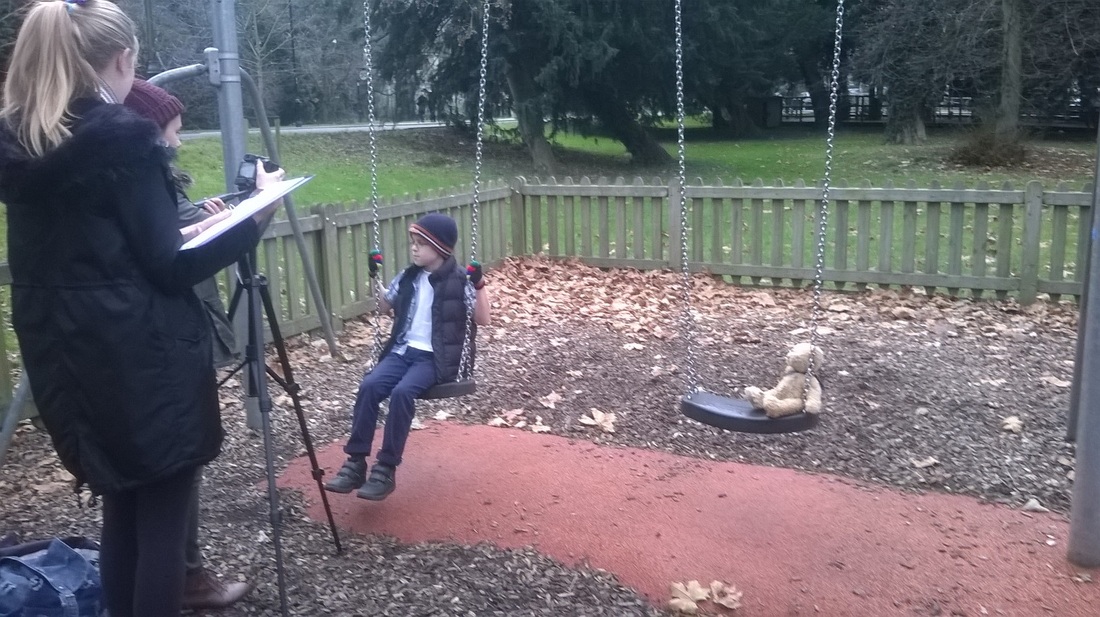
My 9 year old next door neighbour will be playing the young boy in our piece. We decided to use him becuase he is the right age and height for the character. He also enjoys acting so would be willing to help us out with our piece. He is also a good choice for this character becuase he looks similar to the person weare thinking of having playing the older version of him. 
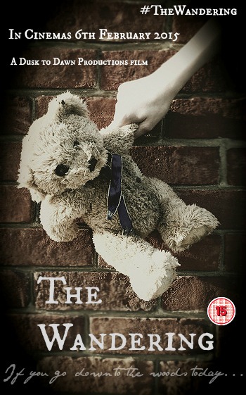 This is our film poster for our thriller film. We looked at other current film posters like The Purge to see what to include. We included the title, a tagline, an age rating, a release date, our institution name and a social media link. Overall we are very happy with our film poster as we think it looks professional and the font and the main picture works well together.
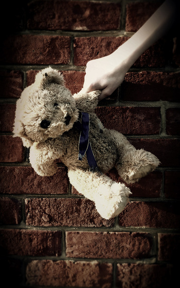
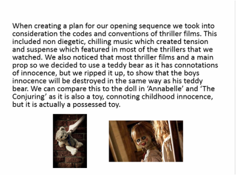
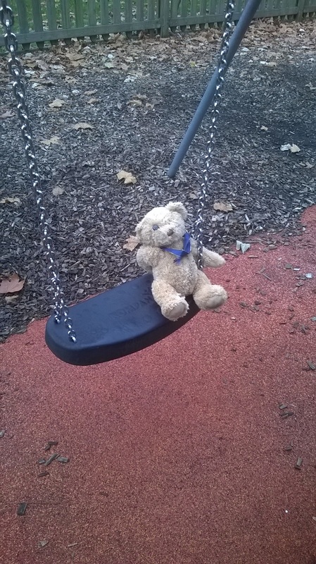
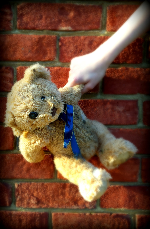
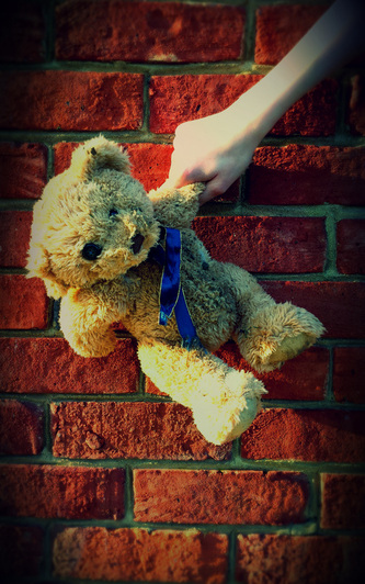
We decided to make a film poster to help advertise our film. If the film poster looks interesting, it will entice someone to come and see the film. It is a good way to show the genre of the film to our target audience. We used the teddy bear as it is the main prop in the film, so it would be a memorable part of the film. We wanted a photo of the bear as it symbolises the innocence of the child in the film, but also the destruction of the innocence as we destroyed the bear. We experimented with different settings for the photo, including against a wall, a tree and a white background. We decided to use the wall as the final picture as we felt it looked the best, and the bear contrasted well against the red brick. We have tried editing the picture in different ways, using two different editing programs to see the effects we like. These are the possible film posters we came up with. Our story is quite dark, so we explored dark colourings and focused the attention on different parts of the poster to come up with something we all liked. The use of the teddy bear has strong links with our opening sequence as it is the main prop.
 |
Archives
March 2015
AuthorAS Media Group 3 Categories
All
|
- Welcome
- AS Level Blogs
- A2 Level Blogs
-
Useful Websites
-
AS EXAM INSTITUTIONS
- G322B1
- Digital Distribution
- Neurocinema and Focus Groups
- Intro to Audiences and Institutions
- Distribution
- Technological Convergence
- Marketing and Technological Convergence by Catilin
- Cross Media Convergence Revision
- Working TItle and Paul
- Pearl and Dean
- Understanding the Film Industry
- Media Ownership
- Documentary about Digital Grading in Lord of the Rings
- Marketing and Technological Convergence
- Benefits of Technological Convergence
- Film Distribution
- Digital Distribution of Film
- Working Title
- Warp Films
- Film Marketing
- Film Marketing
- Marketing and Technological Convergence by Alice and Rosanna
- AS EXAM TV DRAMA

 RSS Feed
