|
Colours used in horror-thrillers posters are a great way to show your audiences on what your film is about and also attracts people to see your film. This links and works with the lighting the dark colours are used to help create a sinister mood .Typically the protagonists , when uncovered are in dark colours such as black ,blues and browns. as the lighting is dark the darker colours help mask the person and their actions. We researched on google images 'thriller horror posters' the results are shown below and shows how faces are used a lot in horror posters to engage the audience. 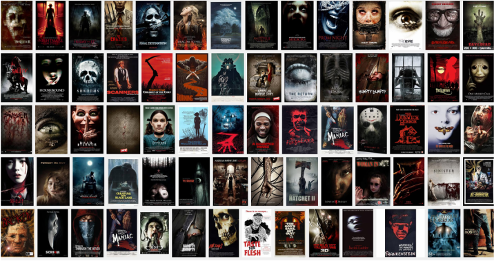 From seeing these horror thriller posters we instantly gain an insight of the common colours used in horror film posters. They commonly have a graphical trend of the dominant colours used mainly red, black, dark blue, green and day light. These colours create a dark sinister mood and engages the audience attention.  These in particular posters portray the dominant colours mainly used in horror film posters. These 5 posters clearly demonstrate the different mise en scene involved in horror thrillers. The titles share a common trend of being placed at the bottom poster as well as they style of the font appear in capital letters. As well as this they don't have bright colourful colours schemes such as using pink, yellow, bright green. Overall disregarding nature elements. From this research we can imply these similar codes in to out horror thriller poster.
0 Comments
Leave a Reply. |
Authors
Tanya Ali Zeynep Kahraman Lubaba Hussain Enya De Wolf Categories
All
|
- Welcome
- AS Level Blogs
- A2 Level Blogs
-
Useful Websites
-
AS EXAM INSTITUTIONS
- G322B1
- Digital Distribution
- Neurocinema and Focus Groups
- Intro to Audiences and Institutions
- Distribution
- Technological Convergence
- Marketing and Technological Convergence by Catilin
- Cross Media Convergence Revision
- Working TItle and Paul
- Pearl and Dean
- Understanding the Film Industry
- Media Ownership
- Documentary about Digital Grading in Lord of the Rings
- Marketing and Technological Convergence
- Benefits of Technological Convergence
- Film Distribution
- Digital Distribution of Film
- Working Title
- Warp Films
- Film Marketing
- Film Marketing
- Marketing and Technological Convergence by Alice and Rosanna
- AS EXAM TV DRAMA
 RSS Feed
